EVERYTHING YOU WANT TO KNOW ABOUT SHERWIN WILLIAMS AGREEABLE GRAY VS REPOSE GRAY 2021
Are you looking for paint advice on Agreeable Gray before painting your entire house gray? Don’t want to mess it up? Keep reading for all the details.

Gray Paint Color Trends
Gray paint has undeniable been popular over the last ten years.
In fact, this is how color trends work. They usually show up in fashion first.
Then architects and interior designers start using them again. I say again because colors cycle in and out of favor.
Designers may get bored of the same colors over and over, so we move towards what’s coming next. This isn’t so we can “make you get rid of everything in your house” to push you into a new trend.
In fact, it’s quite the opposite. We will move towards different colors so that the HUGE investment you are making in your home is on the cutting edge of color combinations (or colors you absolutely love), not on the tail end.
We usually see the color start to pop up in magazines, tv shows, like HGTV and blogs. Then Builder’s catch on to this color trend. They start to specify the color family for every room of the new houses they build.
When the paint color trend hits hardest
Next the color trend hits DIY’ers. They blog, make videos and social media posts about the new color choice. It takes over Pinterest.
Lastly, it filters down to the handyman, painter, contractor who is working on a homeowner’s remodel. The homeowner asks what is popular, or they have been inundated with the color online and ask for that color to be painted.
By then, the color has cycled for 7-10 years. Designers are tired of it. It’s no longer cutting edge. Which means it’s on the back end of a color trend and we don’t want our client’s to spend $$$$ painting and decorating with it when we know it will be out of style in a few years in the mainstream.
The client will regret it and the designer will feel bad that their investment only made the client happy for a few years.
Examples of Home Decor Trends
Think back on these cycling trends as to when you wanted it and how long you loved it before you regretted it:
- Tuscan kitchens
- Built-ins
- Open shelves
- Dark Red & Tan
- Sage green
- Gray cabinets
- Navy blue island
- Beige tile on everything
- Granite countertops
- Cement tile
- Wall to wall carpet
- Modern Farmhouse everything
- Gray wood floors
Now I’m not saying all of these things are “out” or that you have moved on from them. In fact, some of them are still goings strong and will continue to stay strong regionally and if done well.
But, I bet there are at least a few things on that list that you loathe. And that is exactly what we mean by trends. Something that everyone is doing, that you LOVE when you see it, but eventually you tire out of it.
My hope is that you don’t tire quickly of the design choices you make and that they are lasting. If you are strategic in your choices, you will choose things that have always made you happy and will continue to make you smile.
Popular Gray Paint Colors
By now, you can see where gray paint is on this scale. That doesn’t necessarily mean gray paint is out of the question.
It has made an appearance for many, many years and done well.
However, gray on gray on gray is out for me. You know we love color and pattern here at StampinFool!
But if you are in search for the perfect gray paint color, let’s do our homework to make a good choice for your home.
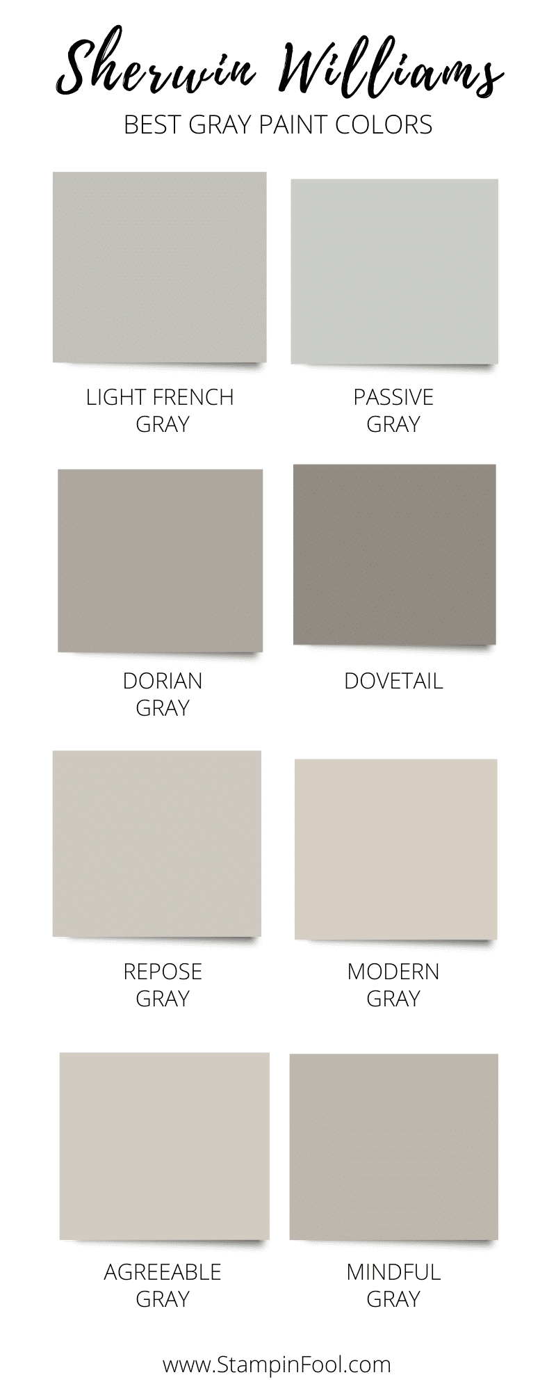
Most Searched For Popular Gray Paint Colors
These gray paint colors are the most searched for grays. That means a lot of homeowners and DIYers want to know more.
- Agreeable Gray
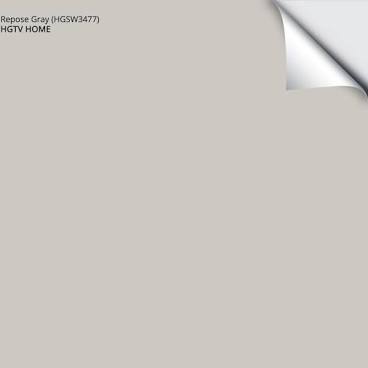
- Repose Gray
- Light French Gray
- Dorian Gray
- Mindful Gray
- Read more about them here
What Are Undertones?
Undertones are the colors towards which a neutral leans. It can be red, pink, blue, green, purple, orange, etc.
The easiest way to identify a color’s undertone is to compare it to a true white and also to a primary color.
Once it is paired with a blue, red, or yellow, you will likely be able to pick out the subtle color towards which it leans.
Is Agreeable Gray a Warm or Cool Gray?
When we talk about whether a color is cool or warm, we are really asking if it is “cooler than” or “warmer than” another color.
So let’s compare Agreeable Gray to some other paint colors.
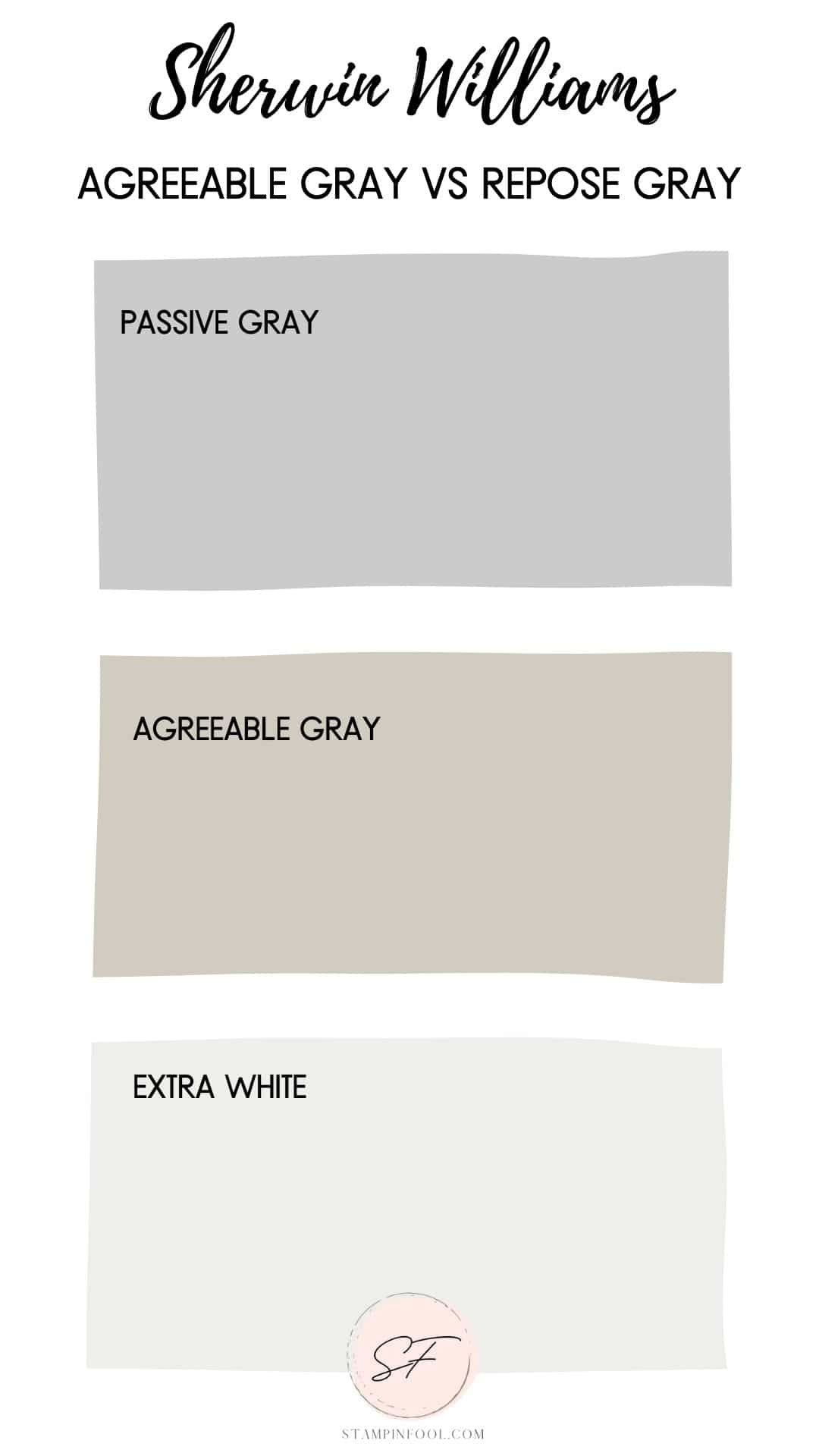
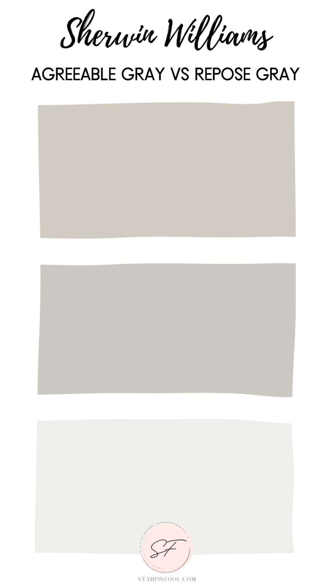
Sherwin Williams Agreeable Gray is warmer than Passive Gray and Extra White.
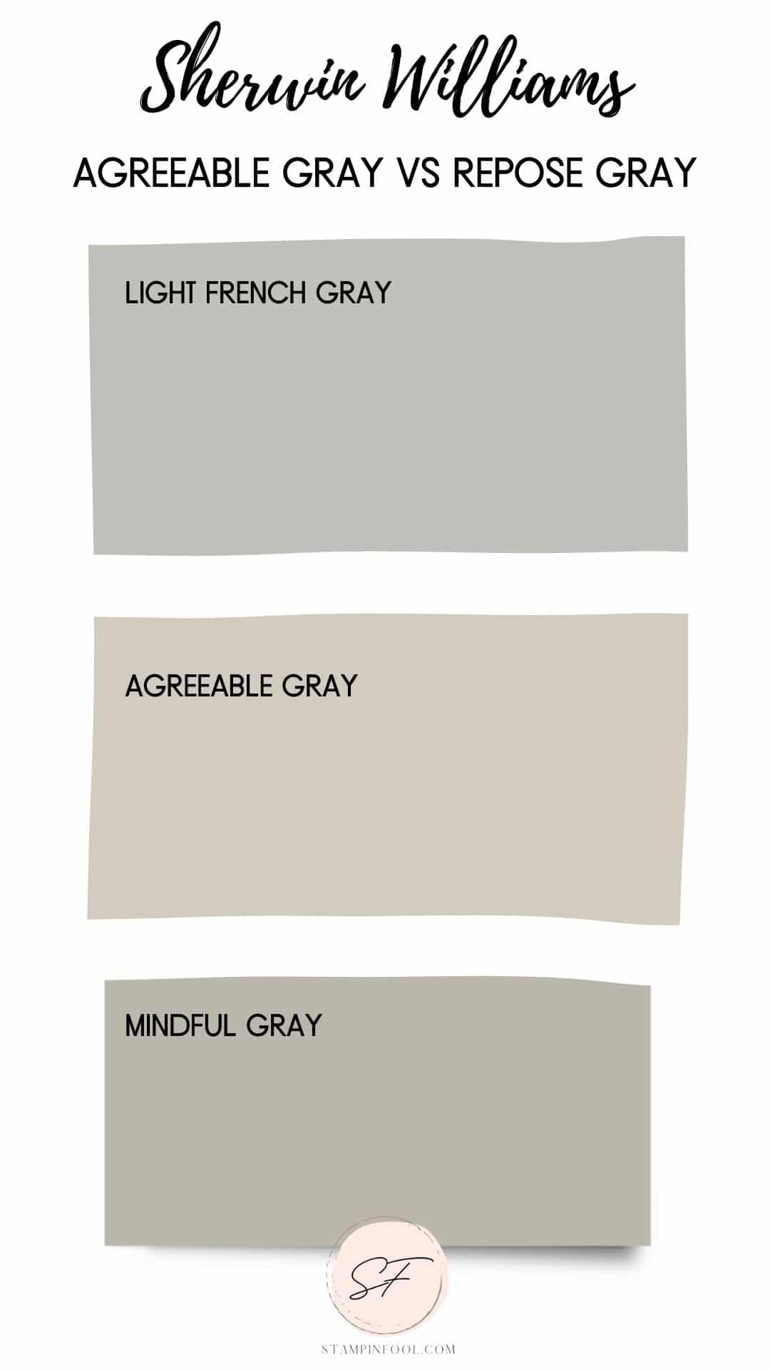
Light French Gray is cooler than Agreeable Gray. Agreeable Gray looks warm and pink compared to Light French Gray and Mindful Gray. Mindful Gray looks cooler and greener than Agreeable Gray.
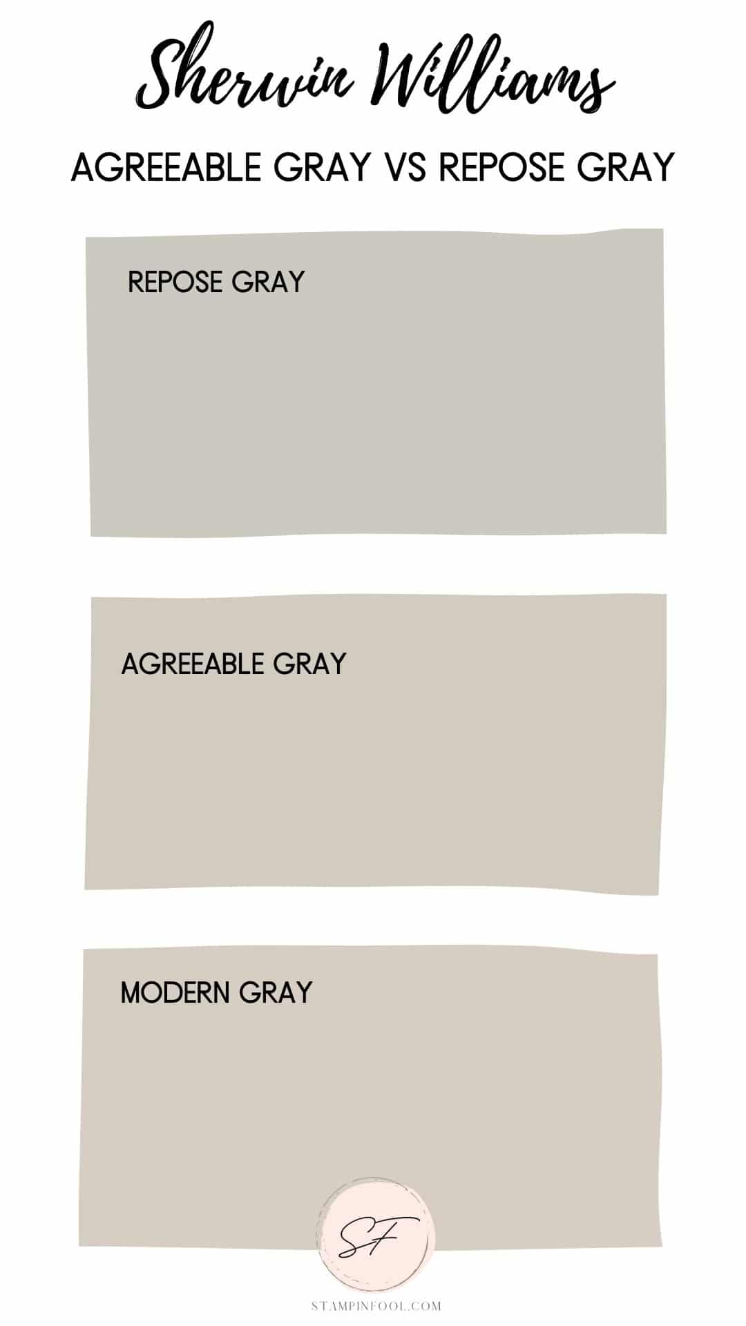
Here, Agreeable Gray is warmer than Repose Gray and slightly warmer than Modern Gray.
Agreeable Gray Undertones
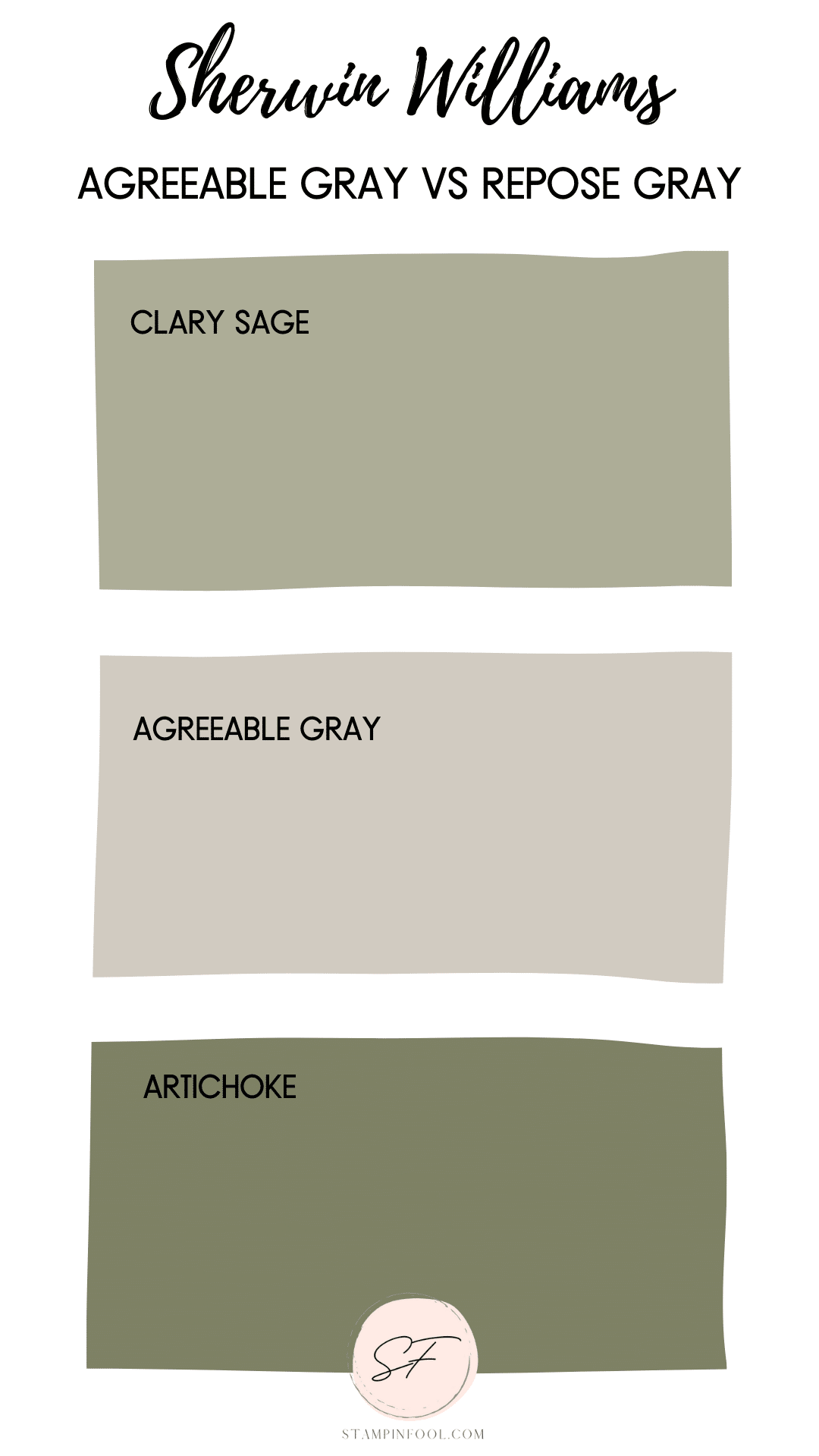
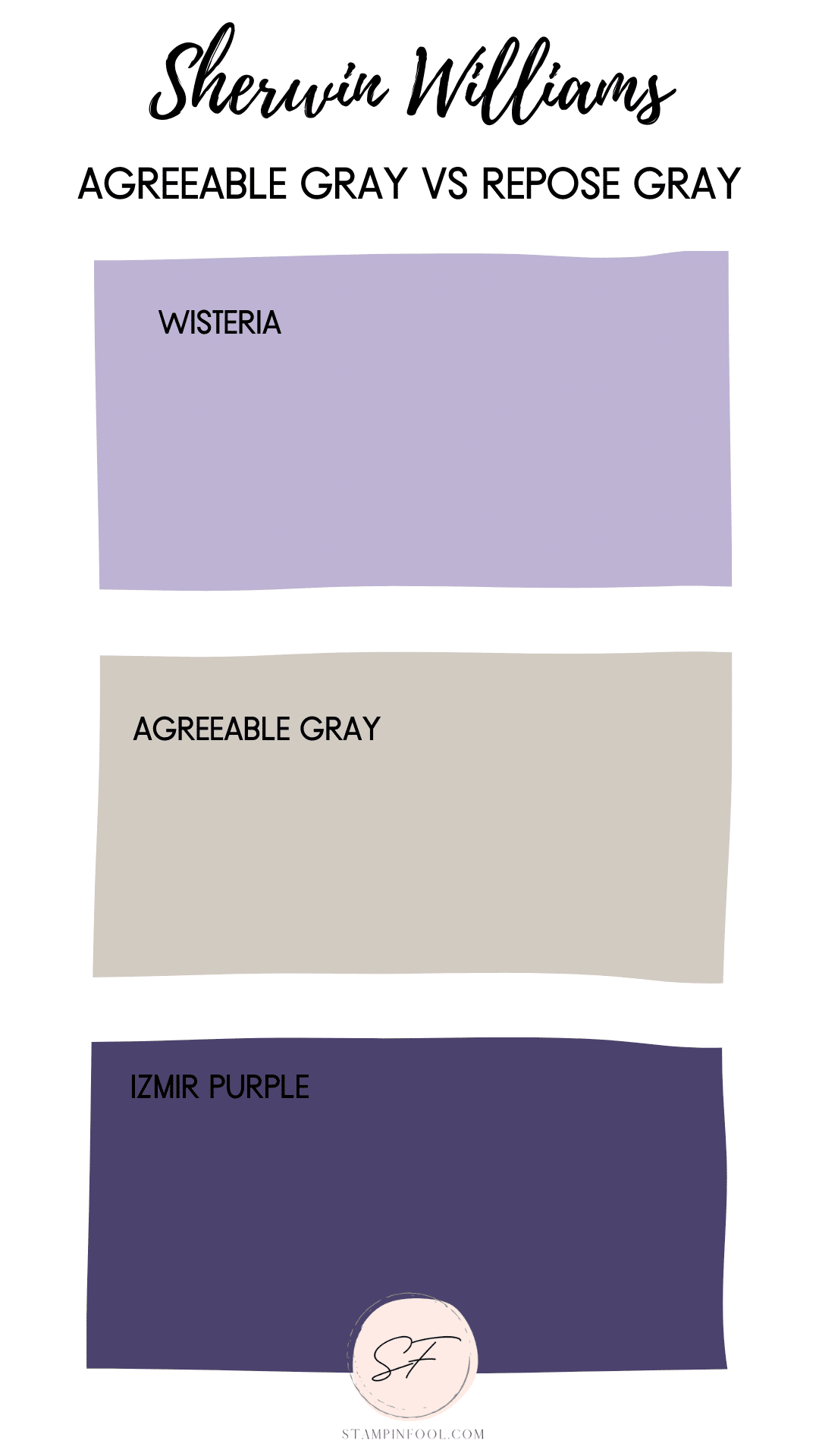
Agreeable gray leans slightly more warm than Repose Gray. And wouldn’t you know it is has TWO undertones that sneak out depending on the other colors in the room.
Those undertones in Sherwin Williams Agreeable Gray are GREEN & PURPLE.
This happens with a lot of grays, they can tend to pull purple, especially in shadowy areas or non natural light sources.
REPOSE GRAY UNDERTONES
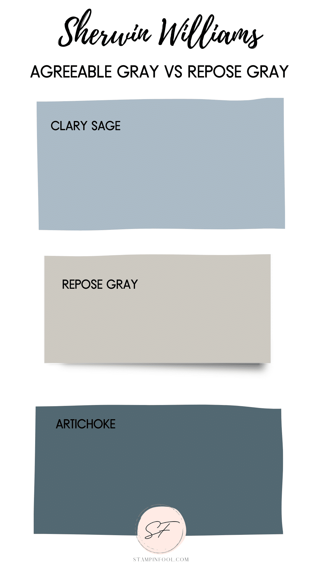
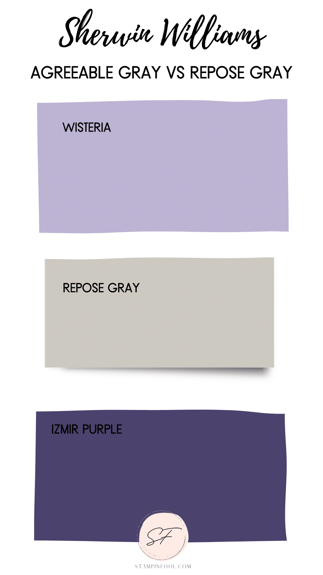
SW Repose Gray is a complex neutral meaning it has undertones- and it’s cool gray. Depending on the context, you can pick up on TWO undertones.
Blue and Purple are the dominant undertones for Sherwin Williams Repose Gray.
North facing rooms will produce a purple/violet shadowy gray color.
In South facing (light filled) rooms the color will remain most neutral, but still cool.
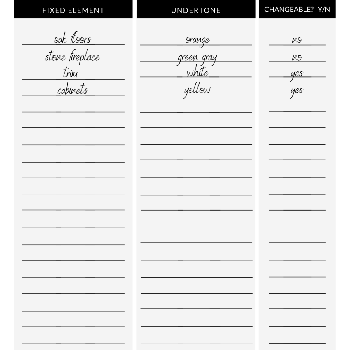
UNDERTONES WORKSHEET
Because your home will already have fixed undertones, you will want to identify those before choosing a color.
The undertones in your home should coordinate well with each other. You can use this worksheet to notate the prevailing undertones and help determine which colors look best together.
Grab a copy of your undertones worksheet here.
EXAMPLES OF AGREEABLE GRAY in real rooms
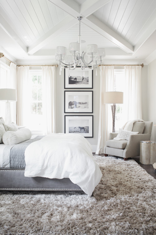
Photo by Set To Sell, LLC – Look for bedroom design inspiration
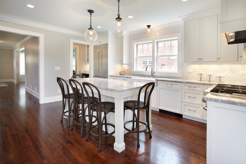
Photo by Kuhl Design Build LLC – Discover kitchen design inspiration
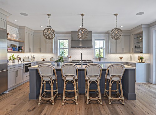
Photo by PB Built – More kitchen ideas
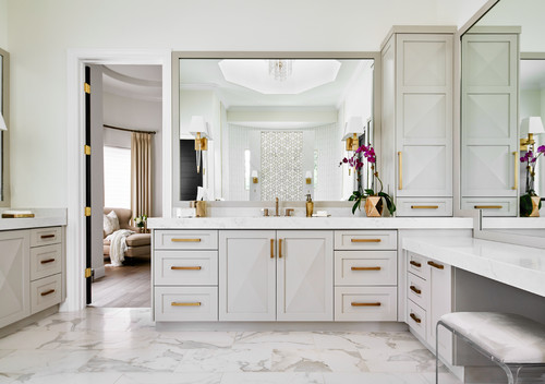
Photo by Haven Design and Construction – More bathroom ideas
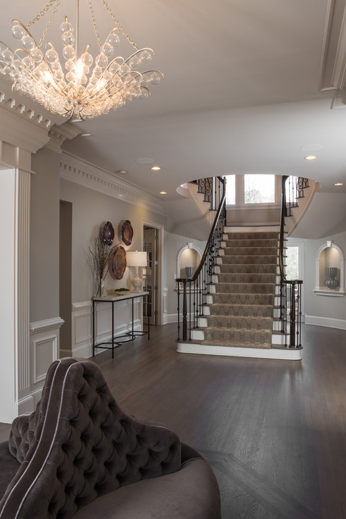
Photo by Pineapple House Interior Design – Search staircase design ideas
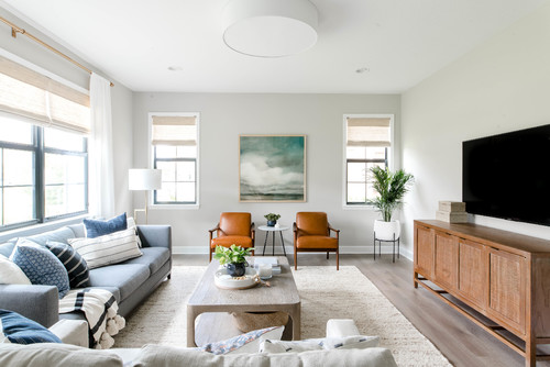
Photo by The Habitat Collective – Look for living room design inspiration
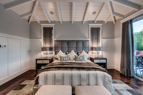
Photo by Calusa Construction, Inc. – Browse bedroom photos
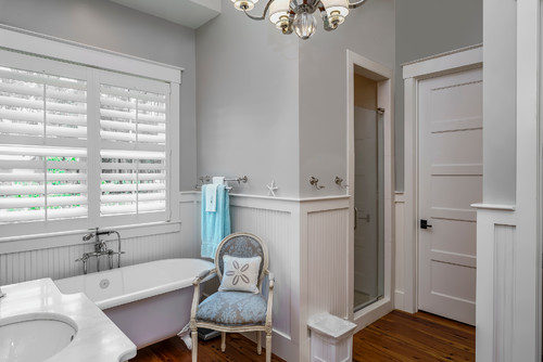
Photo by Coastal Signature Homes – Discover bathroom design ideas
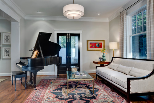
Photo by Domiteaux Garza Architecture – Look for living room pictures
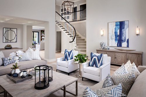
Photo by Tracy Lynn Studio – Look for living room design inspiration
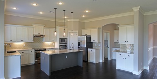
Photo by Kiella Homebuilders – Browse home design ideas
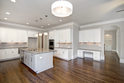
Photo by Jane Ann Designs – Look for kitchen pictures
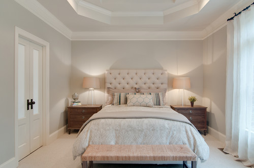
Photo by Usable Space Interiors, LLC – Browse bedroom photos
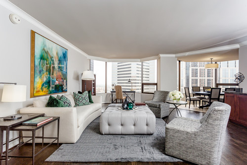
Photo by Chase Dowell Interior Design – Discover living room design inspiration
Sherwin Williams Agreeable Gray Exterior
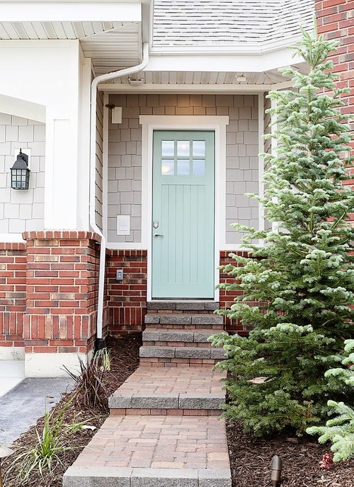
Photo by OSMOND DESIGNS – More exterior home ideas
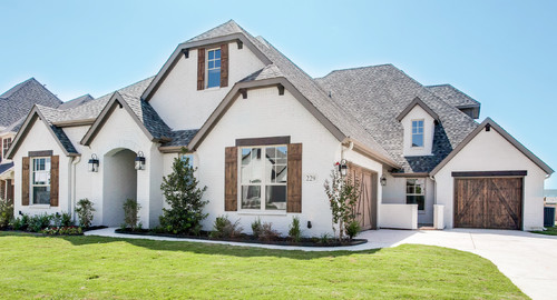
Photo by Bannister Custom Homes – More exterior home ideas
EXAMPLES OF REPOSE GRAY in real rooms
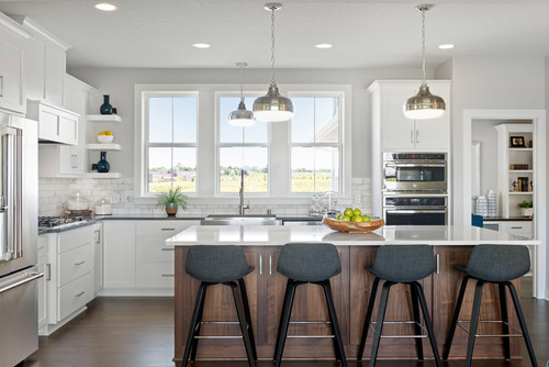
Photo by Robert Thomas Homes – Search kitchen design ideas
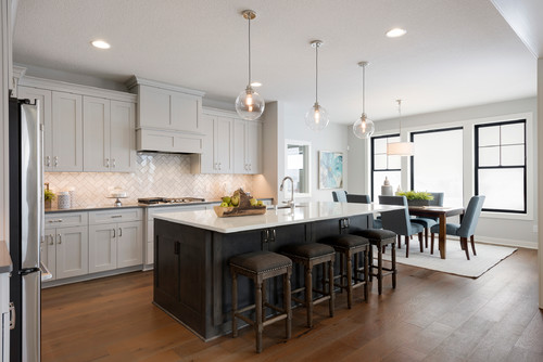
Photo by Robert Thomas Homes – Browse kitchen photos
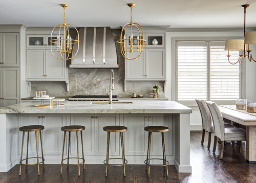
Photo by Edward R James Homes – More kitchen photos
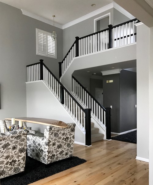
Photo by Blue Parrot Painting – Look for living room design inspiration
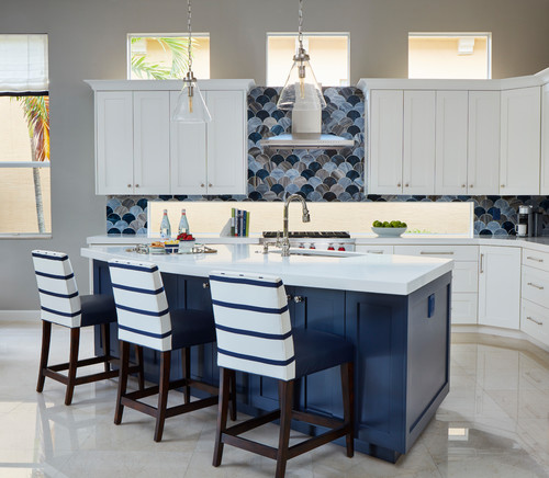
Photo by Piper Gonzalez Designs – Search kitchen design ideas
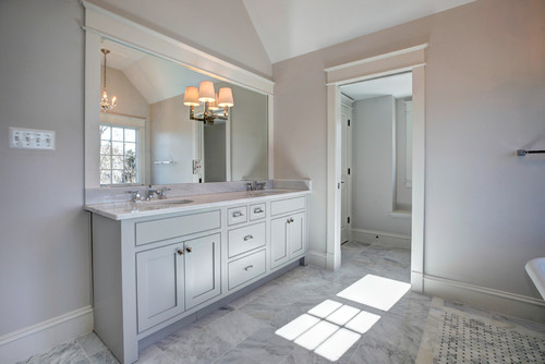
Photo by Starbuck Realty – Search bathroom pictures
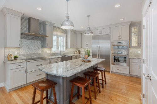
Photo by Plaistow Cabinet – More kitchen ideas
Sherwin Williams Repose Gray Exterior
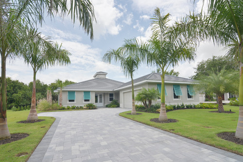
Photo by Brista Homes – Look for exterior home pictures
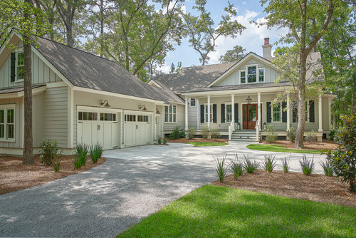
Photo by Coastal Signature Homes – Discover exterior home design inspiration
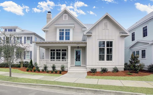
Photo by PBC Design + Build – Browse exterior home ideas
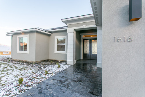
Photo by Prodigy Homes Inc. – More exterior home ideas
How does this apply to our homes?
These colors are on a screen and when we look at photos of the colors in other people’s homes we have to remember that they have different natural lighting, flooring, bulbs, windows, furniture and rugs and other elements that affect how we perceive the colors.
We also know that photos online are edited. Usually the brightness is turned up and the blues or oranges are toned up or down depending on the style.
So in short, the way these colors look in your home, on your walls, with your lamps and windows will be vastly different from the photos and online comparison samples.
How can you choose the best gray paint color?
The only way to choose the best gray paint color for your home is to try out large samples in the rooms you intend to paint.
I know, that’s not the answer you are looking for. It would be much easier to say – go paint it X. But that would be a disservice.
I don’t want you to regret buying expensive paint and paying a painter or your own sweat equity for something you won’t love.
So, let’s make a short list of things to consider.
- How much natural light does the space get?
- What color temperature bulbs are you using? (2700K is usually ideal)
- Does the floor have a complementary undertone?
- What color furnishings and accessories will you use?
- Is the trim being painted another color as well? Is it warmer or cooler?
- Do you have brick or stone or beams that will affect the wall color?
TEST PAINT COLORS
I ALWAYS recommend testing large swatches of your paint colors before committing to the entire house. It’s an expensive mistake that you don’t want to make, so I recommend using Samplize peel and stick swatches to test out your favorites.
Spending $25 on paint samples is always cheaper that a kitchen full of cabinets you hate and a heartache you can’t afford to fix.
- Delivered overnight so you can make those pressing decisions in a crunch
- Crazy accurate color from my favorite paint vendors like BM, SW & Farrow & Ball
- No painting, no mess, no clean up!
- Peel and stick (and come off clean)
- Or don’t peel off the back and use over and over again!
So, don’t forget to test your paint colors!!
The colors you see in other people’s homes won’t look the same in your home. Often times, photos are edited, lightened or color corrected.
Don’t rely solely on photos to make your decision- trust the process and sample the paint.
*Expert Advice*
Is Agreeable Gray or Repose Gray Better?
Trending toward warmer colors, Agreeable Gray wins the battle here. While this is 100% preference, I believe it fairs better as a warmer neutral than Repose Gray because it looks cool in every context.
What do you think? Is Agreeable Gray a winner or do you love Repose Gray?
Do you need help choosing the perfect color scheme for the heart of your home? We are available by zoom or in person consultations to start your projects today. Inquire now.

Yes, gray is never going to look great with beige and honey oak. We need to stick with warmer tones- try SW Greek Villa, Realist Beige, Natural Linen
I will be painting my living room and kitchen, which is an open concept… I have honey oak cabinets and floors… My couch and chair is beige… What color do you recommend… Please help, as I have bought several samples… Agreeable gray looks white, I am thinking about a greige color… What do you recommend? Thanks for your help.