
The Best Sherwin Williams Gray Paint Colors in 2021
Choosing the best Sherwin Williams gray paint color for your space can be tricky. And while designer’s may be over the gray trend, many home builders, sellers, realtors and homeowners are still going strong with the gray paint trend.
Gray is neutral, but there are a lot of ways to go wrong with the wrong gray for your room. So we’ve created this guide to choosing the best Sherwin Williams gray paint colors to help you navigate the cools, warms and go-to paints to find the perfect gray paint color for your space.
The number one question about gray paint I get asked is, “What is the best gray for my house?”. I’m going to try and answer that. While there is no short answer, after we examine the following things, there’s a good chance one of my go to grays will work in your space.
The second most FAQ I get about gray paint it: Is gray paint still in style?
WHAT’S THE MOST POPULAR GRAY PAINT COLOR in 2021?
I would venture to say Sherwin Williams Agreeable Gray or Repose Gray are the number one gray paint colors because they are neutral, not too warm and not too cool in most cases.
In reality, it depends on many factors including what the other elements of the room are, how much light the space gets, and which direction the rooms face in relation to the sun. If you’re looking for the best white paint colors, read here.
But, we’re going to address all of that and leave you with a list of great Sherwin Williams gray paint colors. And it will be based on whether you like cool or warm colors and which undertones best work with what element’s you already have.
GRAY PAINT UNDERTONES
Firstly, undertones will play a huge role in this. We use undertones to talk about color in comparison to other finishes. Either it is cooler/warmer than or cleaner/muddier then the item of comparison.
COOL GRAY VS WARM GRAY
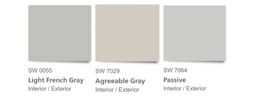
Let me give you an example. SW Light French Gray is cooler and cleaner (purer) than SW Agreeable Gray (see graphic below).
In comparison, SW Agreeable Gray is warmer than Light French Gray and has taupe undertones. Whereas SW Passive Gray in comparison to Agreeable Gray has cooler blue undertones than both of the other two grays.
The easiest way to identify a color’s undertone is to compare it to a true white and also to a primary color.
Once it is paired with a blue, red, or yellow, you will likely be able to pick out the subtle color towards which it leans.
Before you start painting an entire room with a color from this list, you’ll want to consider a few things and prepare to paint large sample boards before committing to a color.
STEPS TO CHOOSING THE BEST SHERWIN WILLIAMS GRAY PAINT
Before you start buying paint, you need to consider the existing elements of the space you are painting. Once you take these things into consideration, you can narrow down the grays to the best color for your space.
You want the wall color to complement the floors, trim, furniture and hard fixtures of the room. If any of these things look poor against the gray wall, the entire room will be lost.
Lastly, the most important factor to consider when paining a room (or all the rooms) in your home gray, is how you will warm up the space. Going gray and white with walls, floors and furniture can make a space feel cold very quickly.
Consider the natural elements you will pull into the design to keep it natural and warm instead of cold. Woven baskets, rugs, rattan side tables, woven lights shades, and an occasional chair that has color can bring invitation to the room while keeping it gray, but not cold.
FIRST STEPS
I want to give you the tools to create a strong foundation before you buy paint. So I’m going to give you some simple steps to work on before getting started. These same steps are used for choosing the best white paint.
- Create a room plan
- Take note of existing elements
- Assess the tones furniture
- Consider lighting
- Narrow down the choices
- Test paint samples
ROOM PLAN
Before you start painting, you should have an entire room plan together. Whether you will be keeping your existing furniture to starting from scratch with everything, have a plan.
Use Canva to make a mood board with pictures of elements you already have chosen. If you haven’t bought anything, start with Pinterest and identify rooms you like. Make a list of the commonalities. Use those elements to plan to the room.
MAKE A LIST
It helps to make a list starting from the top down: lights, paint, trim, window treatments, lamps, chairs, tables, seating, rugs, decor, and plants. Once you have a full list of everything you think you will need, plan out the space with a floor planner tool like this one.
If you are able to gather samples of the wood tones, wallpaper, fabrics you will use and lighting finishes, it will be helpful to see the colors together and compare them with your gray choices.
By gathering these materials you will look for cool vs warm tones and clean vs dirty looking components. When comparing them, you will be able to determine if all of the elements are too cool, the wrong undertones or dirty looking. And if you can avoid those things, the gray will be the right gray for your space.
EXISTING ELEMENTS
Once you have a room plan in place, you should note the things that you cannot change. This list should include hard elements that will not be removed from the room, that you have to work around. Some examples are the fireplace, floors, cabinets, trim, countertops, window sashes.
For each of these things you should identify the element undertone. Make a list of each item and write the undertone beside it. Then jot down whether it can be changed or not.
MAKE THE UNDERTONE LIST
The list should looks something like this (you can download the pdf below):
- stone fireplace – green gray undertone – Yes (can be painted)
- built in cabinets – beige undertone – Yes
- wood flooring – orange undertone – No (floors will not be replaced)
- trim – beige undertone – Yes, can be painted
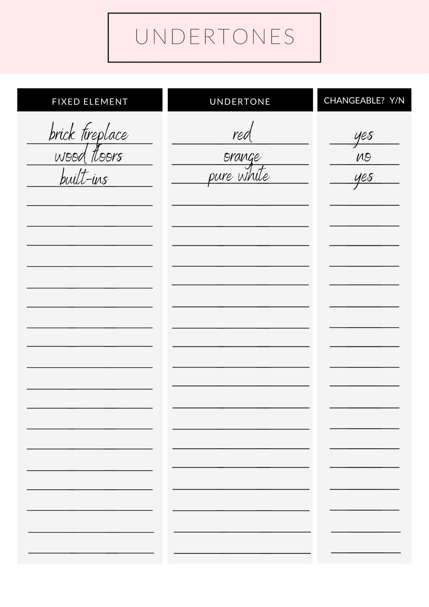
DOWNLOAD THE PDF PAINT UNDERTONE CHECKLIST
FURNITURE
Along the same lines as the fixed elements of the room, consider what furniture you already have and will be using. Or if you have a room plan, note the furniture you will be purchasing for the room.
You can also consider things like drapery, pillows, coffee and side tables, sofas, chairs, book cases. You’ll want to pay close attention to the wood tones of the furniture and compare the paint colors to those wood samples to make sure that they will look clean and not muddled next to each other.
CONSIDER LIGHTING
Next on the list is to take into account the natural and added lighting. Lighting sources may include ceiling lights, chandeliers, sconces, recess lighting, floor and table lamps. All of these things affect how we see the color of paint on the wall.
Your lights should be part of your overall plan, as well as the lightbulbs you use in them. Aim for LED temperature 2700 for a soft, natural looking light.
As far as natural daylight goes, this will depend on the number of windows in the room and the direction the room is facing. South facing rooms get great diffused natural light with windows. Whereas north facing rooms tend to have more shadows and less direct sunlight.
Which brings us to the next point which is most important, trying out LARGE paint samples. You will be able to see how the light affects the way we see the color.
Read more on this post about choosing the perfect size lighting.
NARROW IT DOWN
Now you should take a look back at the fixed element undertone list. If you have primarily warm undertones in those fixed elements, you should choose a warm gray paint color.
A cool gray would look cleaner (and too stark) and make the fixtures look “muddy” or not as crisp.
On the other hand, if the elements have cool undertones green, blue, grays, you can stick to a cool undertoned gray paint so that the walls don’t look muted in comparison to the other elements.
What if you have both? If you have both cool and warm undertones in the fixed elements you should mask them. Is the floor an orange undertone? Cover it with a large natural rug.
And if you have a brick fireplace or built in bookcases, consider painting those the same as the trim or wall color as well. The less variance in competing undertones the better, the colors will work together rather than making the one color stand out as wrong.
WHAT TO AVOID IN CHOOSING GRAY PAINT
I know it sounds scary to paint a wrong color, but here’s what you should avoid mixing:
- Avoid pink beige paired with yellow or orange beige. Pink beige should be paired with green, gray or blue undertones
- Orange beige with pink beige. Pair orange undertones with yellow, gold, taupe or green gray undertones
- Yellow undertones- avoid pink undertones. Pair with gold, orange, green gray
- Green, blue and purple beige or gray undertones- work well with most neutral colors
- The big takeaway is if you have pink undertones in a fixed element, work carefully with the colors you choose to pair with it.
For each room, make a short list of 2-3 Sherwin Williams gray paints you would like to try. Compare the swatches to the fixed elements and furniture choices to make sure the undertones complement each other and move on to ordering samples.
PAINT SAMPLES
Most importantly, before deciding on a color, make sample boards. I want you to gather large size poster boards and buy sample pots of the paint colors you have narrowed it down to.
Paint each poster fully to the edges. Jot down the color of the paint on the board. Hang them on the wall and observe them throughout the day. Place the boards in a corner or next to a door frame to see the shadows cast on the color.
I also want you to move the boards around at different times of day. The lighting changes in a room and you will want to be comfortable with the color at all times. Pay special attention to the evening, when you use lamps to light the room. Especially, if you spend a lot of time in the room in the evenings after the sun has gone down and there isn’t natural light.
Assess whether you like the color at different times as well as with natural light and lamps. After observing the color for a day or two, you should be able to eliminate the ones you don’t love or start again if you aren’t liking any of them.
But to avoid overwhelming yourself, only work with 2-3 colors at a time until you find the one that’s right for you. If you’re having specific trouble, read to the bottom of this post, where I’ve listed FAQ for troubleshooting the best white paint colors.
TEST PAINT COLORS
I ALWAYS recommend testing large swatches of your paint colors before committing to the entire house. It’s an expensive mistake that you don’t want to make, so I recommend using Samplize peel and stick swatches to test out your favorites.
Spending $25 on paint samples is always cheaper that a kitchen full of cabinets you hate and a heartache you can’t afford to fix.
- Delivered overnight so you can make those pressing decisions in a crunch
- Crazy accurate color from my favorite paint vendors like BM, SW & Farrow & Ball
- No painting, no mess, no clean up!
- Peel and stick (and come off clean)
- Or don’t peel off the back and use over and over again!
So, don’t forget to test your paint colors!!
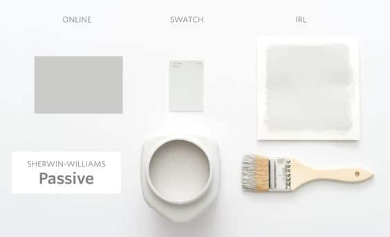
The colors you see in other people’s homes won’t look the same in your home. Often times, photos are edited, lightened or color corrected.
Don’t rely solely on photos to make your decision- trust the process and sample the paint.
*Expert Advice*
THE GUIDE TO GRAY PAINT colors In 2021
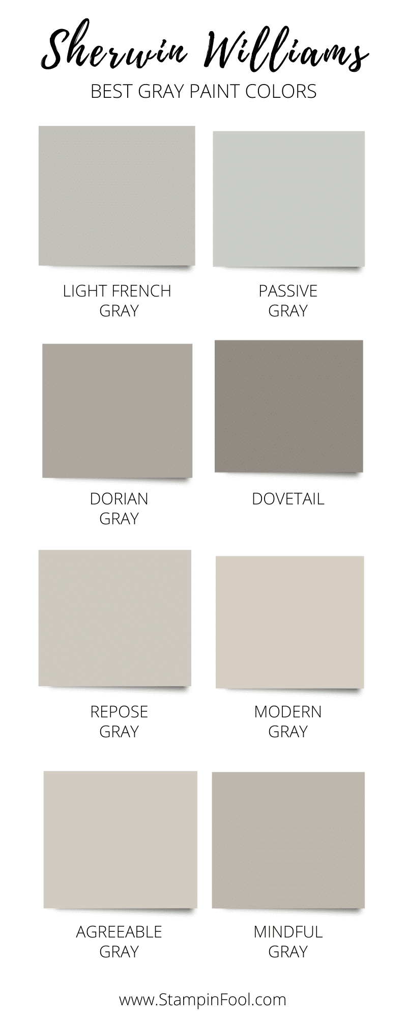
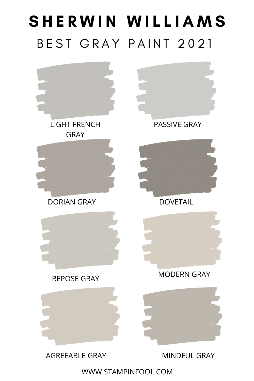
You’ve made it to the color selection process! So I want to give you 12 Sherwin Williams gray paint colors to start working with.
Here are the best gray paint colors to use as a starting point for your white paint selection:
- Light French Gray
- Passive Gray
- Dorian Gray
- Dovetail
- Repose Gray
- Modern Gray
- Agreeable Gray
- Mindful Gray
Are you ready to see each of these Sherwin Williams gray paint colors on walls and why and how they work? Let’s start talking the best gray paint colors.
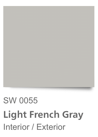
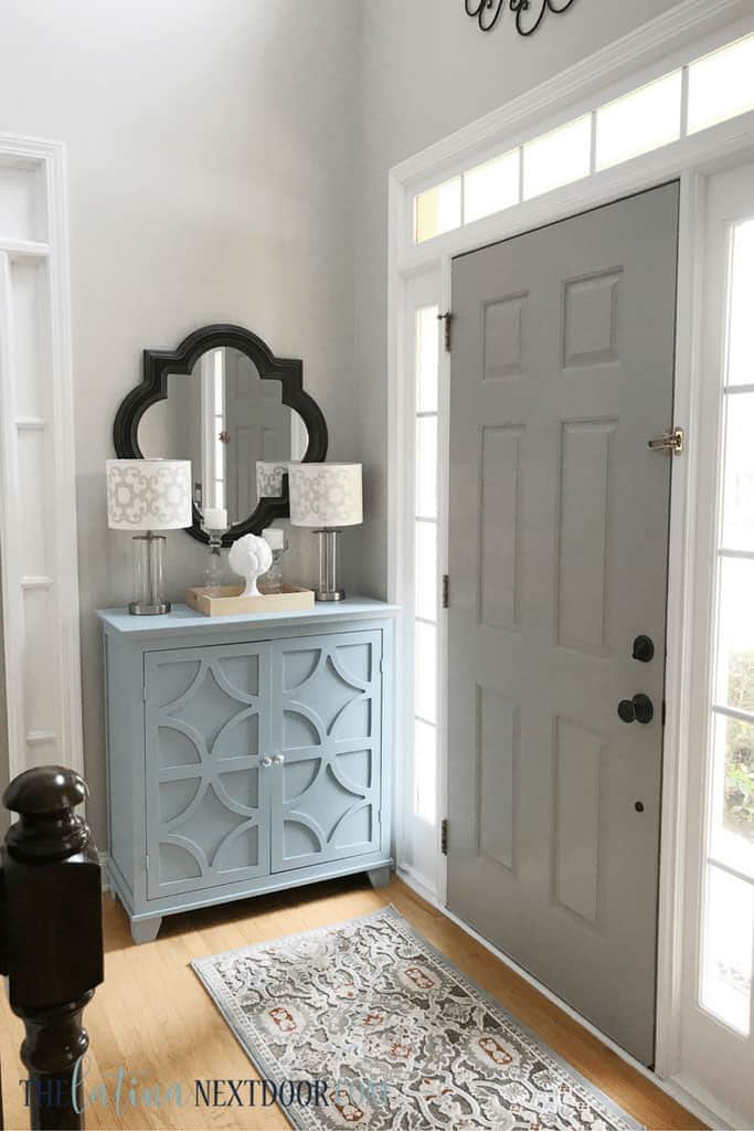
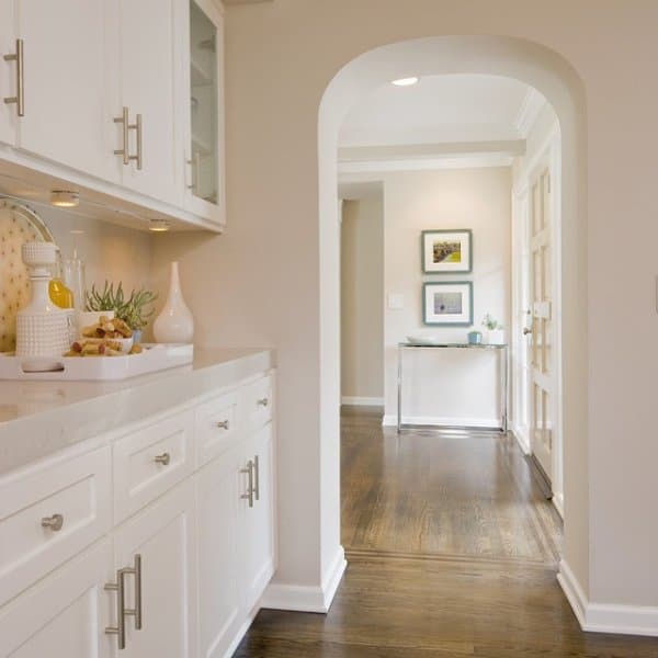
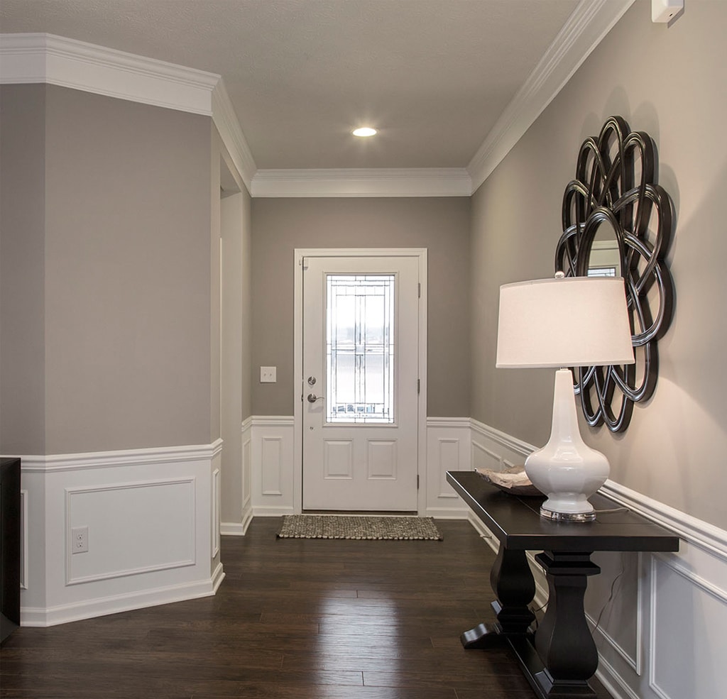
SHERWIN WILLIAMS LIGHT FRENCH GRAY
For the best grays, I am starting with Light French Gray for a few reasons. It looks cooler compared to most of the grays on this list.
Light French Gray is also one of the lightest colors on the list, it is part of the SW Classic collection so we know it’s here to stay, and I have used it in my home. This color looks as good on the walls as it does on the paint chip.
While we can only say a color is cool or warm in comparison to another color, it is cooler than every color on this list than Passive gray.
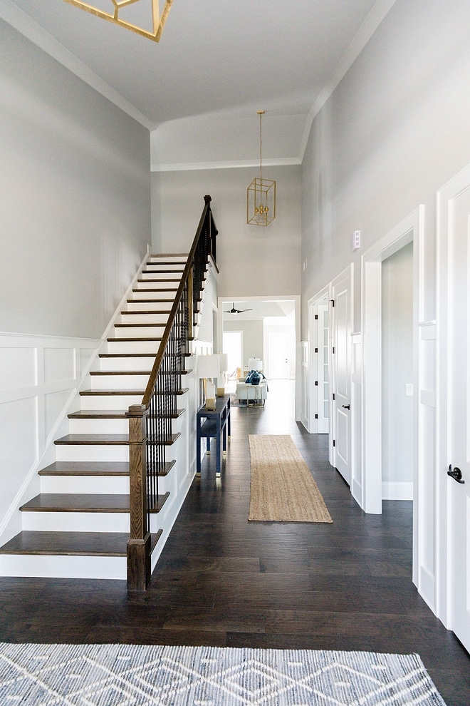
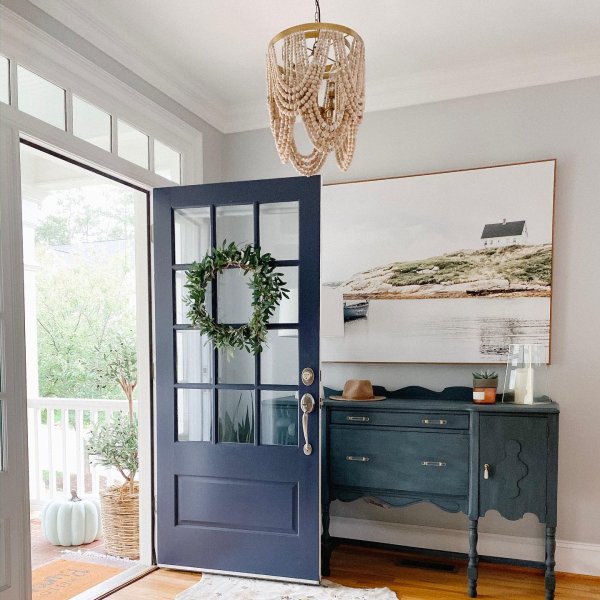
Why Light French Gray works. Here in this entryway, you have great natural light (Likely a southern facing room). It’s paired with a crisp white trim color and dark walnut floors. The flooring, brass light fixtures, and woven runner warm up the space so that it isn’t too cold.
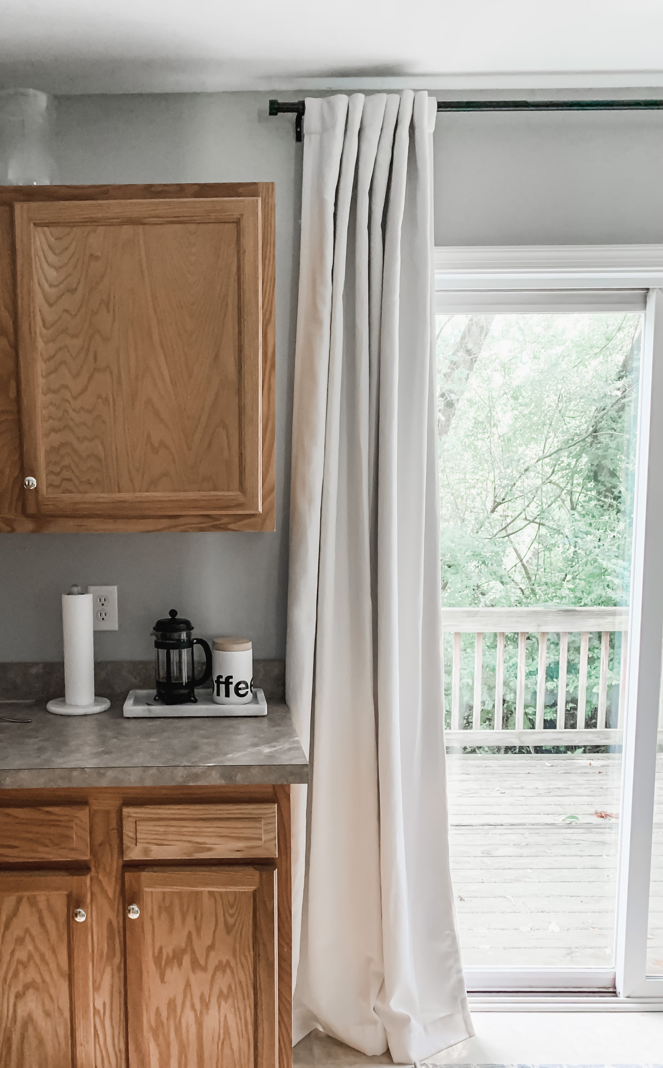
In the two photos below, Sherwin Williams Light French Gray is painted on the walls with white trim in my kitchen. The room is on the back of the southern facing home, so it receives northern exposure light. This means it is less direct light and often means shadows and darker rooms.
In this space, it tones down the orange oak cabinets and handles the shadows well, keeping a consistently cool color. It pairs well with blues and linen color and natural wood tones to keep it from being a cold space.
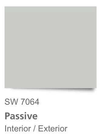
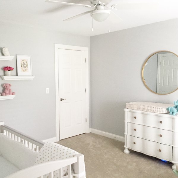
SHERWIN WILLIAMS PASSIVE GRAY
Sherwin Williams Passive is a slightly cool gray paint that works as a neutral backdrop wall color in southern exposure rooms.
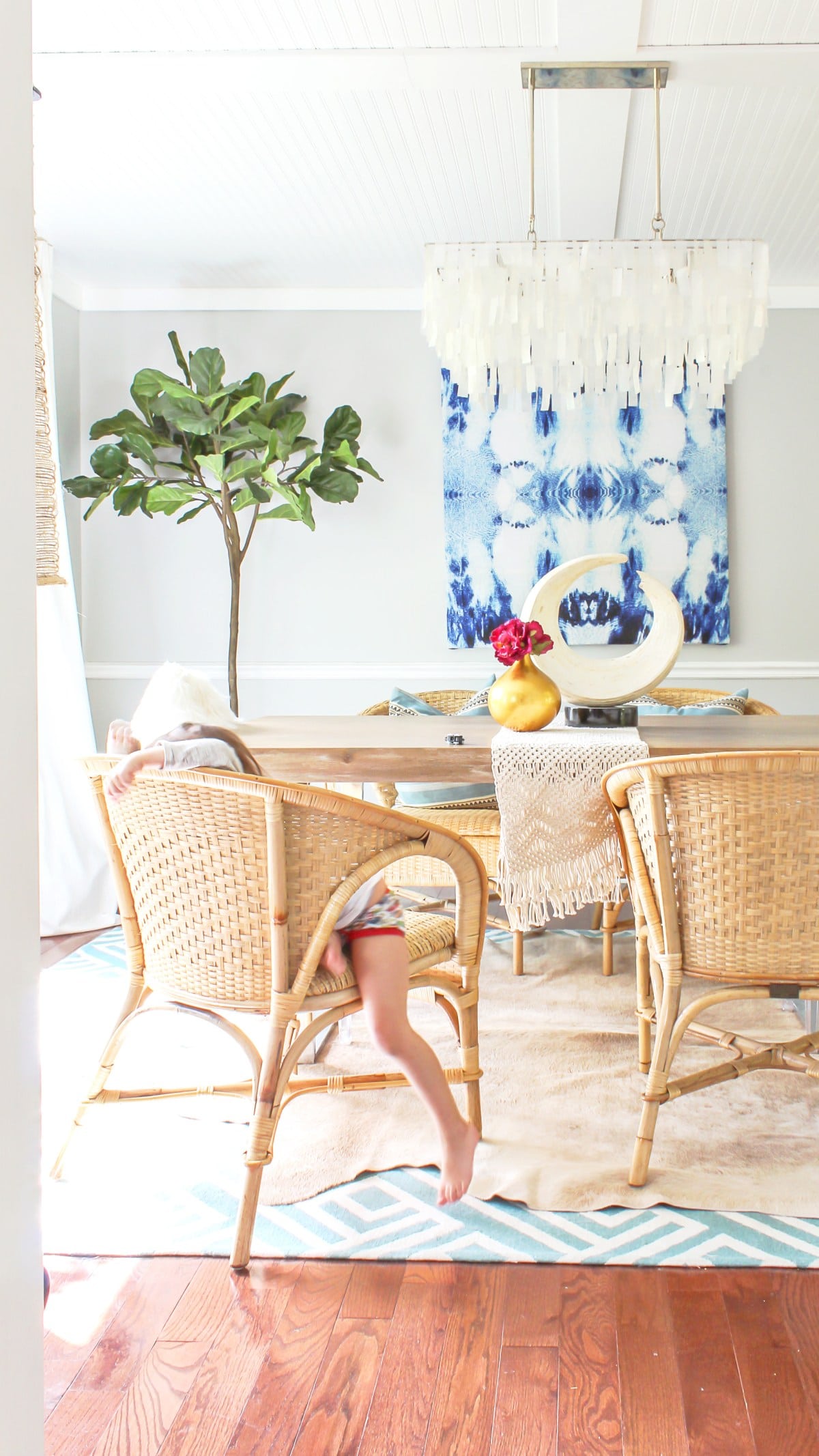
Here Sherwin Williams Passive gray paint goes well with Navy and white. It also is a great choice for orange oak floors.
Below is another example of Passive gray paint warmed up with natural rattan furniture and a hide rug.
Lastly, Passive Gray paint in the nursery below, it looks complementary with the white trim and furniture, but it clashes with the carpet. The carpet is a warmer beige and looks “dirtier” compared to the cool wall color.
A warmer gray or warm white would be a better choice in this room.
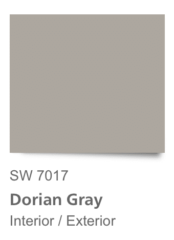
SHERWIN WILLIAMS DORIAN GRAY
I’ve included Dorian Gray in the list because if you are going to paint the trim white, you should can get away with Dorian gray on the walls.
It’s a medium toned gray paint that is warmer and lighter than Dovetail, but cooler and darker than Modern Gray.
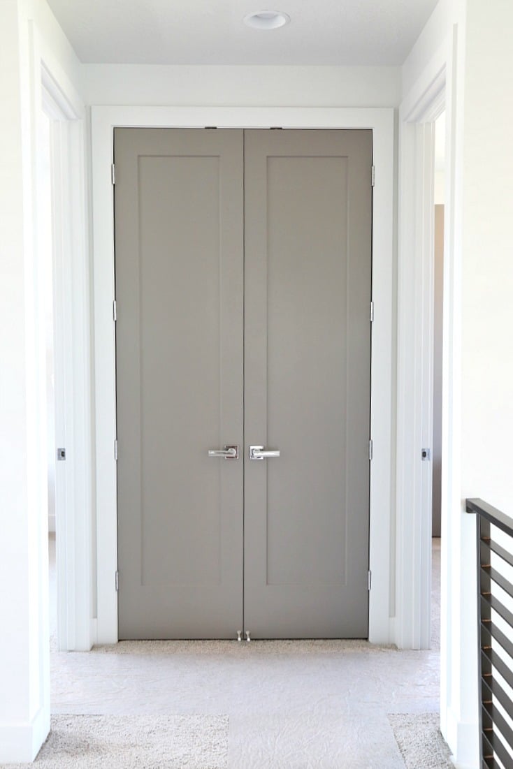
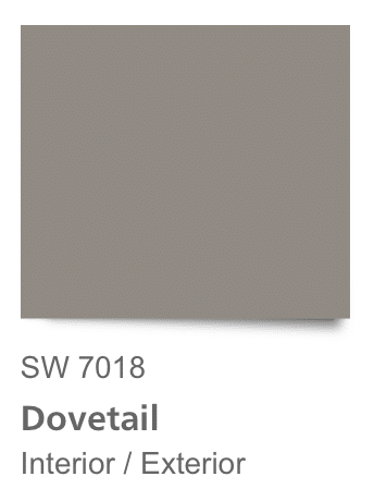
 SHERWIN WILLIAMS DOVETAIL
 SHERWIN WILLIAMS DOVETAIL
Dovetail on its own looks warmly gray, Once it’s on the wall, there is a taupe undertone. If you have a very open room, with great natural light it’s going to work fine. But if you have little light, use this color carefully or it will be very dark.
Below, it makes a great accent on doors and looks slightly warm, but not too muddy next to crisp white trim.
SHERWIN WILLIAMS REPOSE GRAY
There’s no doubt that Repose is cold as ice or warm as wheat. What do I mean by that? In a well lit, overexposed room, its going to look like a very light cool gray paint.
However, if you have low light, or light that casts shadows in the room, it’s going to have a pink beige, warm undertone.
So pay close attention to those fixed elements in the room like floors, fireplaces and wood trim so that you don’t pair the wrong gray with those undertones.

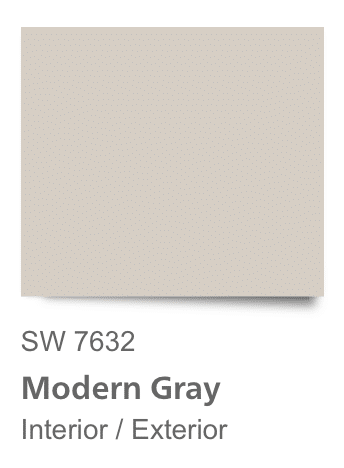
SHERWIN WILLIAMS MODERN GRAY
Modern Gray has a nice warm taupe base. While it is slightly off white, you won’t be disappointed if you’re looking for a white paint color to wash the walls without it feeling sterile.
Beware of the pink beige undertone. Make sure that your fixed elements will coordinate well with this.
Walnut and very light toned oak floors will be the winner here. Everything else should be washed with a crisp white.
However, if you paint it next to warm orange oak floors, it will look like a cool gray, and out of place.
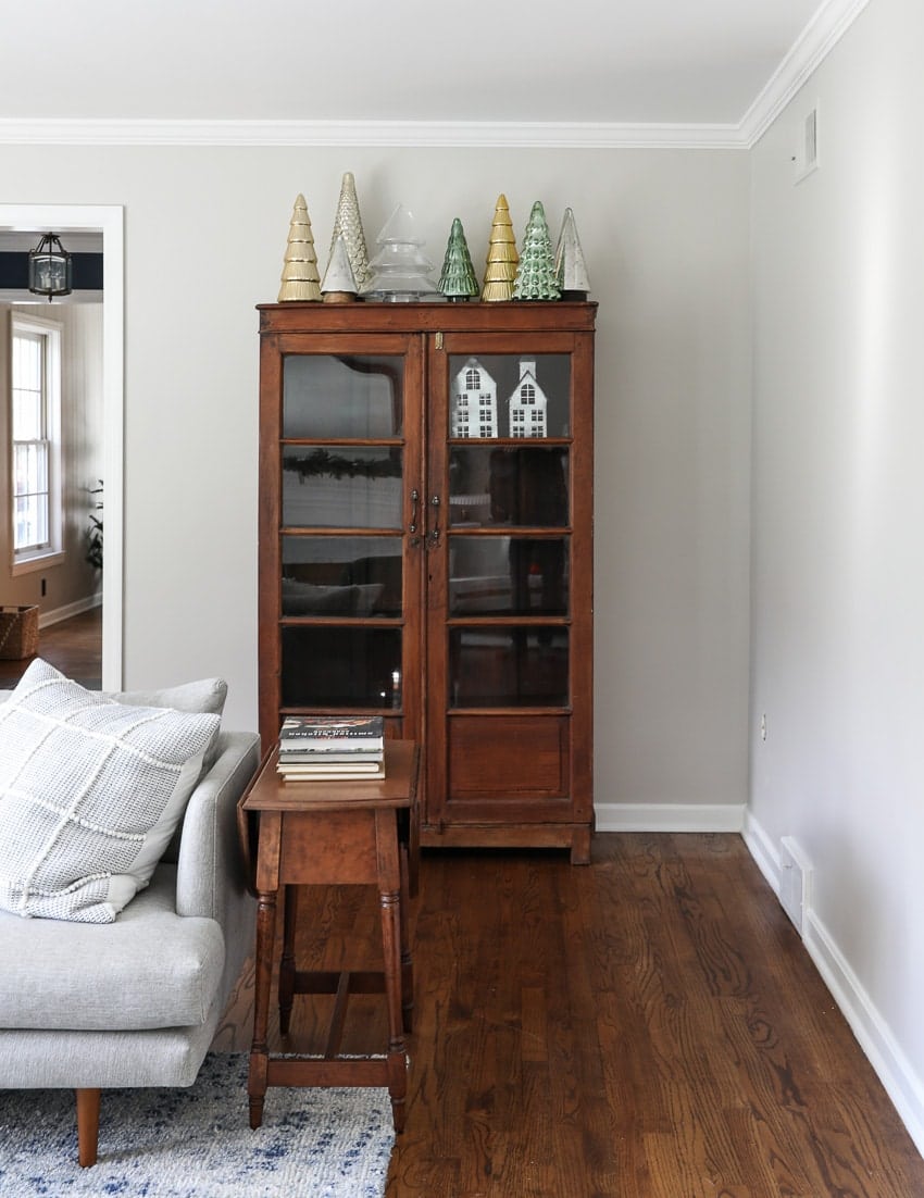
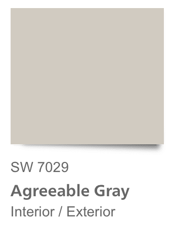
SHERWIN WILLIAMS AGREEABLE GRAY
You have probably heard the name Agreeable Gray by now. It is very trendy and a popular Sherwin Williams gray paint. I will show you a few rooms as examples for this light gray.
Compared to white trim, it still looks fresh and clean. When you pair it with warm toned flooring, it will look cooler than the brown elements.
It’s close in form to Accessible Beige without being as orange warm. And if I had to choose a flooring, I would pair it with wood floors and a very large woven rug to bring out the warmth in the color and keep it from leaning too cold.
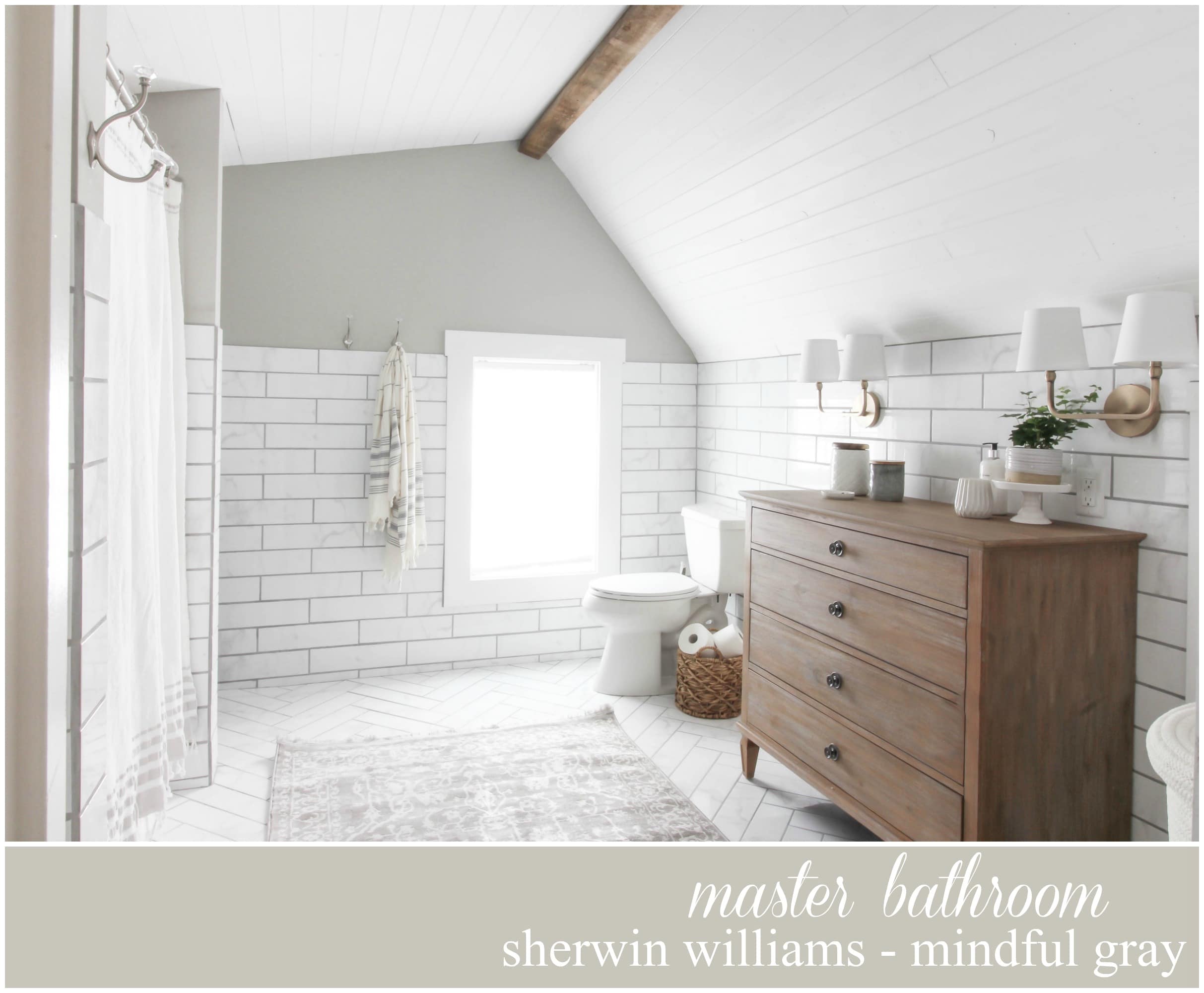
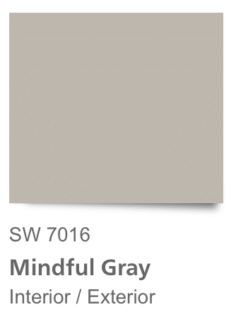
SHERWIN WILLIAMS MINDFUL GRAY
Sherwin Williams Mindful Gray is slightly warm. It doesn’t have a strong yellow undertone, you could say it has the slightest taupe undertone. It looks beautiful on cabinetry.
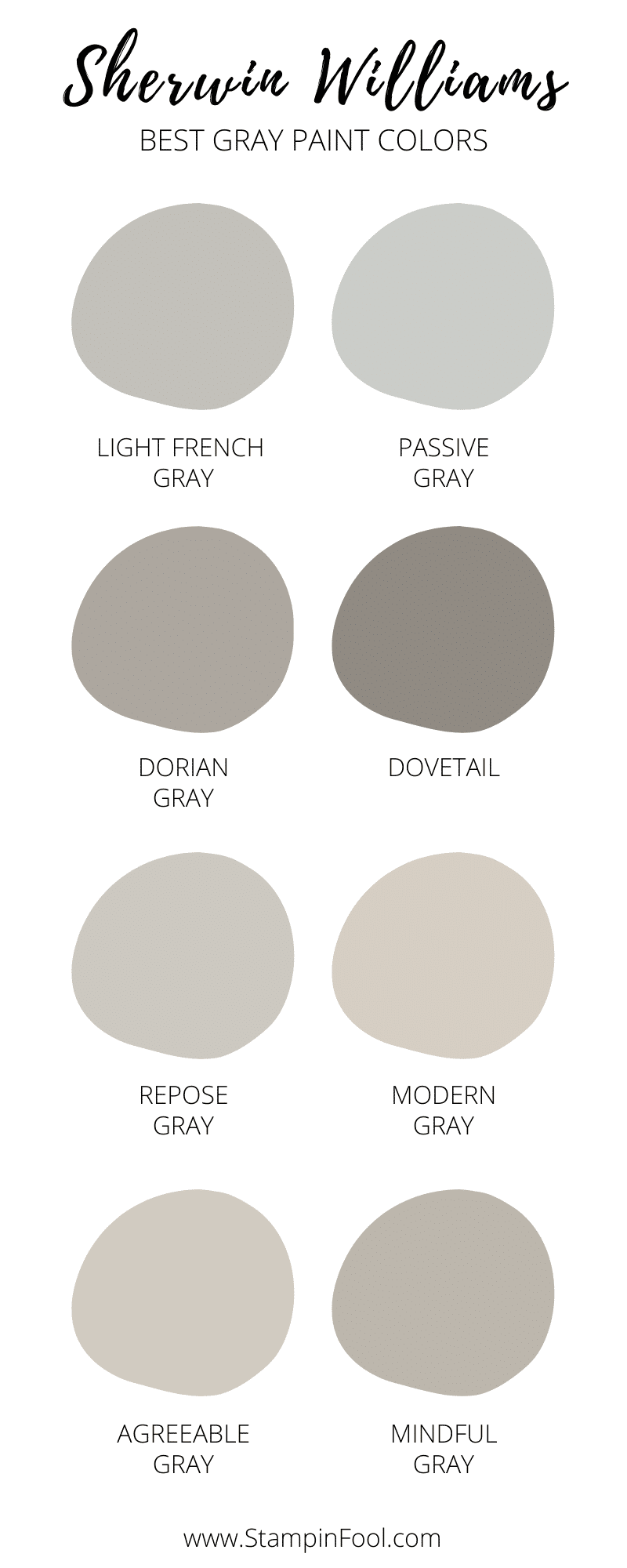
CONCLUSION oN BEST GRAY PAINT COLORS
That’s the roundup for the top 8 Sherwin Williams gray paint colors. While personal preference will play a role, the photos above have demonstrated how to avoid a gray that will look too clean or dirty and too warm or cold compared to your furniture and fixtures.
You can also warm up an all gray space by using woven rugs and chairs, brass fixtures, and warm flooring. Dark blue accessories also play well with gray paint.
- Light French Gray
- Passive Gray
- Dorian Gray
- Dovetail
- Repose Gray
- Modern Gray
- Agreeable Gray
- Mindful Gray
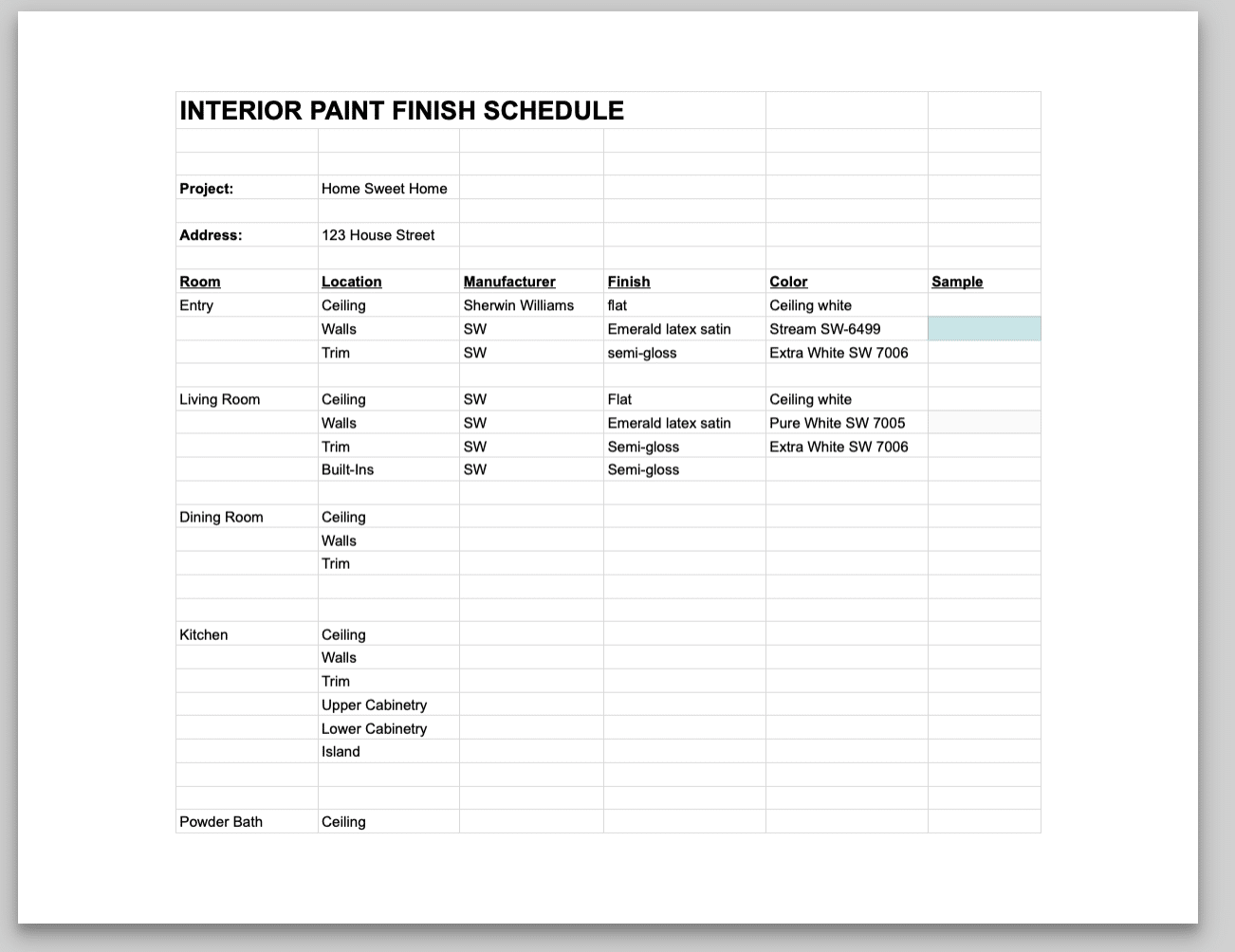
Interior Paint Finish Schedule FREEBIE
Lastly, I have created an interior paint finish schedule to help you plan your whole home painting. It is in a Google doc format. To download, click the link below, select “File” and then “Make a Copy” for your printable copy.
Use the paint finish schedule to track which colors you will use in each room for the ceiling, walls, trim and cabinetry.
DOWNLOAD THE FREE INTERIOR PAINT FINISH SCHEDULE HERE
White Paint FAQ’s
How do I pick from my favorites?
Two words. Sample Boards. The best way to figure out what your favorite paint color is will be to paint a huge poster board and hang it on the wall. Monitor it in different light until you find your favorite.
What sheen should I use?
Semi gloss & high gloss is great for trim and built-ins. Painting the baseboards and cabinetry the same sheen will give the room a high style look.
Ceilings should be painted flat.
For walls you can opt for a premium flat if you don’t want any sheen or a satin for a scrubbable- high durability wall paint.
Cabinets- Satin or high gloss depending on the room.
What white paint looks good with wood trim?
Assuming the wood trim isn’t gray, you’ll want to choose a slightly cool white paint so that it doesn’t look “dirty” next to the warm trim baseboards (aka a dated orange trim next to a warm white will look dated, not crisp).
Small room with not a lot of natural light, which White should I use?
None! In all seriousness, if your goal is to make the room feel larger, a bright white isn’t going to add square footage. So embrace the intimacy of a small unlit room by adding 4-6 light sources- table, floor and sconces, and paint it a saturated color. Don’t forget to paint the ceiling the same color for an enveloped feel.
This technique works great for offices, a library, den, study, bathrooms, and small bedrooms.
Need help finding the perfect selections for your home, become a client. Online or in person.
Hi Taylor, The alternative to a cool blue undertone in a gray paint is a warmer brown or green which puts you into taupe. You could try SW Touch of Grey, Dovetail, Vessel, Sedate Gray. Good luck!
Hey there! I’m looking for some guidance on finding a true light grey for the majority of rooms in our house. We have a lot of natural light with dark hard wood floors and white trim throughout.
I’m looking for a true light grey for our house that has a lot of natural light for the most part. I’m not a fan of the blue tints in greys.
I’m digging warmer colors right now. Because you don’t have any glaring undertones in the space already make sure you test out samples so that cooler grays don’t look too blue. You may want to move down the paint chip a color or two once you find the right gray strip. Consult the entire paint deck – if you look at the bottom color, it usually indicates the undertone leaning of the colors on that strip.
Good luck!
We are building a west facing home and love the clean modern farmhouse look. Would love your recommendation color to paint the brick body, trim and garage door. We have already committed to black roof, black windows and SW Cyberspace front door. we can not do white paint on the body. Thank you so much.
Hi. Painting an open floor plan one gray. Black windows, white trim, walnut flooring. High vaulted wood ceiling. (No orange undertones) A black granite w/white veining floor to ceiling fireplace anchors one end, a white kitchen w/large white quartz (With blue-black veining) anchors the other side (stainless steel appliances) Southwest facing. I presume I’m looking for a cool gray w/blue undertones? Help.
Thank you! Your article is by far the most informative that I’ve read recently. My plan was to use First Star walls, snowbound trim but want to highlight the doors, staircase handrails and newels with a “gray”. (The balusters are also white) Our foyer (where the staircase and front doorstep located ) is south facing. But I have bought way too many gray samples and still can’t find the definition I’m looking for. What ideas can you throw at me? Floors do have the orange tint.
Hi Jen, Repose gray can look cooler or warmer depending on the amount and direction of natural light and the exact color of your wood cabinets and flooring. To me it tends to be a cooler gray and I don’t love it with warm elements. I prefer a more sand color or greige leaning color.
Hello. Thanks for this helpful article. Just want to ask will Repose Gray work with maple cabinets and floor. But my floor and window wood trims are white. Thank you so much.
Jen/Seattle
Hi Denise! Thanks for writing in- you’re not going to like my answers– paint the trim. Ask for forgiveness instead of ask for permission! We know the white trim will look best. You have a decision to make here– can you live with the gray and orange together? Personally, I can’t when it comes to floors. I don’t like those warm oranges with gray- there just isn’t a way to make it work. Now you can do a few things:
paint the trim white (but you still have the issue of the floors), choose a warmer paint that is more taupe or green base than blue gray based.
Look at the chocolate brown and green paint chips and move your way up the paint chip to those lighter colors. They will be taupes, but they look modern and feel better with orange floors.
Now if the orange toned floor against the gray doesn’t bother you, go for it. But the darker you go the better it’s going to be as you get into those rich complex colors instead of cool grays.
Good Luck!
Sorry! It can be frustrating to paint it all then not have things work out. With those warmer tones, I wouldn’t do grey. Unfortunately, unless you find a warm gray – maybe something moody with green undertones, it’s going to look cold against muddy.
Also, don’t feel like you have to make one color work everywhere. It may be a good idea to find a few colors that coordinate with each space best and go with that.
Grab a paint deck and start in the green and brown bottomed section, them move up the chips to something more warm gray toned. You may end up at a taupe. Which isn’t a bad thing- think of it as a moody green gray rather than the traditional 1990’s taupe. Also those colors that are indistinguishable as to whether they are gray or brown or green are more complex and will always look more sophisticated than a pure color that’s easily identified.
I know this is kind of vague advice, but each space is different, so start here and start painting those sample boards.
I’m really at a loss… Our floors are hardwood with an orange undertone all the trim around our windows are also wood with an orange undertone… I love how the gray looks with white trim around the windows but my husband won’t let me paint the wood. I’m trying to paint a spare bedroom but it does have three windows in it so it gets lots of light. What’s the best color gray to go against dark trim around the windows? Thank you Denise Saint Pete Florida
I am at a loss with my paint. I paired my kitchen and family room Colonnade Grey .. my cabinets and floors are a maple color (orange undertone) the paint looks blue and I hate it! My living room has a carpet that has a checkered print of black and beige and none of this is flowing! It’s eating at my soul! Lol!! I was trying to find a neutral that I could do most of the house that has a little bit of beige and a little bit of grey. Do u have any suggestions? Thanks!!
Peel and stick work too! If you have warm wood tones, try warm grays first- they are easy to find if you grab a paint deck and look for brown and beige near the bottom.
Thank you so much for this article. It made sense to me. Now instead of looking for one gray for my entire house, and getting upset when it doesn’t work, I am going to try all of the different grays you recommended in each of the rooms. I feel so relieved, lol. Question, regarding your suggestion to paint a poster board with each of the colors – would the peel and stick paint samples work as well?
Thank you again for this information. It helped me tremendously.
Lisa/Florida