Interior Design Crimes: Mosaic Pencil Tile Backsplash
Mosaic pencil tile backsplashes are the next offense on my design crimes list and I’m going to explain why. This relatively new series on my blog, Design Crimes, is to help you avoid costly mistakes in your own home design plans.
It is my hope that I don’t offend your style or taste, but educate you on why something isn’t a choice with longevity. I want your new spaces to be timeless and unique, but not at the cost of bad design!
You have to start somewhere. Whether that somewhere is moving into a home with a kitchen that was updated in th
e 2000’s or you are googling “mosaic pencil tile” as you plan your kitchen, I want your money to be a wise investment.
But wait, I thought mosaic pencil tile was expensive and “in”. Unfortunately, it seriously dates a home.
WHY I HATE MOSAIC PENCIL TILE Backsplashes
Aside from a pencil tile backsplash screaming 2001, which as of now is almost 20 years ago, it has a few other problems. Let’s get into those and what they mean.
- Color variation is busy
- Often paired with busy granite counters
- Thin tile makes it look like a small space
- Tiles aren’t consistent size and shape
COLOR VARIATION
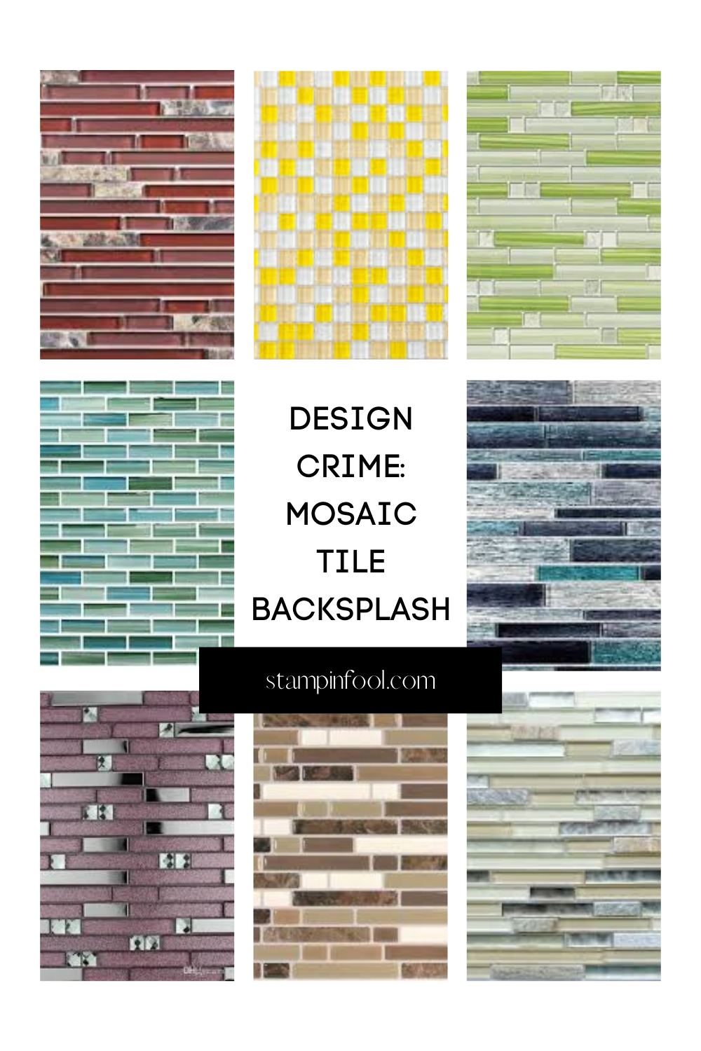
The first issue with these mosaic pencil tiles is that most of the time 12″ x 12″ sheet has numerous colors of individual tiles. This creates a problem because you now have many colors and undertones for which your other Kitchen colors have to coordinate with.
And more colors means more for the eye to bounce around at, which is busy. Pair a busy tile backsplash next to a cabinet color and a granite counter that also has 5 different flecks of colors and you have massive space that visually has so many colors in small little bits. It’s overwhelming.
Your eyes don’t get a break. They bounce around from tile to tile and you can’t tell where the tile ends and the counter starts.
 THE GRANITE COUNTER
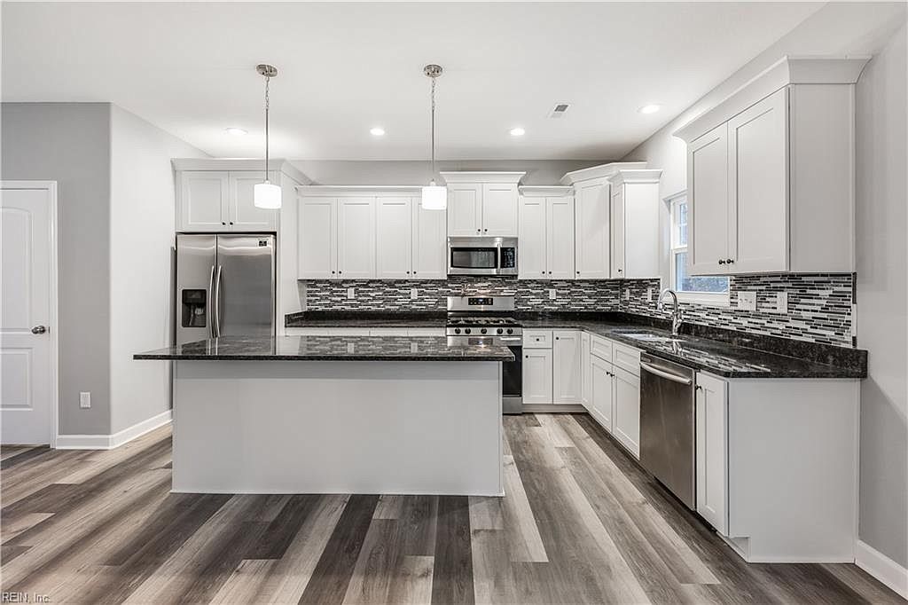
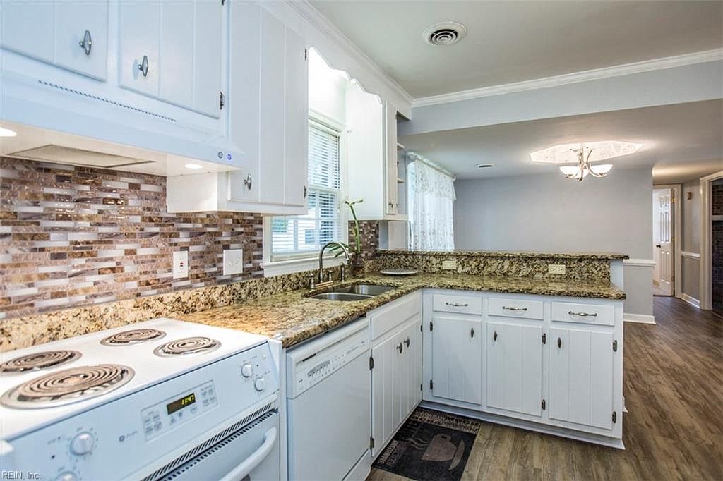
The photo above illustrates both the busyness of the tile and the problem granite proves. Like in this kitchen, often times the granite color is different than the tile colors.
They clash terribly because the tile colors are limited and you think beige and beige match. In reality there are so many subtle color changes that don’t coordinate in the least. The brown tiles have a red undertone and the counter has a green beige undertone.
A note on granite counters
Granite is a very busy stone. It has many layers and color changes. Also, there are a lot of different flecks of color (the same goes for Corian). When you combine this with the busy backsplash it’s visual overload. All the little tiles and all of the little specks of color and your eyes can’t take it all in, they bounce around. It’s not peaceful.
SMALL TILE
Here’s the WHY about mosaic tile backsplashes. Because the tiles are little, there are a lot of them. When you look at the tiles, there are hundreds, thousands even. A lot of small little tiles in different colors make for a very busy backdrop.
It’s not large tiles in a neutral or a bold pattern, it’s many small, similarly colored tiles. There’s no way to make the small tiles look like one piece or “together”. So skip the small tiles and go with a classic with a twist.
 INCONSISTENT SIZE
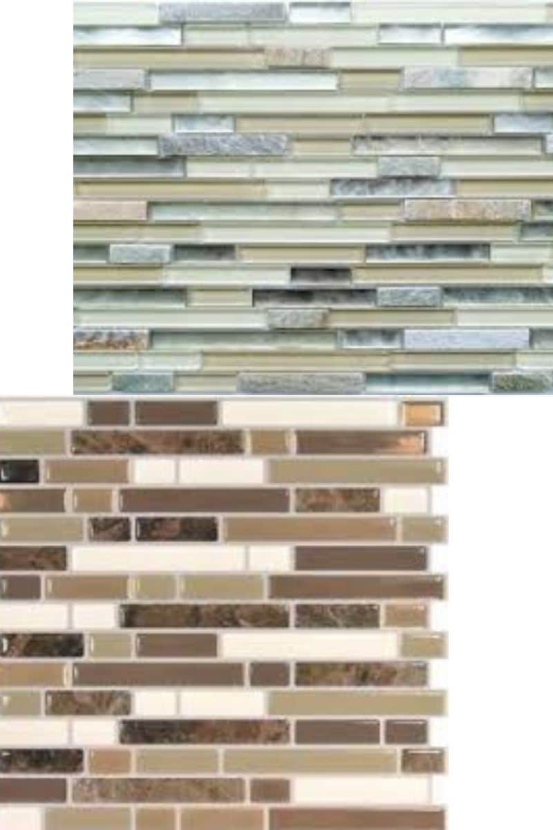
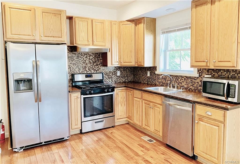
Another problematic thing with mosaic pencil tiles as a backsplash or shower, is that they are mass produced and often the quality isn’t 100%. This means that the tiles may be slightly smaller or larger on a mesh backing, or even not quite straight. Then, when they are installed and grouted, you can see the change in size and the gaps.
It becomes especially obvious when they aren’t perfectly level or evenly spaced. It doesn’t seem like a huge deal, but after spending thousands of dollars for tile work, you can’t unsee the imperfections once they are there.
INVESTMENT = MONEY
Likewise, having tile work done is expensive. Yes, you can DIY, but this isn’t an area you want to mess up. When you decide to make the investment to have a backsplash installed, make sure you choose a tile that will stand the test of time.
I will make suggestions towards the end of this post!
TRENDY TILE PATTERN
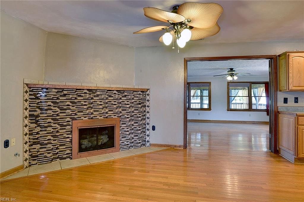
Lastly, pencil mosaic tile backsplashes were a trend of the past. In the early 2000’s they became the high end remodel thing to do. It then trickled down to DIY.
Now, if you have it in your kitchen or bath, it instantly dates the space. Today, we prefer subway, square fireclay, hand painted cement tiles or something of the like.
Also, color trends tend to change. And as with past color trends the tans, baby blues and beige backgrounds are out and clean white or bold blues are back in style.
CONCLUSION: AVOID MOSAIC PENCIL TILE BACKSPLASHES
In conclusion, mosaic tiles are out and should be avoided as a matter of cost and trends. While you can make the argument that you should “do what you love”, my job as a designer is to look forward and guide you to things that will have a lasting impact.
I want your money to be well spent, a good return on investment.
So, if you are shopping for a tile backsplash, keep reading and I’ll make some solid suggestions. But first, how to live with it.
HOW TO LIVE WITH PENCIL TILE
Have you already made the mistake of newly installing a mosaic tile backsplash? Or did you buy a home that has it presently and aren’t in a position to update it right now.
We want to downplay the tile. There are a number of things you can do to distract from it.
- Paint the tile. Yes! you can paint tile. And this would be a great way to cover it up until you can afford to retile. This is best advice for purchased home (where you didn’t just pay to have it installed). Use TSP to clean, prime the tile and paint over it with a solid color. Seal with polycrylic & enjoy.
- Replace the counter with quartz, butcher block or a non-granite. We talked about how busy granite is, so if you have granite countertops, it’s adding to the problem of too many colors and too many small things to look at. Swapping granite out for quartz or butcher block will eliminate a source of visual busyness.
- Clear your countertops. This may seem unrelated, but keeping the counters clear of appliances and tchotchkes will at least make it look minimal. While you will see the tile, you won’t be on total clutter overload.
- Create a new focal point. Now is a great time to make other things the star of the show. If you can’t compete, give them something to look at. New oversized pendant lights, neutral cabinets (white or black), flooring that doesn’t have a lot of pattern, a beautiful rug- all of these things can help draw the eye away from the busy backsplash and give you something else to look at.
WHAT TO USE INSTEAD OF MOSAIC PENCIL TILE Backsplashes
Now that we know the why behind not using mosaic tiles for a backsplash, I want to give you some other options.
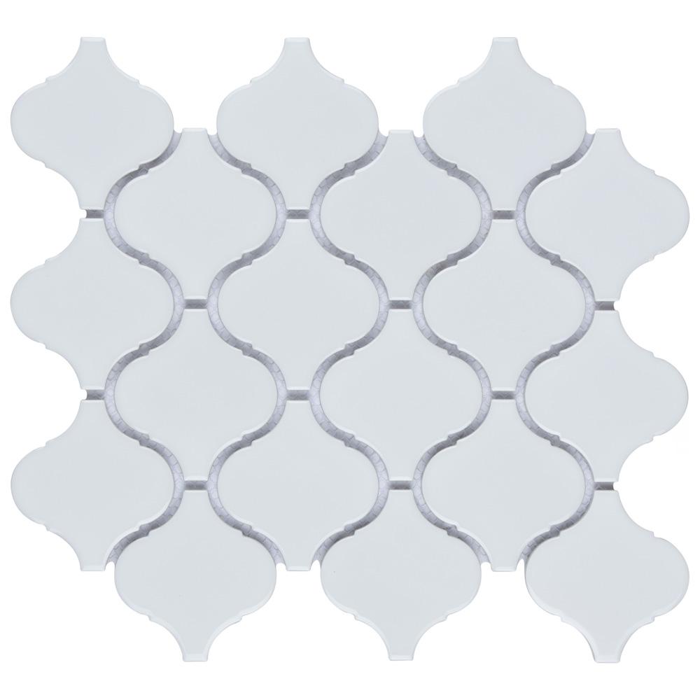
CLASSIC WHITE LANTERN
This classic take on a patterned tile works because it is still a solid color, but the pattern in interesting and large enough to not look busy. Pair it with a subtle grout as to not be overwhelming.
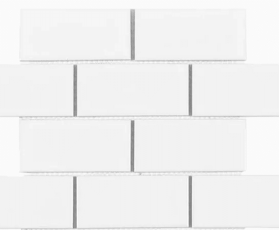
SUBWAY TILE
Subway tile is always a win. It’s been used for years, but is the updated counter part to the square tile backsplash. If you plan to change your kitchen with the trends, every 5-7 years, go for a bold colorful tile that matches your personality.
Lay it in an Interesting Pattern
Another way to up your tile game with subway tile is to lay it in a different orientation such as herringbone, stacked or crosshatch.
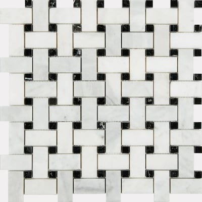
BASKETWEAVE
The sophisticated cousin to the mosaic tile. While I love a basketweave tile on flooring, it can set a really classy tone for your kitchen as well.
When added to the backsplash with marble counters and light ash wood tone or solid white or black cabinets, it really shines. Make sure you have a neutral wood floor if you choose this small patterned tile.
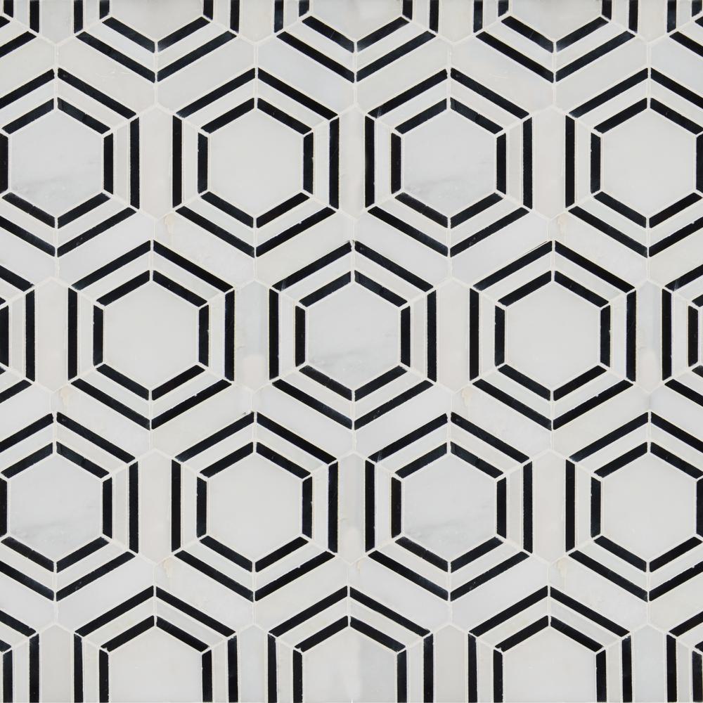
HEXAGON HIVE
Lately, we are all about hexagons. It mimics the shape of a honeycomb and can add a wow factor without overdoing it. Aim for a large 4″ – 6″ tile so that there aren’t too many little hexagons making a buzz.
CONCLUSION
Kitchen trends are fast changing, but one thing is for sure. Mosaic tiles are out for backsplashes and subway tile is always in. We want to make wise investments of our time and money.
So choose a tile that will stand the test of time. Make sure your tile coordinates with your countertop color and that it isn’t too busy, especially if it’s paired with granite.
Happy tiling!
Posts You’ll Love
Design Crimes: Gray Wood Floors
The Best Sherwin Williams White Paint Colors
Help! Design a Kitchen Around Oak Cabinets

 THE GRANITE COUNTER
 INCONSISTENT SIZE
I constantly say, not my circus, not my monkeys! Pencil tile just dates the space so much and it’s sooo busy. Granite is busy enough without it. Honestly, I love pattern and color, so I’d rather someone remodeling to choose a tile that has texture or pattern or even a solid color that’s interesting. But it’s hard to balance it against granite, so if they don’t have an eye for it- sticking to subway is the best novice advice I can give.
I am a fan of carrying the countertop up to full backsplash rather than a 2″ or 4″ lip.
Thank you! My husband is a builder and I do all the office work and design and he kept trying to get me to do quoins (gag) and mosaic backsplashes. I cannot Stand the mosaic pencil backsplashes for all the reasons you listed. I was beginning to think I was the only one!
I have to say I’m not a fan of the subway, either, though. Backsplashes in general if I’m fully disclosing. It’s one of my tougher choices to make. We use granite in our houses and I want the granite to stand out as it’s one of the bigger investments. If it’s overshadowed by the backsplash there’s little point to getting a level 2 or 3 granite. We had one customer insist on light grey subway tile Mapei Brick Red grout to “match” his very fancy Paradiso Bash granite . I about cried. However, we have a mantra, “not my house.” What mattered in the end was that He was happy, even if I couldn’t look at it. :D
I am old enough to remember when absolutely no one wanted to create a new kitchen with subway tile because it was considered a stodgy relic of the past. When I first purchased my home in 1990, there was a box of ogee tile in my garage which had been all the rage in the 1970s along with Moroccan themes and painted cabinetry. It went out of style completely and now, it’s back along with polished brass fixtures now found in high end showrooms which the design world claimed were a fad of the 1980s never to return again.
I do understand designers having issues with styles going out of fashion and needed to seem forward thinking, but it is a bit over the top to suggest to someone that they paint $30+/sq. ft. glass pencil mosaic tile to “keep in fashion.” There are literally tons of small upgrades that can be done to a kitchen to keep it looking fresh and up to date without cheapening the look of a backsplash by painting it. And, given that many tile showrooms are still showing pencil mosaics, I would suggest that designers figure out ways to utilize what some people may find attractive in creative ways. I have far more respect for a designer who is clever and creative than one who is trying to sell me on blue cabinets (a major investment) which will be totally out of fashion in less than five years and painted pencil tile which will look both tacky and tasteless especially when a cooking stain requires a bit of scrubbing and the paint begins to flake off even sealed with polycrylic.
I’m with Coco Chanel who famously said fashion comes and goes, but style is forever. There are pencil mosaic tile backsplashes that even 20 years after the style first appeared are stunning and classy looking And then there are those that were tasteless when first installed and which can now be used to illustrate so broadly that every type of pencil mosaic is a “crime” and will instantly turn a home into an out of date relic. This is silly.
Thank you!