
12 Best Sherwin Williams White Paint Colors in 2023
Looking for the perfect Sherwin Williams white paint color of 2023 for your home? I’ve got the details on each famous white paint and how to choose the right color.
Choosing the best white paint color for your space can be challenging. That’s why we’ve created this guide to choosing the best Sherwin Williams white paint color to help you navigate the cools, warms and go-to paints to find the perfect fit.
Often times I get asked, “What is the best white paint color for my house?” And the short answer is, it depends on many factors including the direction the room faces, natural light, how and when you use the room, and what the other elements of the room are.
If you’re looking for the best Benjamin Moore white paint colors, read this post.
But, we’re going to address all of that and leave you with a list of great Sherwin Williams white paint colors to try out in your space. And it will be based on whether you like cool or warm colors and which undertones best work with what element’s you already have.
UNDERTONES
Firstly, undertones will play a huge role in this. So what is an undertone?
Mass tone vs. undertone. Whenever a color is made by mixing two or more colors together, that color will have both a mass tone and an undertone. The mass tone is what you see first; it’s what tells you the color is red, blue, green and so forth. The closer the undertone is to the mass tone, the truer the color will appear. So a true red will have a mass tone and undertone that are very similar, but magenta will have a blue undertone, while poppy will have an orange undertone.
– via Sherwin-Williams.com
UNDERTONES & COMPARISON
We use undertones to talk about color in comparison to other colors. Either it is cooler/warmer than or cleaner/muddier then the item of comparison. And it will lean towards the undertone color.
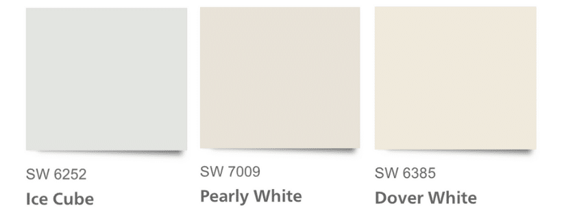
Let me give you an example of the undertones and three white paints in comparison to one another.
- SW Ice Cube is cooler (blue undertone) and cleaner (purer/closer to mass tone of white) than SW Pearly White (see above).
- In comparison, SW Pearly White is warmer than Ice Cube and has pink/peachy undertone.
- Whereas SW Dover White has a warm, creamy yellow undertone and is also dirtier than SW Ice Cube.
- If you were to paint Ice Cube and Pearly White walls side by side in a room (perhaps trim and wall color), the room would look off because the undertones do not mix well.
- i.e. the blue gray and pink peach undertones don’t play well together.
HOW TO IDENTIFY THE UNDERTONE
The easiest way to identify a color’s undertone is to compare it to a true white and also compare it to a primary color.
Once it is paired with a blue, red, or yellow, you will likely be able to pick out the color towards which it leans.
So, before you start painting an entire room with a color from this list, you’ll want to consider a few things about your existing elements.
This will prevent you from having a mismatched undertone problem. You should also ALWAYS paint large sample boards before committing to a color.
CHOOSING THE BEST SHERWIN WILLIAMS WHITE PAINT
Alright, I know you want to choose the best white paint for you space, but we’re going to get there slowly.
We will walk through a few things to do before buying gallons of paint and getting it right.
FIRST STEPS for CHOOSING WHITE PAINT
I want to give you a really strong foundation before you buy paint and slap it on the wall. Follow these simple steps before putting paint to the wall for the best color choice.
Who knew choosing white paint could be so involved?
- Create a room plan
- Take note of existing elements
- Assess the tones of furniture
- Consider lighting
- Narrow down the choices
- Test paint samples

ROOM PLAN
Now, you know I am a huge proponent of having an entire house design plan. It saves you money in the long run by not making purchasing choices that don’t fit the size, color scheme or style of your house.
Before you start painting, you should have an entire room plan together at least. Notate whether you will be keeping your existing furniture to starting from scratch, have a plan from top to bottom. The plan should include:
- lighting – color, style, type (ceiling, lamps, floor lamps, sconces)
- paint color and finish (you can list the general color family until you pick the exact color)
- wallpaper
- curtains/pillows/fabrics
- upholstered furniture & seating (sofas, chairs, ottomans)
- tables/nightstands
- rugs
- flooring (wood, tile, carpet)
- measurements of the space, including window and doorway size and placement
- any fixed elements in the room (built-ins, fireplace, cabinetry, stonework)
USE A FLOOR PLANNER TOOL
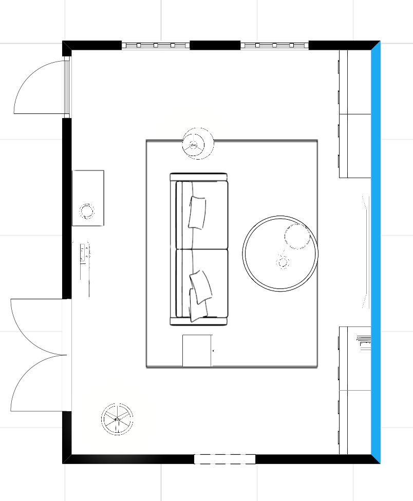
Once you have a full list of everything you think you will need, plan out the space with a floor planner tool like this one.
Tips for using the floor planner:
- Input the exact dimensions of your room and draw the walls accordingly
- I like to work on one room or open space at a time rather than the entire house in one file
- Large file sizes slow it down, so start small
- Start with the rug. Place the rug in the center of the room, leaving a natural walkway
- Add the sofa and chairs next
- Then add coffee table, side tables, accent pieces, television etc.
Next, use a program like Canva to make a mood board with pictures of elements you have already chosen.
If you haven’t bought anything, start with Pinterest and identify rooms you like. Make a list of the commonalities. Use those elements to plan to the room.
Identify EXISTING ELEMENT UNDERTONES
Once you have a room plan in place, you should note the things that you cannot change. This list should include hard elements that will not be removed from the room, that you have to work around.
Some examples are the fireplace, floors, cabinets, trim, countertops, window sashes.
For each of these things you should identify the element’s undertone. Make a list of each item and write the undertone beside it. Then jot down whether it can be changed or not.
The list should looks something like this:
- stone fireplace – green gray undertone – Yes (can be painted)
- built in cabinets – beige undertone – Yes
- wood flooring – orange undertone – No (floors will not be replaced)
- trim – beige undertone – Yes, can be painted
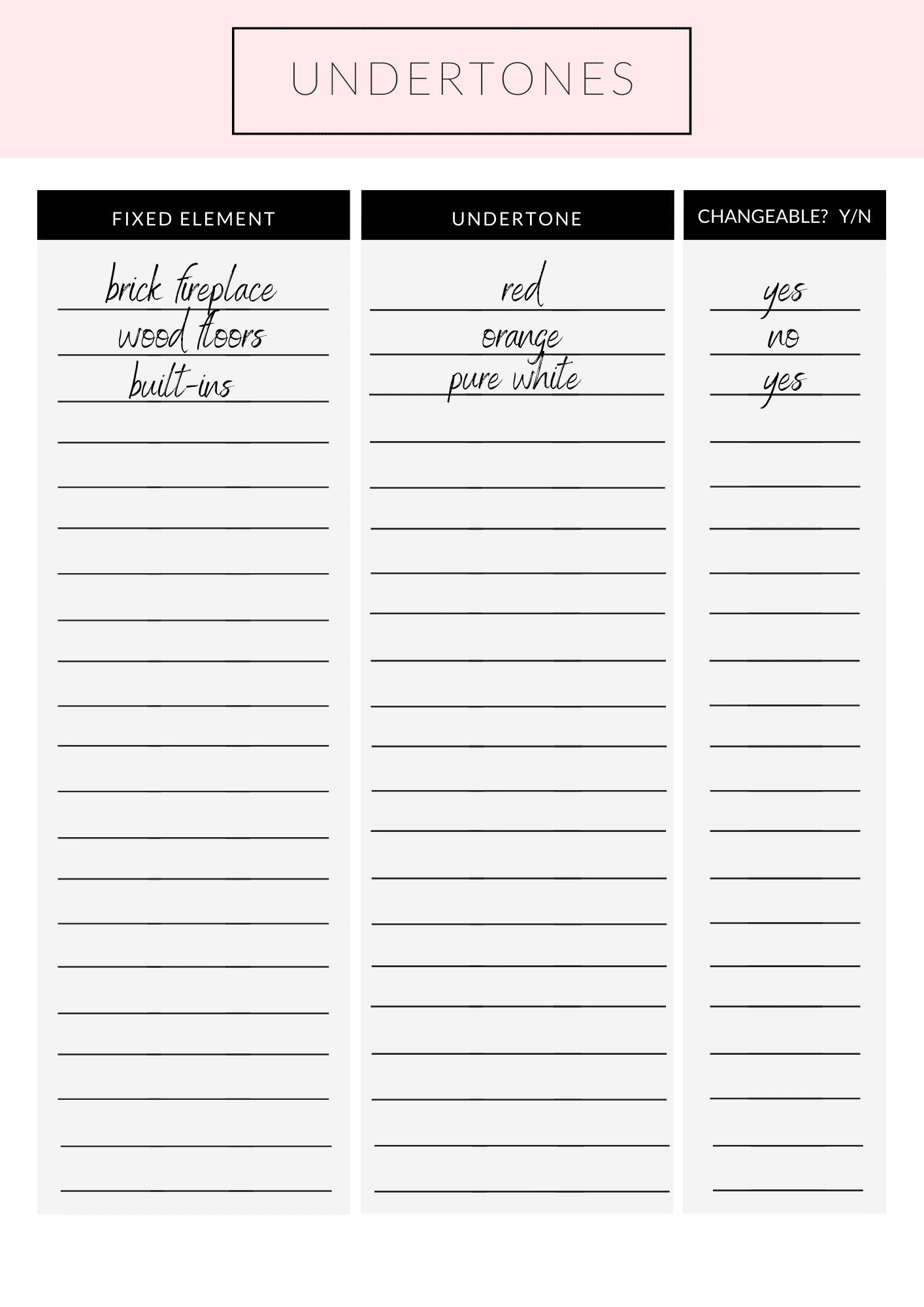
{Download your copy of the fixed undertone worksheet.}
Consider FURNITURE
Along the same lines as the fixed elements of the room, consider what furniture you already have and will be using.
Or if you have a room plan, note the furniture you will be purchasing for the room.
You can also consider things like drapery, pillows, coffee and side tables, sofas, chairs, book cases.
You’ll want to pay close attention to the fabric background color of the pieces and compare them to the paint colors you are considering. This is to make sure that they look “clean” and not muddled next to each other.
CONSIDER LIGHTING
Next on the list is to take into account the natural and added lighting. Lighting sources may include ceiling lights, chandeliers, sconces, recess lighting, floor and table lamps.
All of these things affect how we see the color of paint on the wall.
Your lights should be part of your overall plan, as well as the lightbulbs you use in them. Aim for LED temperature 2700 – 3000K for a soft, natural looking light.
Read more on this post about choosing the perfect size lighting.
As far as natural daylight goes, this will depend on the number of windows in the room and the direction the room is facing.
South facing rooms get great diffused natural light with windows. Whereas north facing exposure tends to have more shadows and less direct sunlight. The amount of natural light in a space will affect how the color looks. White paints can look gray due to shadows in a northern exposure room.
Which brings us to the next point which is the most important thing: try out LARGE paint samples. You will be able to see how the light affects the way we see the color.
NARROW IT DOWN
Now you should take a look back at the fixed element undertone list. If you have primarily warm undertones in those fixed elements, you should choose a warm white. A cool white would look cleaner and make the fixtures look “muddy” or not as crisp.
On the other hand, if the elements have cool undertones green, blue, grays, you can stick to a cool undertoned white so that the walls don’t look muted in comparison to the other elements.
What if you have both? If you have both cool and warm undertones in the fixed elements you should mask them.
Is the floor an orange undertone? Cover it with a large natural rug. And if you have a brick fireplace or built in bookcases, consider painting those the same as the trim or wall color as well.
The less variance in competing undertones the better, the colors will work together rather than making the one color stand out as wrong.
UNDERTONE RECAP
I know it sounds scary to paint a wrong color, but here’s what you should avoid mixing:
- Avoid pink undertones paired with yellow or orange. A pink undertone should be paired with green, gray or blue undertones
- Avoid orange undertones with pink. Pair orange undertones with yellow, gold, taupe or green-gray undertones
- Yellow undertone- avoid a pink undertone pairing. Pair with gold, orange, green-gray
- Green, blue and purple beige or gray undertones- work well with most neutral colors
- The big takeaway is if you have a pink undertone in a fixed element (counter, trim, floor), work carefully with the colors you choose to pair with it.
- Pink does not play well with other warm undertones.
For each room, make a short list of 2-3 whites you would like to try. Compare the swatches to the fixed elements and furniture choices to make sure the undertones complement each other and move on to ordering samples.
test PAINT SAMPLES
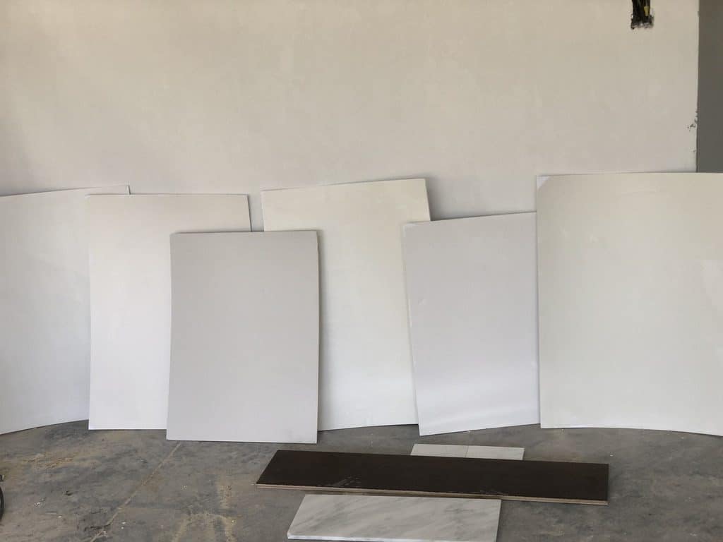
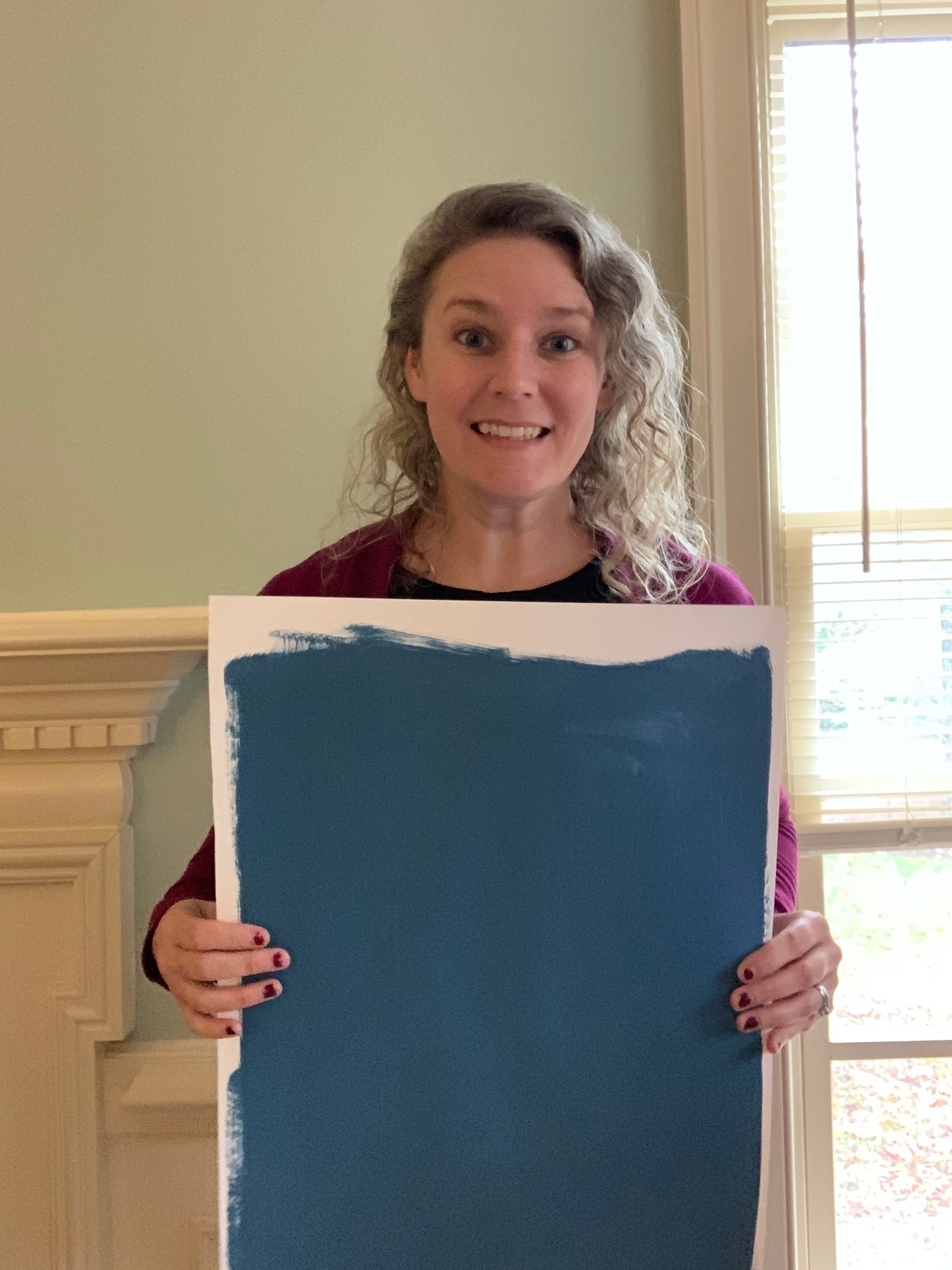
Most importantly, before deciding on a color, you paint sample boards. I want you to gather large size poster boards (12 x 12) and buy sample pots of the white paint choices you have narrowed it down to.
Paint each poster fully to the edges. Jot down the color of the paint on the back of the board. Hang them on the wall and observe them throughout the day. Place the boards in a corner or next to a door frame to see the shadows cast on the color.
Consider EVENING LIGHT
You should also move the boards around at different times of day. The lighting changes in a room and you will want to be comfortable with the color at all times.
Pay special attention to the evening, when you use lamps to light the room. Especially, if you spend a lot of time in the room in the evenings, after the sun has gone down and there isn’t natural light.
Assess whether you like the color at different times as well as with natural light and lamps. After observing the color for a day or two, you should be able to eliminate the ones you don’t love or start again if you aren’t liking any of them.
MAKE A SHORT LIST
But to avoid overwhelming yourself, only work with 2-3 colors at a time until you find the one that’s right for you. If you’re having specific trouble, read to the bottom of this post, where I’ve listed FAQ for troubleshooting the best white paint colors.
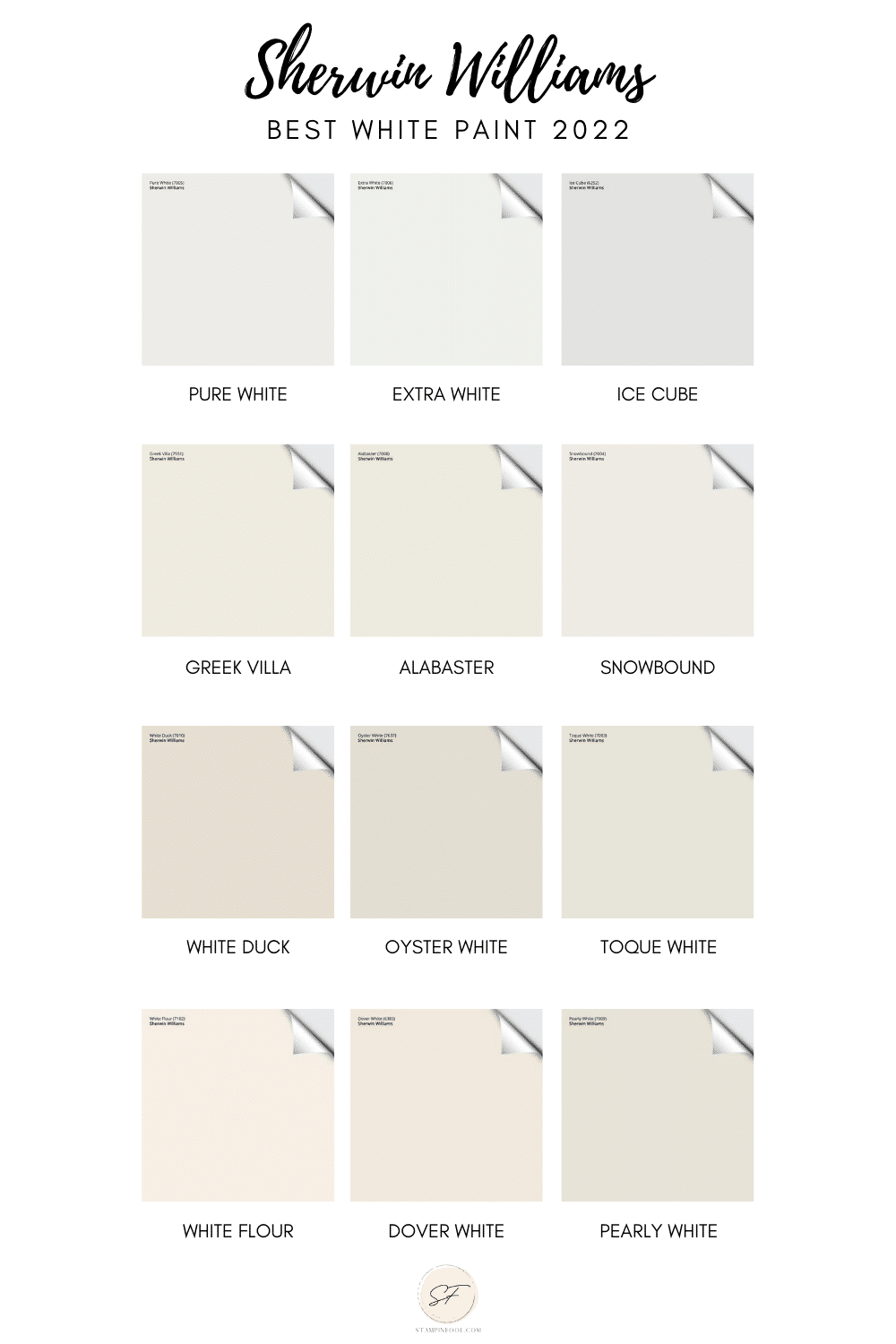
2023 GUIDE TO SHERWIN WILLIAMS WHITE PAINT
You’ve made it to the color selection process! Give yourself a pat on the back. So I want to give you 12 Sherwin Williams white paint colors to start working with. If you’re looking for the best Benjamin Moore white paint colors, read this post.
UPDATED Paint Colors 2023
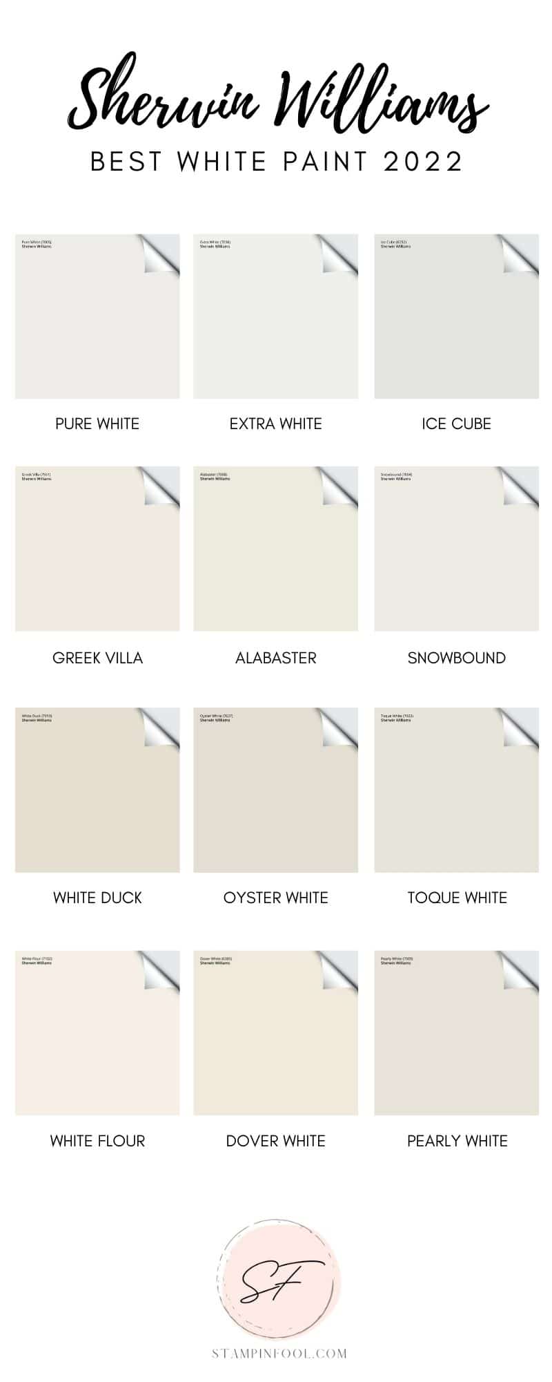
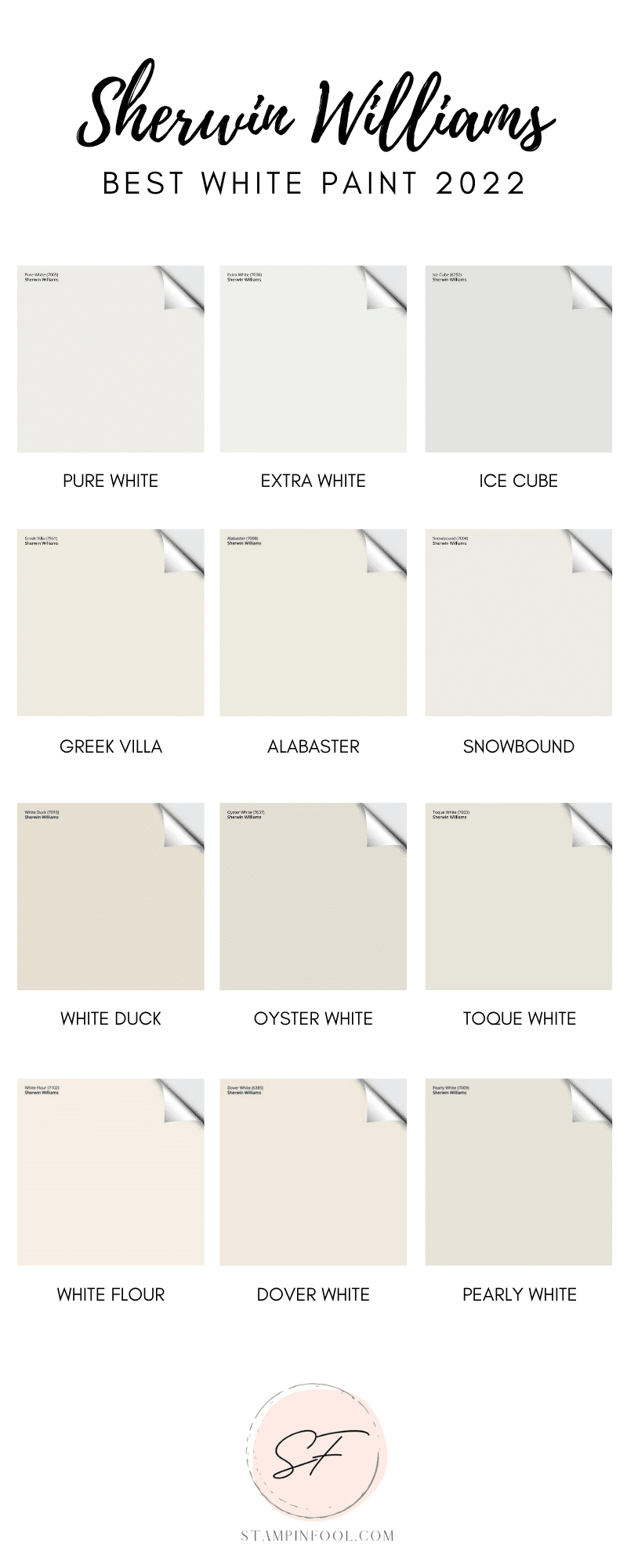
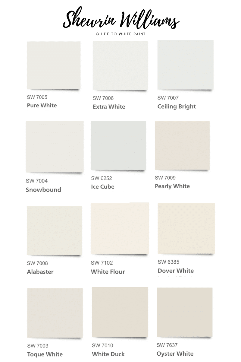
Here are the best white paint colors to use as a starting point for your white paint selection:
- Sherwin Williams Greek Villa
- Pure White
- Extra White
- Ceiling White
- Snowbound
- Ice Cube
- Pearly White
- Alabaster
- White Flour
- Dover White
- Toque White
- White Duck
- Oyster White
Are you ready to talk about the specific undertones and some color properties of each of these 12 white paints that made the list? Let’s get to white paint talk.
SHERWIN WILLIAMS GREEK VILLA
JUST ADDED 2022
I am adding Sherwin William Greek Villa to the list of Best White Paint Colors. I recently used this color in a my latest projects and I have to say it is hands down a winner.
If you love that other brand (BM) famous white paint color, this a close comparison. Greek Villa is slightly warm. It doesn’t look cold, even in hallways and shady corners.
You can feel the warm of this white paint color, like a hug of warm white flooding all around you. I will note that depending on the ceiling color and natural lighting it can look yellower that the ceiling white. But that is to be expected.
To avoid any yellow tones, paint the ceiling the same color or a slightly warmer color than ceiling white.
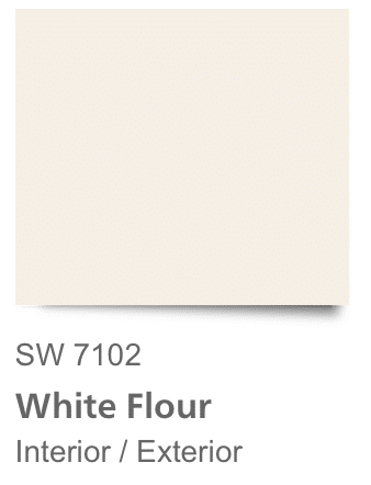
SHERWIN WILLIAMS WHITE FLOUR
Sherwin Williams White Flour is taking the world be storm. It’s slightly warm and doesn’t have a strong yellow or blue undertone. You could say it has the slightest pink undertone.
So if your hard fixtures have pink undertones, it may pull pink. That means it will look pinkish on the wall, but that could work to your advantage with those warm fixtures of the room.
If you are looking for a subtle white paint with depth and warmth, try White Flour. You won’t be disappointed.
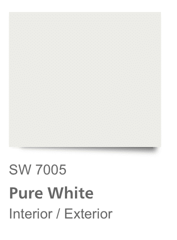
SHERWIN WILLIAMS PURE WHITE
Is a great neutral that isn’t too warm or cool. It has the slightest bit of color to it so that it is a good stark white, but not a strong blue, yellow or beige undertone. It looks great on trim & built-ins in a semi or high gloss finish.
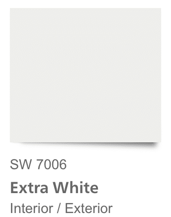
SHERWIN WILLIAMS EXTRA WHITE
Extra White is another great choice for trim and built-in cabinetry. It has very little undertone and runs slightly cool. It will complement any modern space well.
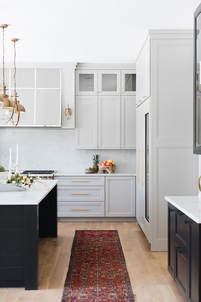
Above is SW Extra White in a kitchen paired with BM Gray cabinetry. image via: https://www.homebunch.com/black-home-exterior-design-ideas/
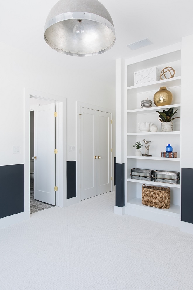
Here is SW Extra White paired with navy blue lower wall image via: https://www.homebunch.com/black-home-exterior-design-ideas/
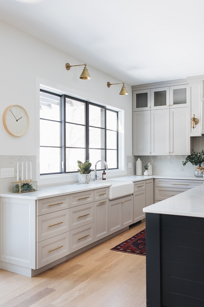
Lastly, SW Extra White paired with Benjamin Moore Grey Husky cabinetry. image via https://www.homebunch.com/black-home-exterior-design-ideas/
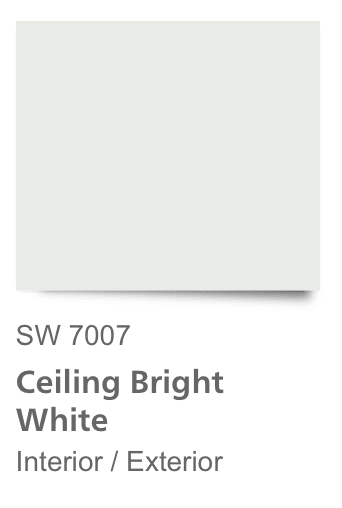
SHERWIN WILLIAMS CEILING WHITE
I’ve included Ceiling White in the list because if you are going to paint the walls white, you should probably also paint the ceiling a bright white.
But, I will put a huge caveat on this, if you are painting the walls a saturated color, you should also paint the ceiling the same color, not white. So make your ceilings bright with white walls, but paint them as the 5th wall if you plan to wallpaper or paint the walls another color.
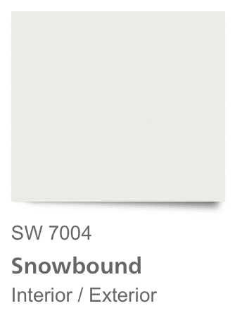
SHERWIN WILLIAMS SNOWBOUND WHITE
Snowbound on its own looks slightly gray, but when compared to warm whites, it shows its cool color. Once it’s on the wall, there is hardly an undertone, but you can feel the crispness of the color.
If you have a very open room, without much wall decor, it can feel sterile, so use this color carefully. I used Snowbound in a hallway and it looks cool, but not blue.
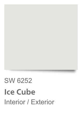
SHERWIN WILLIAMS ICE CUBE WHITE
There’s no doubt that Ice Cube is cold as ice. When it is painted on the wall, it will feel cool and clean. It has light blue- gray undertones which work well with anything.
This one can lean blue, so make sure you paint a large sample board. If you have gray and blue fixtures or furniture it may read blue.
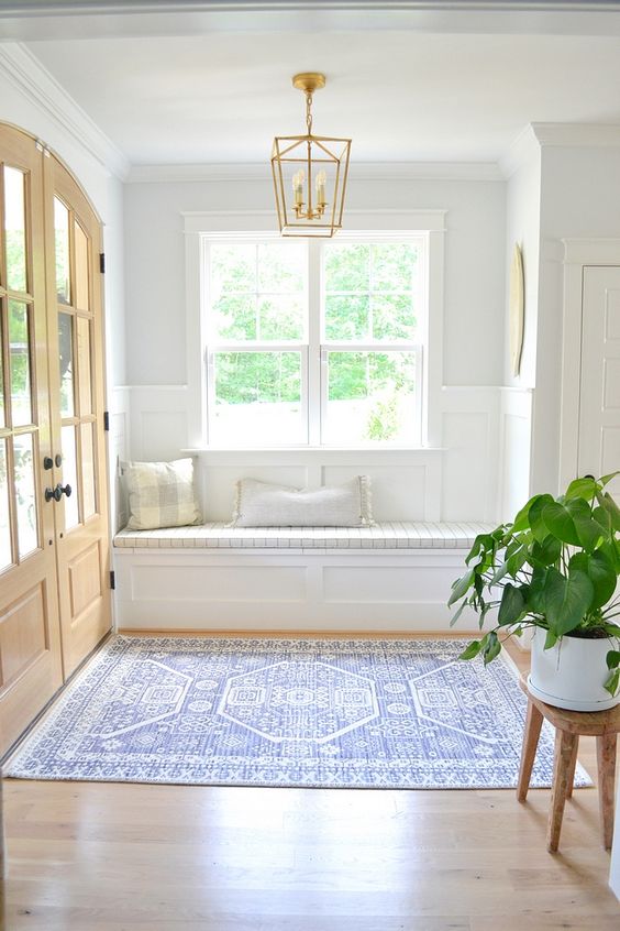
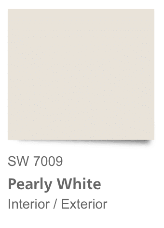
SHERWIN WILLIAMS PEARLY WHITE
Pearly white has a nice taupe base. While it is slightly off white, you won’t be disappointed if you’re looking for a white paint color to wash the walls without it feeling sterile.
You can see (and feel) the warmth here. But be careful of pink undertones here. Use those sample boards!
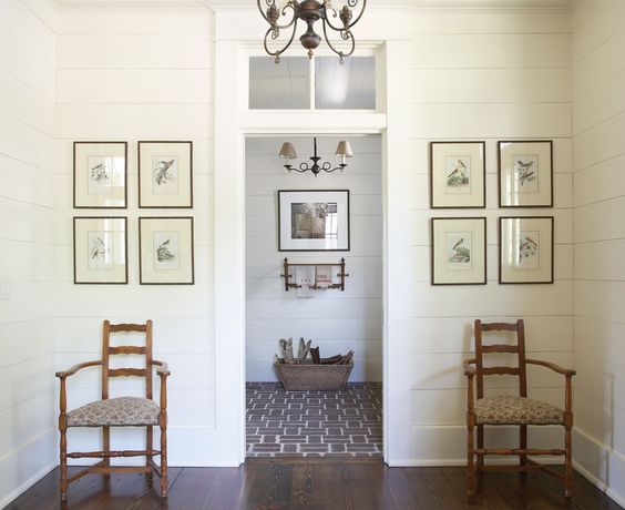
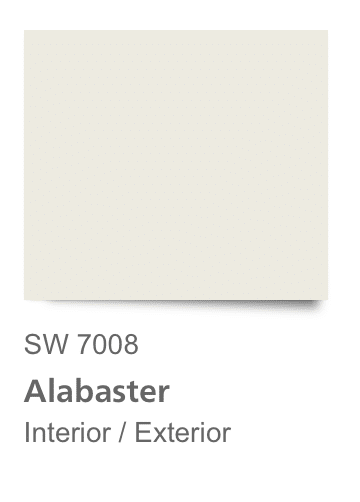
SHERWIN WILLIAMS ALABASTER
You have probably heard the name Alabaster by now. If I had to guess, it is the number one selling SW paint other than ceiling white.
It has trended quickly for a modern white for trim and wall paint alike. It works wonderfully in rooms lit with natural light, giving them a sun filled feel.
**While it looks warm on the swatch, I found it to be too white for our living room. So test out a sample and make sure it doesn’t read cold. If you are looking for a warmer white, opt for SW Greek Villa.
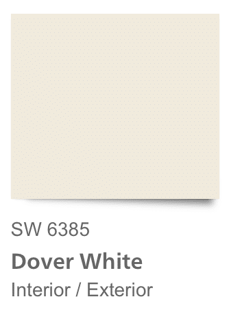
SHERWIN WILLIAMS DOVER WHITE
Dover White has a definite yellow undertone. It is much warmer when compared to Snowbound or Alabaster. If you are looking for a warm white, without going full on yellow, this is your color.
It’s going to be alright for walls in rooms with great lighting, but don’t use it on trim. It will look “dirtier” and yellower compared to bright white ceilings and doors.
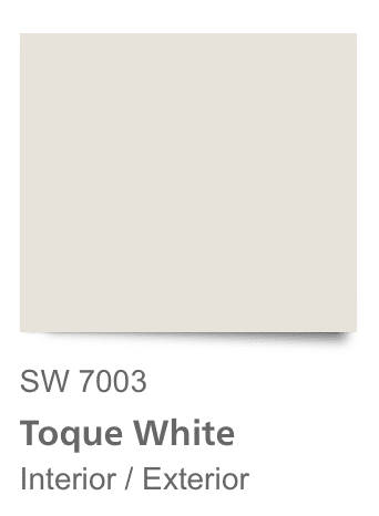
SHERWIN WILLIAMS TOQUE WHITE
This white leans gray/griege. It will be a good fit for walls or trim, or even painting interior doors for a little something different.
If you want gray, but don’t want to fall into the gray trend, Toque White is a great option.
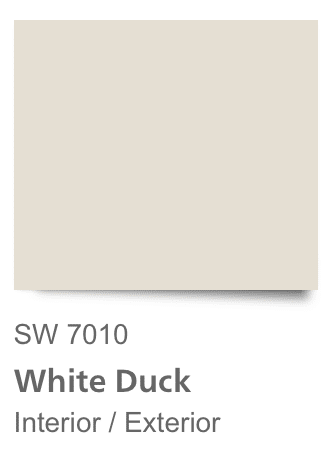
SHERWIN WILLIAMS WHITE DUCK
Staying with the warm whites, White Duck has a slight beige to it. It looks great with wood tone floors and natural stone elements.

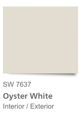
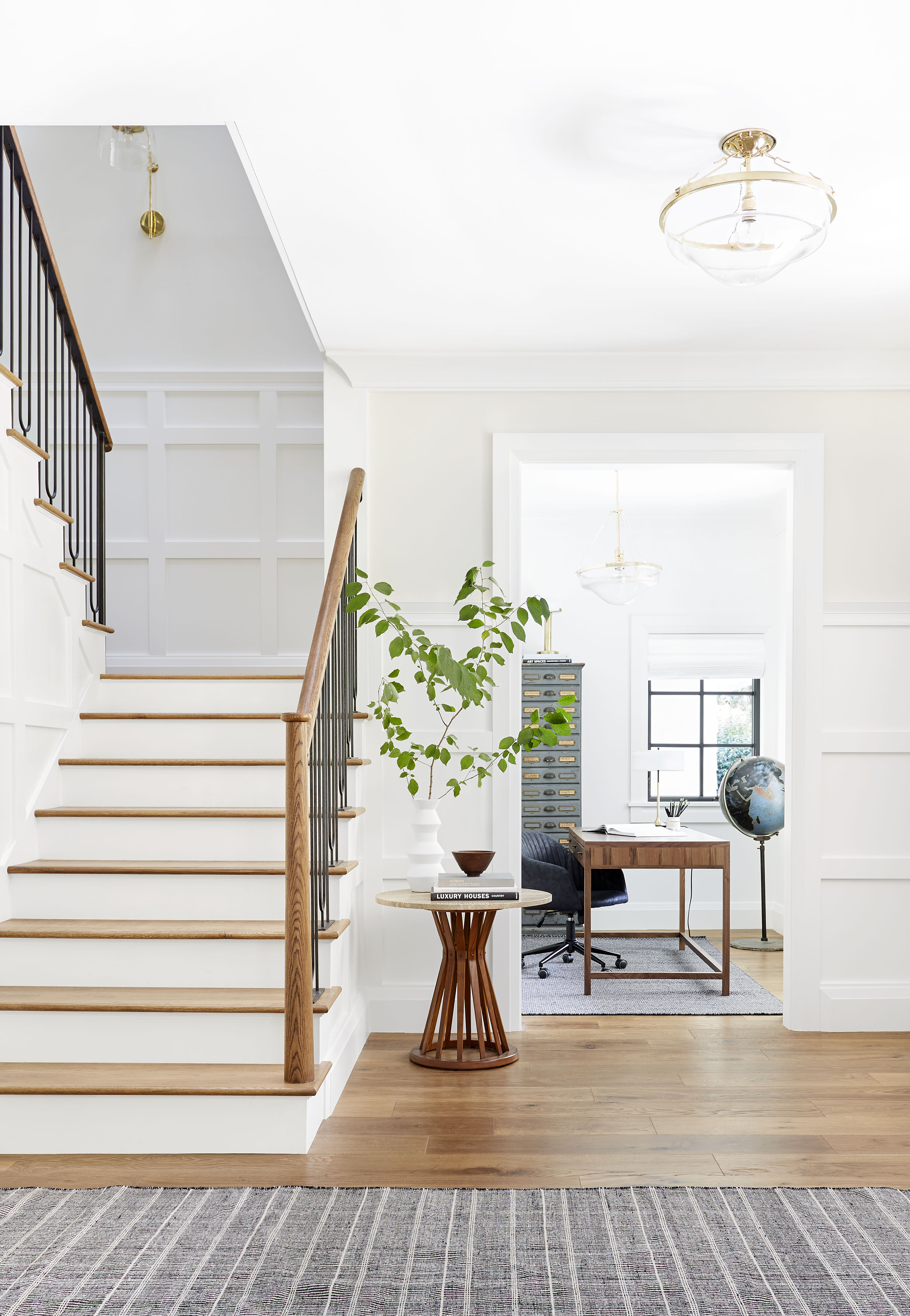
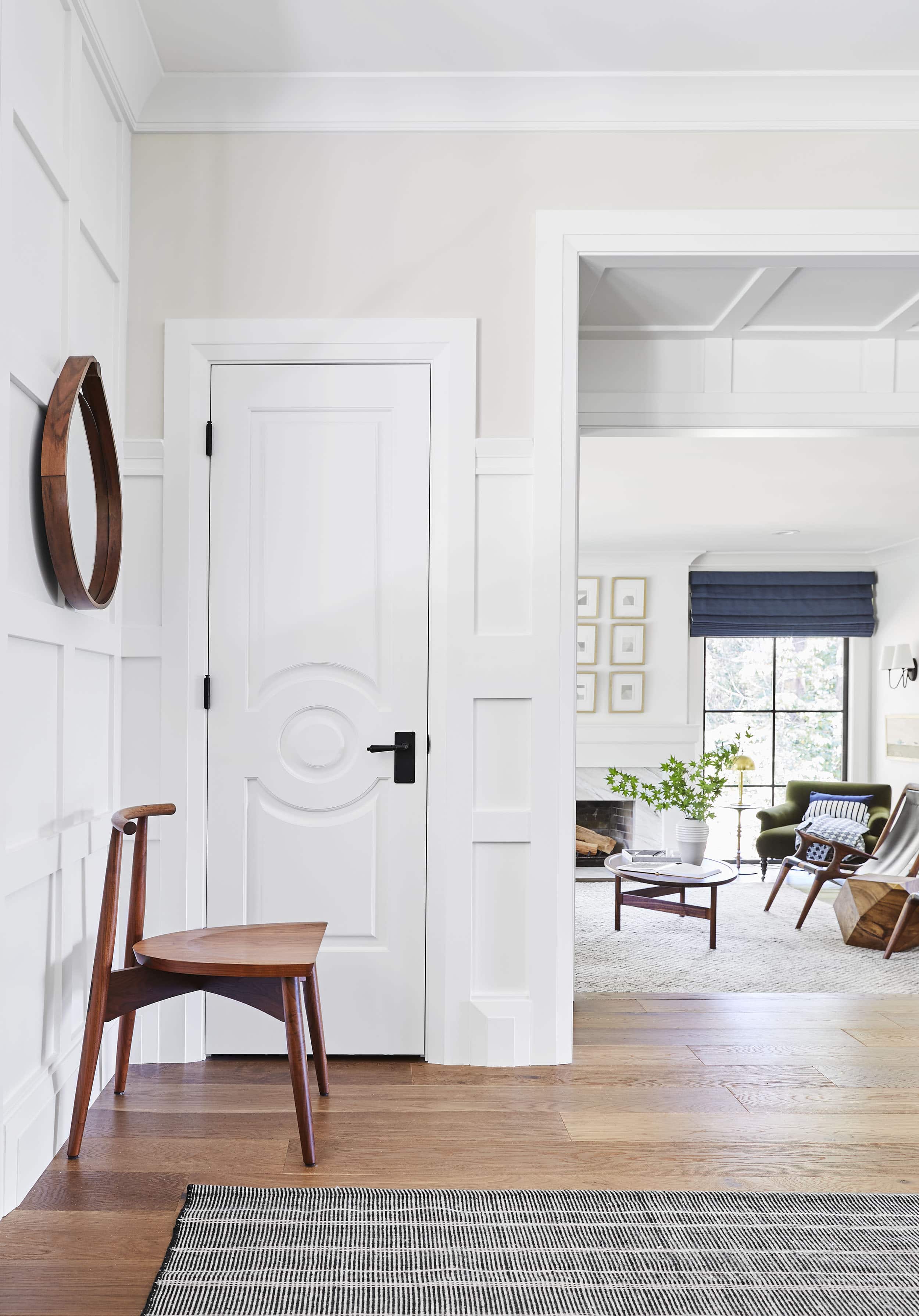
SHERWIN WILLIAMS OYSTER WHITE
Sherwin Williams Oyster is creamy and warm. It looks like a hint of coffee in your cream. Great for bedrooms and bathrooms, or pairing with dark wood tone floors.
That’s the roundup for the top 12 Sherwin Williams white paints. In the end it’s going to come down to personal preference for favorite white in your space. While there are sometimes colors that look “wrong”, there is also more than one color that will look right.
SAMPLE Paint colors to WIN
TEST PAINT COLORS
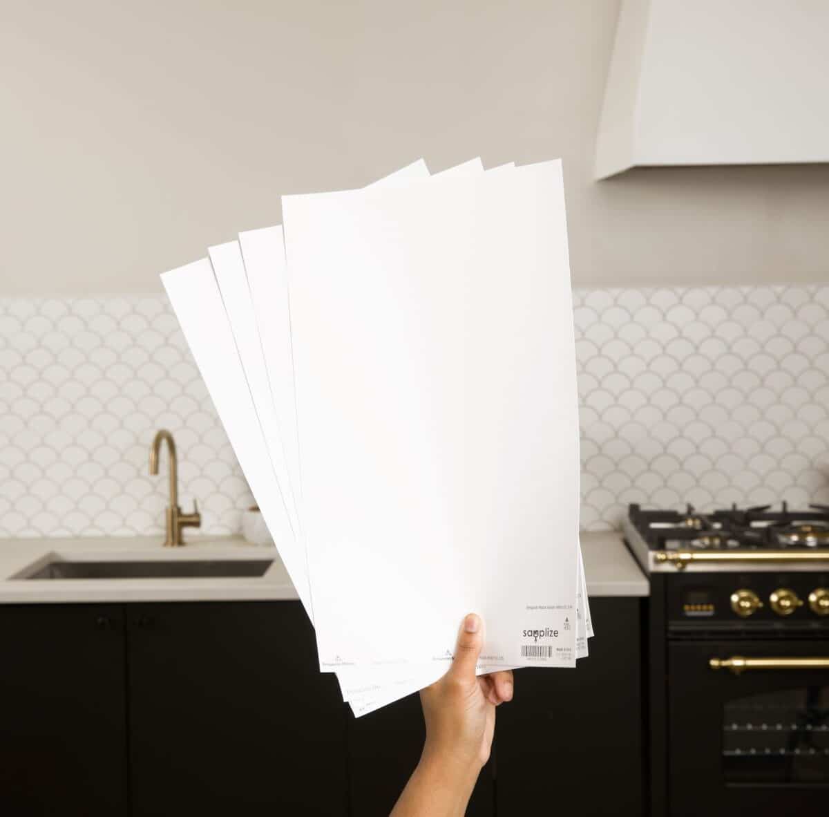
I ALWAYS recommend testing large swatches of your paint colors before committing to the entire house. It’s an expensive mistake that you don’t want to make, so I recommend using Samplize peel and stick swatches to test out your favorites.
Spending $25 on paint samples is always cheaper that a kitchen full of cabinets you hate and a heartache you can’t afford to fix.
- Delivered overnight so you can make those pressing decisions in a crunch
- Crazy accurate color from my favorite paint vendors like BM, SW & Farrow & Ball
- No painting, no mess, no clean up!
- Peel and stick (and come off clean)
- Or don’t peel off the back and use over and over again!
So, don’t forget to test your paint colors!!
The colors you see in other people’s homes won’t look the same in your home. Often times, photos are edited, lightened or color corrected.
Don’t rely solely on photos to make your decision- trust the process and sample the paint.
*Expert Advice*
White Paint FAQ’s
Two words. Sample Boards. The best way to figure out what your favorite paint color is will be to paint a huge poster board and hang it on the wall. Monitor it in different light until you find your favorite.
Semi gloss & high gloss is great for trim and built-ins. Painting the baseboards and cabinetry the same sheen will give the room a high style look.
Ceilings should be painted flat.
For walls you can opt for a premium flat if you don’t want any sheen or a satin for a scrubbable- high durability wall paint.
Cabinets- Satin or high gloss depending on the room.
Assuming the wood trim isn’t gray, you’ll want to choose a slightly cool white paint so that it doesn’t look “dirty” next to the warm trim baseboards (aka a dated orange trim next to a warm white will look dated, not crisp).
None! In all seriousness, if your goal is to make the room feel larger, a bright white isn’t going to add square footage.
So embrace the intimacy of a small unlit room by adding 4-6 light sources- table, floor and sconces, and paint it a saturated color. Don’t forget to paint the ceiling the same color for an enveloped feel.
This technique works great for offices, a library, den, study, bathrooms, and small bedrooms.
The quick answer is a slightly warm white, but read this post on updating an entire kitchen around oak cabinets.
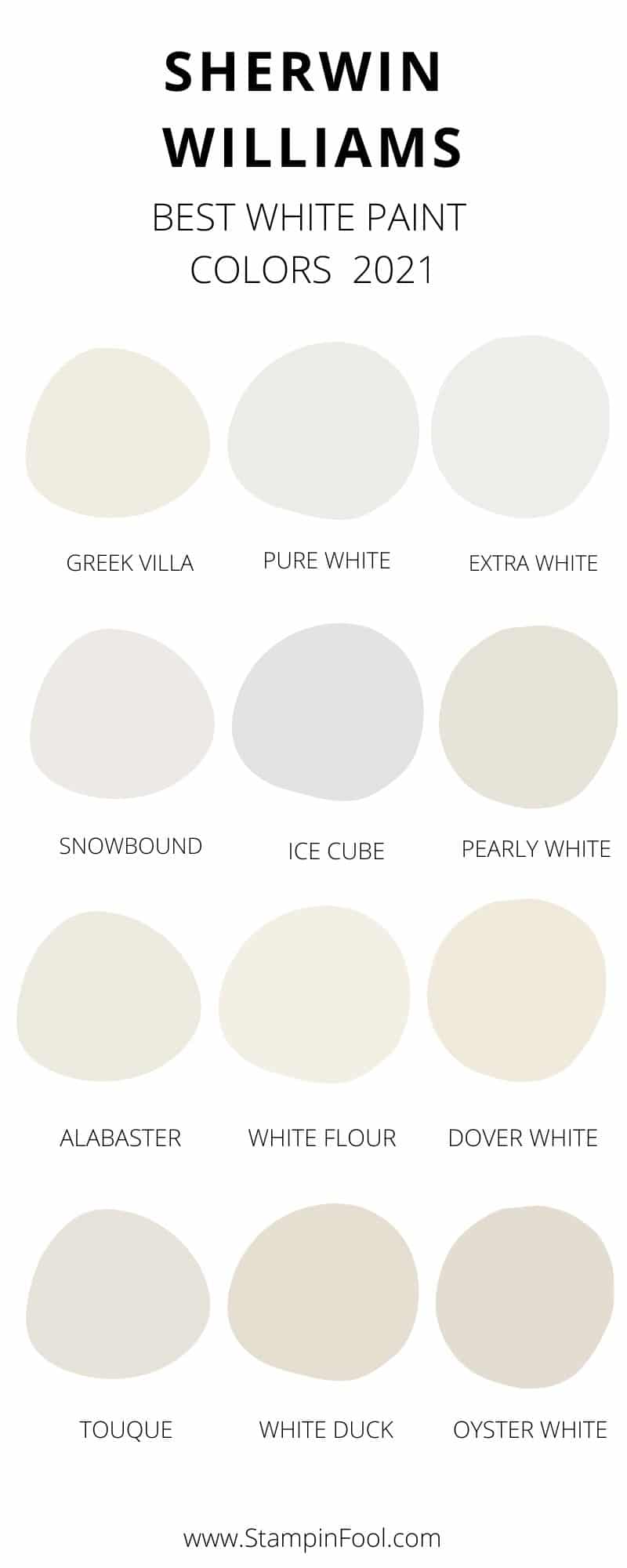
RECAP OF BEST Sherwin Williams white paint colors
These are the best White Paint Colors from Sherwin Williams for 2023 As always, make sure you sample the color in different lighting conditions throughout the day so that you pick the color that works best in your home.
- Greek Villa
- Pure White
- Extra White
- Ceiling White
- Snowbound
- Ice Cube
- Pearly White
- Alabaster
- White Flour
- Dover White
- Toque White
- White Duck
- Oyster White
Other Posts You’ll Love
Exterior double entry doors (facing south), and back porch door (facing north) are painted with Rojo Marron (SW9182). Foors will be a light grey mixture. Would Ice Cube wall color work in a great room with can lights and large south facing windows ?
Hello, great information! We are doing a new build and have just picked out countertops and backsplash. Looking for a white paint color for the cabinets but having a hard time finding one that works. Our countertops are silestone eternal statuario and our backsplash is a 3×12 white subway tile. Best white recommendation for cabinets? Floors are an oak color if that matters.
comment
Home inspections can either make a deal or break it, so make sure that you are well prepared for such inspections. They can hold the key to your aspirations.
Love this post! So much to consider. We’re building new and our main living / dining / kitchen area are all connected. We’ll have a lot of blues & grays. Thinking of Greek Villa for the walls & ceilings, but struggling with which white to pick for trim / millwork. Would love your thoughts on what’s best to complement Greek Villa with the blues / grays! Thank you!
I’ve ordered kitchen cabinet uppers that are Oyster White (no trim or valance above the cabinets)/ I’d like to use Pure White on the walls and trim in the rest of the kitchen. Good idea, or no?
We are remodeling our entire house. It is a modern farmhouse vibe. White kitchen cabinets-black hardware, medium to dark flooring, walnut beams, natural light is more on the lower side. I want white walls but not sure what tint. White trim. I am not into the grays.
You will want to sample large sections on the brick in different places on your house. Watch for colors that look too stark white- especially when the sun is hitting them directly (blinding). Start with warm whites like White Dove, but you can also move down the paint chips to something sand colored or off white. In a large scale it will look “white”, but not as blinding.
I would sample BM White Dove, SW Eider White, Shoji White, White Flour
I have rusty sand greige brick. Looking to update exterior color warm white with black trim As we have black gutters Which color should you use
Hi thank you for nice article.
I am Painting whole house.
I want off white for whole house. Main family room is east facing lots of neutral light. I am thinking eider white or city loft.
Would help me?
Greek Villa is my #1 go to, but make sure to test a sample to ensure it doesn’t look yellow or dirty against the Gray.
Start with Greek Villa and see if you can pull it off without it looking yellow. Each space receives color and reflects light differently. Make sure to test samples!Good Luck!
Do you like the Toque white? If it looks good on the walls, go for it. Otherwise I would look at the mushroom colored paint colors, such as Shitake, Loggia- think sand/putty colors that will pull green and coordinate with the flooring instead of looking pink against it. Good luck!
Hi there
I am remodeling my home – old school i have red oak flooring with a clear finish, and just painted my livingroom kitchen Toque White. I have a large brick fireplace and am having difficulties finding a corrdinating color to paint it (old ugly brick).
any suggestions?
Hi,
I have natural maple cabinet. entire home now are in prime. Does pure white for ceiling and alabaster on wall works?
Thanks
m
I live in Arizona and have Saltillo tile floors and knotty alder doors and cabinets. I don’t get a lot of natural light and I want to lighten my interior walls. I’m looking for an off white that is not glaring and with no yellow under tones.
Do you have any suggestions?
Hi, I’m looking for a good whole house white paint color. I have honey oak hard wood floors, white kitchen cabinets with black countertops, and a lot of light gray furnishings and carpet. All rooms get a fair amount of natural light. What would be the best white to use on the walls? Thank you.
Thank you for the great information. I am remodeling and have chosen Agreeable Gray for kitchen cabinets. My home does not have good natural light so want to use a white on the walls and trim. Do you think that Greek Villa is a good choice to use on both walls, trim and ceiling? Or should I do something different on trim and ceiling?
I am so glad you painted large samples!!! Yes, every home and lighting makes color look different. And it’s important to remember that photos online of the colors are edited and typically brightened and color adjusted to read less warm.
In case anyone is considering White Flour and happens to see this: Make sure to test large swatches in multiple areas and check it out in various lighting! Luckily I realized it looks too yellow in our space before the whole house was done. Yikes.
Thank you for your article! I have been battling to pick the right white on a 1900 Queen Anne Victorian home we are restoring. It has fir hardwood floors throughout, and the custom kitchen cabinets and trim will be Alabaster. I am thinking of Oyster White for walls and ceilings throughout. Advice? I would really appreciate it!
We are redoing our kitchen and it is a north facing room, black cabinets, lots of walnut and white counter tops. Doing a lot of brown and black in the room..what would be the best white for the walls?
We also have a living room attached and want to carry white in there on the walls..but this room has blue and grey undertones? Thx!
With all of the gray and blue tones, you may not want to go stark white. It could feel too cold- try a sample door of Greek Villa, Alabaster and Pure White and see which looks best in your space.
Alabaster is a good complement.
Extra and Pure are both pretty colorless, they are great for trim!
We just painted the walls dover white and I chose extra white as the trim and door color.
Was this a good choice or would pure white have been better?
I have sw kilim beige in my entire house
And divine white trims
I like kilim beige but don’t like trims
I wish to repaint it along with my cabinets
I have a ton of natural light in most part of the house
Which color should I pick for trims and doors and cabinets which goes with kilim beige ?
Im currently moving into a new home and redoing the kitchen. The floors are a deeper brown walnut color and bottom counters will be navy. White/gray marble counter and backsplash. South facing kitchen with medium sized window and decent amount of natural light. What would be best white for top cabinets and walls? Leaning to pure white cabinets and snowbound walls but confused!
Alabaster has a yellow hue in brightly lit rooms and a beige hue in darker rooms. My sister and I both love Alabaster and painted most rooms in our houses in Alabaster with a more standard white for trims and doors. Not sure if I would go for Alabaster trim myself, but to each their own. Maybe it would look good?
I’m using BM Edgecomb gray on the walls. I was thinking about sw alabaster on the trim in semi gloss but not sure if I should paint all the ceilings in alabaster flat/matte.
Any suggestions? Going paint crazy!
Greek Villa is slightly warm, but a nice white.
We recently used sw white duck when we remodeled our kitchen cabinets and it turned out great. We have travertine floors and are trying to figure out what color white to paint the walls to complement the cabinet color
I’m not sure I would add in another white here. Maybe a light sand color or carry the Alabaster around the room. Otherwise go with a color like a desaturated blue.
Great question, I have a warm brick exterior and this too requires a warm white trim. I like to pair these warmer tones with sand colored trim- try Ivory Lace, shell white or a light sand color. Make sure you check undertones of the trim against the exterior in the natural light on all sides before committing to a color. You don’t want it to look pink!
It sounds like lighting may be the cause here- either reflecting what is outside (greenery/trees) or the overhead lighting is casting and it looks green. The contrast between the walls and trim is obviously not working for you. Without seeing it, I’m not sure the exact solution, but likely another deeper warm white that is like a white sand color may better deal with the green tint. I worry painting the trim the same color will just exaggerate the probelm.
When it comes to cool, clean whites, I like to match the ceiling color to the walls.
My trim and cabinetry is alabaster. What would you suggest for walls in the whites family for a tiny bit of contrast but one that doesn’t make the trim look dingy?
I’m looking for a muted white for exterior trim. The body of my home is SW Ethereal Mood.. any suggestions ?
I wish I had read this before we painted our bedroom walls alabaster.
I loved the sample because it seemed like a warmer white but now it looks almost bright green next to the white trim. I really don’t want to paint the walls again. Is there a white for the trim you’d recommend or should I just paint the walls?
Hi – I am redoing my bathrooms my elements are gold fixtures, gold hardware, Carrera marble counter tops, cashmere (white), floors are hexagon white with gray grout I want to do walls in snowbound and trim in snowbound, should I do ceiling in snowbound too or in a different white?
https://stylebyemilyhenderson.com/blog/portland-project-the-entry-staircase-reveal
It’s a project that Emily Henderson did in Portland. She used SW Pure White on all the trim and doors.
Could I paint Origami White walls with Extra White trim? Or would Pure White look better as trim?
I don’t have the answer…but I was trying to figure that out as well;). I’m building a new home and leaning towards Oyster white for my walls and now trying to figure out the trim. My kitchen cabinets are going to be alabaster (from the cabinet company so not sure if it’s the same as SW because mine sure seems to have grey undertones).
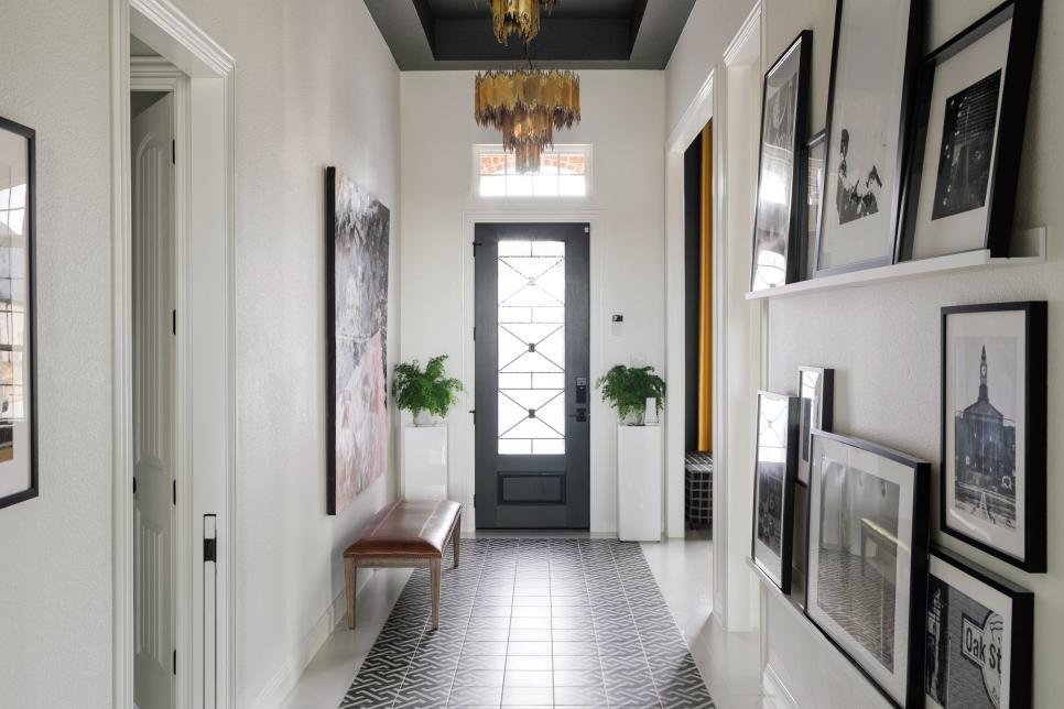
In the second photo representing oyster white, ( it’s a photo of a foyer) please tell me the color of the doors and wood trim that is paired with oyster white
Thank you for this extremely helpful article
I can relate to this. We have an orangish brick exterior. I can best tell you what not to do: don’t go with the grout color- it looks dated and too brown, don’t do a bright white. Exterior colors look so much whiter and brighter due to the natural light exposure. So, choose a warm white- almost creamy or light sand colored and test samples on a window casing first. I don’t have a specific color example, but I will be working on a post for this exact problem soon!
I hope this is helpful to avoid too brown/beige and too stark. Aim for a nice warm white.
Same here, based on the comment that Oyster White pairs with dark wood I am choosing it over Alabaster. Hope it works!
Could you suggest a pairing of 2 whites that work well together and could work with orange tinted Chicago brick on the exterior of our home? Everything is brown and would like to lighten up the exterior of the house. Thank you
I have not seen cool white exteriors like Ice Cube in person. My worry would be that on a rainy day or of you have a lot of trees, it’s going to reflect that color and actually look blue or greenish.
I tend to lean towards a warm white exterior. If you dislike warm colors in general (I def prefer cool most of the time), it can seem odd to choose a warm white. But because natural light is so bright/different than interiors, your warm white is not going to look warm or yellow- it just prevents your house from looking too white and obtrusive. It will tone it down slightly.
I would try very large paint samples before they paint the entire exterior- Make sure you choose a sunny spot and a very shadowy spot to see what the color will look like in high sun and on the sides that don’t get a lot of light.
Because it is new construction- it may slightly delay painting to have them try samples, but try to get the go ahead to try them as soon as masonry is done & you are allowed to paint. Make sure the sample is sizelable- like 36″ x 40″ and multiples coats so that you get a real feel for how it’s going to look.
Good luck!
Hi April, I have a new build, and I will be painting the exterior brick in a cool white tone.. Accented w/straight edge cedar shake or a smooth lap siding either in a dark gray [like wrought iron] or I will do it in all the same white paint color as the brick.. I really like Ice Cube, my question is.. I was wondering if you have seen this color on exterior brick or your thoughts on this color for using it outside.
Oh this is a good question. You can do a walkthrough and consider how light hits your rooms. From there, compare your paint swatches to the floor samples and cabinets samples you have picked out.
You want the largest fixtures in the room to work together. If you don’t get much natural light, I like a warmer white or a gray. For lots of natural light, if you like bright white, go for Alabaster.
Alabaster is a little bit cool for my liking. I prefer White Dove by BM or SW Greek Villa. It’s a nice white that’s the slightest bit warm.
I’m looking at the same situation. I’m reading one part of her post that says not to put a warm white next to a warm wood trim as it will look dated. Alabaster was one I was considering, but it’s warm.
How do you pick when you have a new build and walls aren’t up?
Thank you for such a well-written post along with paint samples and picture examples.
Our home is full of honey oak…trim, kitchen cabinets, doors.
I would like to paint the whole main floor and was looking at two choices: Alabaster or Dover White.
Do you think one of those would look better with honey oak?