
THE BEST BENJAMIN MOORE WHITE PAINT COLORS IN 2021
Are you struggling to choose the best Benjamin Moore White Paint colors for your home? I get it, it’s challenging to get the right white. There are so many white paints to choose from. Which one is the right choice? How can you narrow it down and be sure to get it right the first time?
Have you already painted with the wrong white? If you’ve ever chosen the “wrong” white, you know what I’m talking about. It’s either so cold looking OR the white makes the trim look dirty and less than fresh.
But fear not! That’s why we’ve created this guide to choosing the best Benjamin Moore white paint colors to help you navigate the warm colors, cool whites and our go-to paints to find the perfect fit for your home.
What’s Best BM White Paint?
So, what is the best white paint color for your house? The short answer is, it depends on a ton of factors including the direction the room faces, how much natural light it gets, how and when you use the room, what the other elements of the room are, and what your style preference is.
But, we’re going to address all of that and leave you with a list of great Benjamin Moore white paint colors to try out in your space. The list will be based on whether you like warm or cool colors and which undertones best work with the elements that already exist in the space.
You don’t have to worry any longer on how to choose the best Benjamin Moore white paint for your space from the hundreds of choices of white paint colors.
FAQ ABOUT WHITE PAINT COLORS
Before I go into the in depth as to the how and why to choose a white paint color, I want to answer the most common questions I get regarding the best white paint colors.
What is the most popular white paint color?
The most popular white paint colors vary by brand. The top Sherwin Willams white paint color is Pure White and the most popular Benjamin Moore white paint color is White Dove.
What is the best white paint for walls?
Benjamin Moore’s White Dove is the best white paint color for walls in almost every situation. It is slightly warm, but does not have strong undertones. It looks great on interior walls and on exterior.
What is the best exterior white paint color?
The best exterior white paint color is Benjamin Moore’s White Dove because it doesn’t have strong undertones, but isn’t so stark that it looks jarring. If you are painting brick or even siding, give Benjamin Moore White Dove a try. Make sure you paint large samples before committing to the whole house.
What is the best warm white paint?
Benjamin Moore’s White Dove is the best warm white paint color for walls. It is slightly warm, but does not have strong undertones and doesn’t look yellow. It looks great on interior walls and on the exterior of homes too.
What is the most popular Benjamin Moore white paint?
You won’t be surprised that Benjamin Moore’e White Dove, Decorator’s White & Chantilly Lace are the most popular white paint colors in their collections. They are both trending in the 2020’s, but also timeless colorless white paint colors.
UNDERTONES IN WHITE PAINT
What are Paint Undertones? Undertones are the result of blending more than one color together, like blue with a black tint (for indigo) or blue with a green tint (making turquoise). The dominant color, sometimes called a mass tone or overtone, is the color you perceive. The color you don’t see is the undertone. From paintzen.com
Firstly, undertones will play a huge role in how we see paint color. We use undertones to talk about color in comparison to other colors. So either it is cooler/warmer than or cleaner/muddier then the item of comparison.
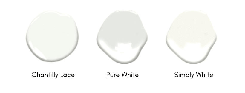
Let me give you an example. Benjamin Moore Chantilly Lace is warmer than BM Pure White. In comparison, BM Pure White and Chantilly Lace are cooler that Simply White which has yellow undertones. Benjamin Moore Pure White is the coolest of these whites and has gray undertones.
PRACTICE MAKES PERFECT
Here is another example for you to practice with:
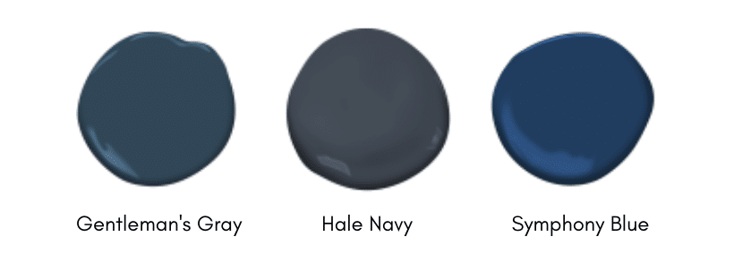
Gentleman’s Gray: Blue/green undertone; It is cleaner (purer) than Hale Navy
Hale Navy: Gray undertone and muddier (more grayed) than the other two blues
Symphony Blue: true Blue; it is cleaner than Hale Navy and Gentleman’s Gray
The easiest way to identify a color’s undertone is to compare it to a true white. If you are still unsure of the undertone, place it beside a primary color and see which one it favors. Once it is paired with a blue, red, or yellow, you will likely be able to pick out the subtle color towards which it leans.
Make a short list of your favorite colors and jot down the undertones. Then form a bracket of your favorites (like final four) and compare them to one another and write down when they are cooler or warmer, moving to the next round in the bracket.
Before you start painting an entire room with a color from this list, you’ll want to consider a few more things, so keep reading. Be prepared to paint large sample boards before committing to a color.
Resource: How Paint Undertones Work. The Spruce
CHOOSING THE BEST BENJAMIN MOORE WHITE PAINT COLOR
Like I said, we want you to really love the color you choose, so let’s take the time to work through the steps that will give us the best result. We will start analyzing the rooms and then paint sample boards.
FIRST STEPS
Here are the simple steps to work on before painting your walls white.
- Create a room plan
- Take note of existing elements
- Assess the tones of furniture
- Consider lighting
- Narrow down the choices
- Test paint samples
- Paint!
DESIGNING A ROOM PLAN
First, you’ve probably heard me say this 100 times before. Have a plan. A full room plan (or even a full home plan). Before you start painting, you should have an entire room plan together. Whether you will be keeping your existing furniture to starting from scratch with everything, have a plan.
Use a program like Canva to make a mood board with pictures of elements you already have chosen. If you haven’t bought anything, start with Pinterest and identify rooms you like. Make a list of the commonalities. Use those elements to plan to the room.
THINGS TO INCLUDE IN THE ROOM PLAN
It helps to make a list starting from the top down.
- lighting choices: note natural light, chandeliers, lamps, sconces, recessed lighting
- proposed or current paint colors
- trim color and finish
- window treatment fabrics & style
- chairs/sofa
- side tables, coffee tables, nightstands
- rugs/wood floor sample
- artwork, decor and plants.
Once you have a full list of everything you think you will need, plan out the space with a floor planner tool like this one.
Why do you need a room plan:
- It will save money on buying the right things the first time,
- You can refer to it with each purchase,
- It will keep your purchases in the same “style” of the room/home,
- It’s a quick visual list of colors and undertones to make sure things look good together,
- It will save you money,
- It will save you money.
No, that’s not a typo, ha! I am repeating myself because it is the foundation of a solid room design. Sometimes we still get things wrong even with a plan. But I promise you will waste far less money on things that don’t work in color, style and size if you have a full plan.
Make sure the plan includes dimensions and allows for a traffic pattern and room to move in between furniture, places for drinks and books to sit, and plenty of light sources.
EXISTING ELEMENTS
Once you have a room plan in place, note the things that you cannot change. These are the hard elements that cannot be removed from the room: fireplace, floors, cabinets, trim, countertops, window sashes.
For each of these things, identify the element undertone. Make a list of each item and write the undertone beside it. Then jot down whether it can be changed or not.
HARD FIXTURES
The list should looks something like this:
- brick fireplace – red undertone – Yes, can be painted white
- built in bookshelves – beige undertone – Yes, can be painted
- vinyl wood flooring – gray undertone – No, floors will not be replaced
- trim – beige undertone – Yes, can be painted
FURNITURE
Go back to the room plan and make a list of things that you will retain or buy. Make note of the undertones and clean/dirty comparison of those items.
IT’S OKAY TO WARM UP A COOL ROOM WITH WOVEN MATERIALS, BRASS AND A PIECE OF WARM WOOD TONED FURNITURE.
YOU DON’T WANT A SPACE TO LOOK TOO COLD.
April Waltrip Interiors via Stampinfool.com
Make sure your list includes: drapery, pillows, coffee and side tables, sofas, chairs, book cases. Pay close attention to the wood tones of the furniture and compare the paint colors to those wood samples to make sure that they will look clean and not muddled next to each other.
CONSIDER LIGHTING
Next on the list is to take into account the natural and added lighting. Lighting sources may include ceiling lights, chandeliers, sconces, recess lighting, floor and table lamps. All of these things affect how we see the color of paint on the wall.
Your lights should be part of your overall plan, as well as the lightbulbs you use in them. Aim for LED temperature 2700 for a soft, natural looking light.
As far as natural daylight goes, this will depend on the number of windows in the room and the direction the room is facing. South facing rooms get great diffused natural light with windows. Whereas north facing rooms tend to have more shadows and less direct sunlight.
Which brings us to the next point which is most important, trying out LARGE paint samples. You will be able to see how the light affects the way we see the color.
Read more: Perfect Size Lighting for Every Space.
NARROW IT DOWN
Now you should take a look back at the fixed element undertone list. If you have primarily warm undertones in those fixed elements, you should choose a warm white. A cool white would look cleaner and make the fixtures look “muddy” or not as crisp.
On the other hand, if the elements have cool undertones green, blue, grays, you can stick to a cool white so that the walls don’t look muted in comparison to the other elements.
What if you have both? If you have both cool and warm undertones in the fixed elements you should mask them. Is the floor an orange undertone? Cover it with a large natural rug.
If you have a brick fireplace or built in bookcases, consider painting those the same as the trim or wall color as well. The less variance in competing undertones the better, the colors will work together rather than making the one color stand out as wrong.
I know it sounds scary to paint a wrong color, but here’s what you should avoid mixing:
- Avoid pink beige paired with yellow or orange beige. Pink beige should be paired with green, gray or blue undertones
- Orange beige with pink beige. Pair orange undertones with yellow, gold, taupe or green gray undertones
- Yellow undertones- avoid pink undertones. Pair with gold, orange, green gray
- Green, blue and purple beige or gray undertones- work well with most neutral colors
- The big takeaway is if you have pink undertones in a fixed element, work carefully with the colors you choose to pair with it.
- Don’t use bright white in a room with no natural light, it will look gray and shadowy.
- Do use warm wood tones and wovens to warm up an all white space and keep it from looking cold.
For each room, make a short list of 2-3 whites you would like to try.
Take the list of your favorite paint colors and place them side by side with the elements of the room plan. Do they complement each other or make one color look crazy? Order 2-3 paint samples of your top colors and let’s get to painting samples.
PAINT SAMPLES
Before deciding on a color, make paint color sample boards. Grab large size poster boards and buy sample pots of the paint colors you have narrowed it down to.
Paint each poster fully to the edges. Jot down the color of the paint on the back of the board. Hang them on the wall and observe them throughout the day. Place the boards in a corner or next to a door frame to see the shadows cast on the color.
I also want you to move the boards around at different times of day. The lighting changes in a room and you will want to be comfortable with the color at all times. Pay special attention to the evening, when you use lamps to light the room. Especially, if you spend a lot of time in the room in the evenings after the sun has gone down and there isn’t natural light.
Assess whether you like the color at different times as well as with natural light and lamps. After observing the color for a day or two, you should be able to eliminate the ones you don’t love or start again if you aren’t liking any of them.
Avoid overwhelming yourself, work with 2-3 colors at a time until you find the one that’s right for you. If you’re having specific trouble, read to the bottom of this post, where I’ve listed FAQ for troubleshooting the best white paint colors.
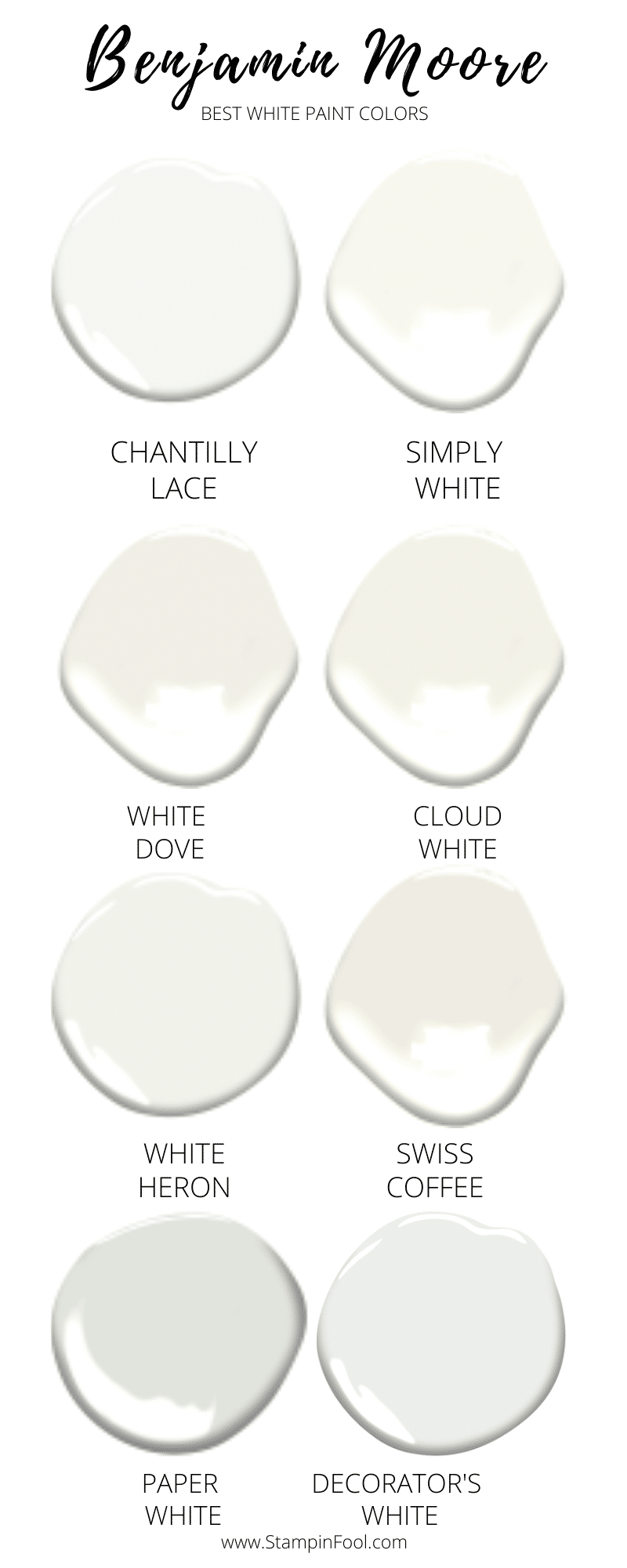
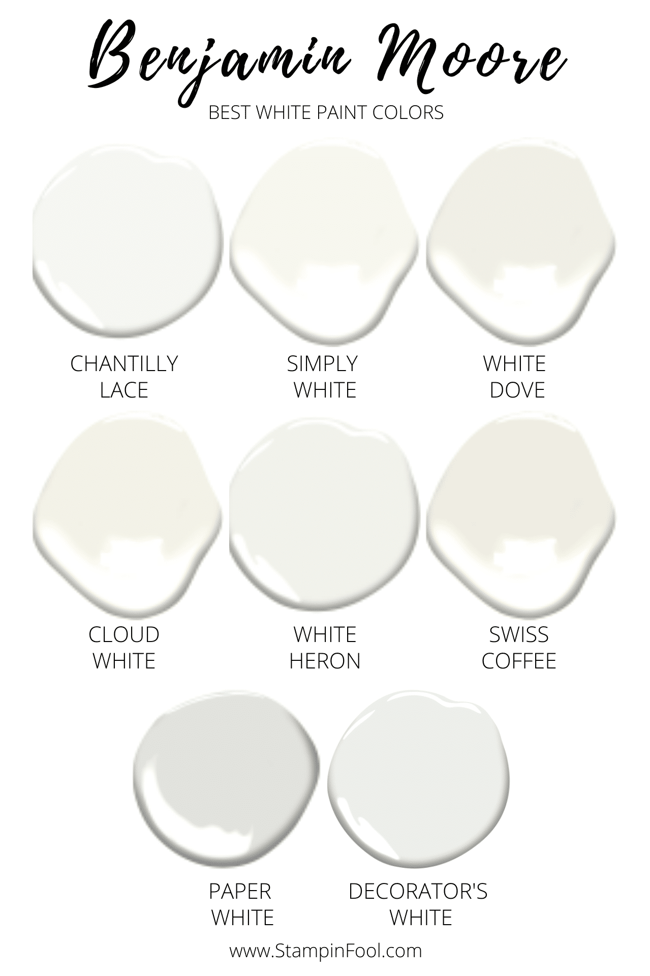
BEST 8 BENJAMIN MOORE WHITE PAINT COLORS
THE GUIDE TO WHITE PAINT
You’ve made it to the color selection process! So I want to give you the best Benjamin Moore white paint colors of 2020 to start working with.
First, here are the best white paint colors to use as a starting point for your white paint selection, in no particular order:
- Chantilly Lace
- Simply White
- White Dove
- Cloud White
- White Heron
- Swiss Coffee
- Paper White
- Decorator’s White
Then, for each other these colors, we will talk about the undertone and compare how cool or warm the color is compared to the next.
Last, we’ll wrap up this talk about the best white paint colors with the answers to your FAQ about paint!
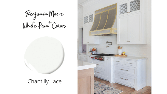
BENJAMIN MOORE CHANTILLY LACE
Definitely one of the top 8 Benjamin Moore white colors is Chantilly Lace. It’s a crisp cool white that works really well in rooms with good natural light and other light toned woods and fixtures. This white looks clean when paired with light oak and goal accents.
Lastly, it looks cooler than most of the other white paint colors on this list, with the exception of Decorator’s White which tends to also read cool, but with a grayish undertone.
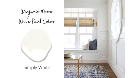
BENJAMIN MOORE SIMPLY WHITE
Simply White is a soft white paint color that will look slightly warm when paired with a bright ceiling white. While it’s great for any room, it is especially good for those large open rooms, that can feel cold without a little warmth added to them.
Because Simply White is warm, you won’t want it directly next to a cold color, so use it on trim as well. Pairing it with stark white will make it look “dirty”. Also, compare a sample to your countertop color so that you don’t have that same muddy effect.

 BENJAMIN MOORE WHITE DOVE

 BENJAMIN MOORE WHITE DOVE
White Dove by Benjamin Moore is probably my favorite white paint color. While I usually lean towards cooler, stark or dramatic colors, this is the perfect white for bedrooms. I recently painted my children’s bedroom walls and trim with BM White Dove.
It is slightly warm, but doesn’t look yellow. You can tell in the photo above that it is not as ivory as the bed, which is a French white from Pottery Barn.
In comparison, the ceiling white, it is slightly warmer. If you have narrowed it down to one or two whites, make a sample board of White Dove. You won’t be disappointed.
https://www.kylieminteriors.ca/colour-review-benjamin-moore-3-best-off-white-paint-colours/
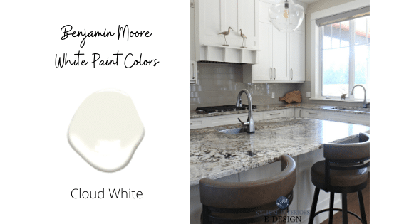
BENJAMIN MOORE CLOUD WHITE
Cloud White is another slightly warm, but subtle white paint color. Unlike some other the other whites that have very little color to them, this paint does have a tint to it. You will notice the color, so if you want a little contrast from the trim, opt for Cloud White.
Review by Kylie M Interiors: https://youtu.be/I6-xDjXfeFw
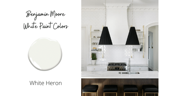
BENJAMIN MOORE WHITE HERON
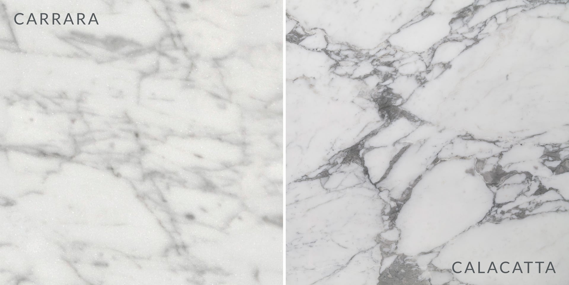
White Heron comes in warmer than Decorator’s White, but cooler than White Dove. So if you are looking for a crisp white for your naturally lit room, White Heron is a good choice. Use the same color on ceilings and trim.
It will look great with Carrara marble, but may make your quartz look off-white, so steer clear.
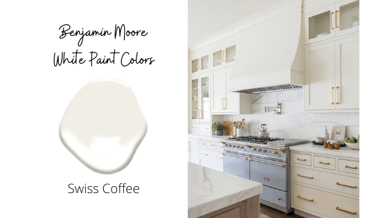
BENJAMIN MOORE SWISS COFFEE
Swiss Coffee is a warm, creamy white with slight yellow undertones. When compared to white trim, it will have yellow undertones and you will easily see the contrast. If you’re looking for a natural color that isn’t stark white, Swiss Coffee makes the list.
I found a great 30 second video review by Erica at Designing Vibes so head over and check it out:
 BENJAMIN MOORE PAPER WHITE
Paper White is a fresh, crisp white paint color. It has a hint of gray, but is not overpowering. So if you want that halo of gray without the strong gray color, paint away with Paper White.
https://www.architecturaldigest.com/story/benjamin-moore-paper-white-paint-color/amp


BENJAMIN MOORE DECORATOR’S WHITE
For a really crisp, clean white background, Decorator’s White is the right color. It is cooler than most of the whites on this list.
Don’t put it in a room with no natural light or it will look shadowy. Also, avoid pairing it with warm trim, because the trim will look yellow next to it.
SUMMARY OF BEST BENJAMIN MOORE WHITES
That’s the roundup for the 8 Best Benjamin Moore white paint colors of 2021. In the end it’s going to come down to what looks best with your existing hard finishes and your personal preference for the feeling you’re going for in the space.
But here is a quick cheat sheet of things to look for in choosing the best white for your space:
WARMER WHITES
- Simply White
- White Dove
- Cloud White
- Swiss Coffee
- Good for dark rooms with no little natural light or north facing.
- Avoid clean whites, stark whites on trim.
- Make sure to compare it to your marble so they complement and don’t make one look “muddy”
COOLER WHITES
- Chantilly Lace
- Paper White
- Decorator’s White
- Make sure to compare it to your marble so they complement and don’t make one look “sterile”
- Pair with white ceiling & trim color that isn’t a warm white, otherwise trim will look yellow.
- Great in well lit, southern exposure natural light.
While there are sometimes colors that look “wrong”, there is also more than one color that will look right. So grab your sample boards and start painting your favorite warm & cool white paint colors!
FAQ’S BENJAMIN MOORE PAINT
I often get asked for the color codes for these because multiple numbers come up when you google them. These other numbers can be from previous color collections, outdoor paint numbers, or different brands with the same color name. These white paint colors are part of the Benjamin Moore Off White Color Collection referred to as OC.
Off-White Color collection:
Chantilly Lace OC-65
Simply White OC-117
White Dove OC-17
Cloud White OC-130
White Heron OC-57
Swiss Coffee OC-45
Paper White OC-55
Decorator’s White OC-149
WANT TO KNOW WHAT THE BEST SHERWIN WILLIAMS WHITE COLORS ARE?

WHITE PAINT FAQ’S
HOW DO I PICK FROM MY FAVORITES?
Two words. Sample Boards. The best way to figure out what your favorite paint color is will be to paint a huge poster board and hang it on the wall. Monitor it in different light until you find your favorite.
– Semi gloss & high gloss is great for trim and built-ins. Painting the baseboards and cabinetry the same sheen will give the room a high style look.
– Ceilings should be painted flat. Unless you have them professionally lacquered. If you are going with a dark color, always paint the ceiling. Don’t leave it white.
– For walls you can opt for a premium flat if you don’t want any sheen. Use a satin finish for a scrubbable- high durability wall paint.
– Skip the Eggshell finish altogether because it cant be touched up like other finishes.
– Cabinets- Satin or high gloss depending on the room.
Assuming the wood trim isn’t gray, you’ll want to choose a slightly cool white paint so that it doesn’t look “dirty” next to the warm trim baseboards (aka a dated orange trim next to a warm white will look dated, not crisp).
None! In all seriousness, if your goal is to make the room feel larger, a bright white isn’t going to add square footage.
So embrace the intimacy of a small unlit room by adding 4-6 light sources- table, floor and sconces, and paint it a saturated color. Don’t forget to paint the ceiling the same color for an enveloped feel.
This technique works great for offices, a library, den, study, bathrooms, and small bedrooms.
TEST PAINT COLORS
I ALWAYS recommend testing large swatches of your paint colors before committing to the entire house. It’s an expensive mistake that you don’t want to make, so I recommend using Samplize peel and stick swatches to test out your favorites.
Spending $25 on paint samples is always cheaper that a kitchen full of cabinets you hate and a heartache you can’t afford to fix.
- Delivered overnight so you can make those pressing decisions in a crunch
- Crazy accurate color from my favorite paint vendors like BM, SW & Farrow & Ball
- No painting, no mess, no clean up!
- Peel and stick (and come off clean)
- Or don’t peel off the back and use over and over again!
So, don’t forget to test your paint colors!!
The colors you see in other people’s homes won’t look the same in your home. Often times, photos are edited, lightened or color corrected.
Don’t rely solely on photos to make your decision- trust the process and sample the paint.
*Expert Advice*
Happy Decorating!
Resources:
The Best Sherwin Williams Paint Colors
I have cherry wood wanes coating that I can’t change. A stone fireplace with cherry wood surrounding it. My walls are a taupe beige color. Old. I want to lighten it up. My furniture is leather linen color couch. And cinnamon colored leather chairs.
What is a good light color of white or other.
I’ve painted my bathroom walls American White. I am now stuck on a trim colour. I tried Chantilly White and the contrast I want doesn’t seem to be there. A thought struck me and I wondered if I should paint the trim a darker colour – Cement. What do you think?
If you aren’t getting a lot of natural light, and it’s currently the “right beige” it will actually work better with the trim and doors to keep it beige instead of white. Painting it white isn’t going to make it look much bigger. I would focus on adding ceiling lighting, table lamps and a floor lamp with 2700K bulbs to make the most of the room.
If you choose to repaint- I would really, really go the extra mile and paint the trim and doors- it will make a huge difference. White Dove and Simply White are always nice, but they can look start next to oak trim and doors.
I’ll be moving into a 12′ x 7′ bedroom, which has honey oak trim all over and 2 doors of this same color. It’s currently painted a beige color, which is nice but I want it to look more spacious. It has 2 windows that I don’t feel it gets a lot of light in. I’m looking at colors like White Dove, Swiss coffee, and simply white for the walls. Do you recommend I paint my future bedroom? If so, what color? Your input would be truly appreciated.
Thank yo for such an informative post! Our style is transition and we’ve decided to repaint our stucco siding with Graphite by BM, Onyx on the shutters, and we’re in-between colors for our trim. Any suggestions for a fitting white? We prefer something that does not have a yellow undertone while making sure the house remains approachable/not too cold. Oh! And we’re still deciding on a front door color. 🤪
Chantilly Lace is almost always a winner.
Yes, you can paint the trim satin. I typically go satin on walls and Semi on trim. But if I am aiming for a wall that fades away behind some showstopping decor pieces, I will do flat on the walls and satin on the trim.
If I use White Dove for my walls and say, a ceiling white on the walls, what would you recommend for the trim? And same for walls in Chantilly lace, what trim would be best? If walls are in satin, is it ok to paint the trim in a satin finish, too?
Thanks
Hi! We are using White Dove for our living room, and deciding between White Dove, Simply White, or Chantilly Lace for the ceiling… would you have a recommendation on which we should use? Room is West facing and the floor is warm wood.
Try a sample of BM Chantilly Lace.
Try samples of bright whites next to the countertops. But do note that some whites can feel gray of shadowy in different lighting conditions.
Try BM Chantilly Lace or Decorator’s White.
Hi very useful. We have a south facing kitchen in Scotland with high ceilings. The floors will be oak and the island a light blue/green. The south facing chimney breast is marble metro tiles and the countertop is a white quartz both have grey/blue tones through them. For our walls and cabinets most samples have ended up too yellow next to the counter and tiles. Any suggestions/help would be really appreciated as I’m going mad!
Hello, I’m looking for a white for a living room with east sun in the morning and hot west sun in the afternoon. We have oak staircase and brick fireplace. Floors are a LVP with brown and gray undertone. Doing a modern farmhouse look. The color would move into the Kitchen.
If you are looking to stick with cooler whites try a sample of BM Chantilly Lace or Super White.
If you are aiming for colorless, skip White Dove. Opt for Chantilly Lace or Decorator’s White. You need to sample each on a few walls to see the lighting they will get. They can look gray or blue depending on the natural lighting situation in each space. Wait until drywall is up and hang sample boards.
Good Luck!
Hi!
I am in the process of building my house and have to quickly decide on colors but Im having a real difficult time! Im hoping you can help me out! Im stuck on which white paint to use in my house. My kitchen is white shaker cabinets, Calcutta quartz, open floor plan to dining room and living room. Living room has pine coffee tables, stone colored sofa, charcoal/black/cobalt pillows. I want to keep it bright, airy. Stuck between decorators white, whit dove and paper white. I do not want any yellow, blue undertones. HELP, LOL!
Thank you!!
I have a tiny bathroom with Hale Navy cabinet…no window, carrara quartz. What white with blue undertones recommended??
I went with a flat ceiling white, but in a bedroom, you could easily continue the same wall color to the ceiling in a flat.
Hi April,
Oh, who knew painting a room white could be so challenging? I love what you did in your children’s room, with the white dove walls and trim. Would you share which white you used on your ceiling? I have been struggling with this decision for weeks.
Thanks so much!
What is the color shown on the wall in the photo with the fireplace?
Off-White Color collection:
Chantilly Lace OC-65
Simply White OC-117
White Dove OC-17
Cloud White OC-130
White Heron OC-57
Swiss Coffee OC-45
Paper White OC-55
Decorator’s White OC-149
They may have alternate numbers if the color was part of a previous collection, outdoor paint, or if another brand also has a color with the same name.
Hey thanks for dropping by the Blog. First, get a large sample of Trout Gray and paint it on a white wall, or poster board. Then you will want to compare samples to it. It will look warmer or cooler depending on your amount of natural light, flooring, hard fixtures and elements in the room. So, if it looks warm, go for a warmer white, and if it looks pure/saturated and cooler, opt for a cool white like Chantilly Lace.
Hi Ms. Waltrip, I just loved this article. But of course I’m lost with which white to pick. I would like to paint an accent wall in Benjamin Moore -Trout Gray (2124 20). But having a hard time deciding which white /trim would balance my kitchen.
When I search each of these colors, 2-3 options come up with varying letters/numbers … I don’t know which to select?
If you are going for a light and airy look, go for a warm white like BM White Dove or SW Westhighland White. I like trim and walls the same color in bedrooms. If you want a cocoon feel, choose a light blue close to duck egg and paint the walls, ceiling and skirting for a full on feel. It will be cozy and peaceful.
Try samples of SW 9054 Little Boy Blu and Billowy Breeze.
Definitely test a large paint sample, but generally, White Dove goes really well with warm wood tones.
Hi April,love your site. I have honey oak baseboards, doors, kitchen cabinets throughout our home. No way will my husband let me paint them. I want to paint the whole house white, would dove white work? The crown moulding is white. What BM white paint should I use? Many thanks for your help.
I have duck egg blue bedspread and a mid brown carpet. Any suggestions as to best colour for my walls, ceiling and skirting boards would be most welcome.
I have duck egg bedding. My bedroom is quite small with not much natural light. What would be the best colour for my walls? I also habe a mid brown carpet, not light and not dark. Any suggestions would be very much appreciated.
Glad to hear you choose the right white paint!
Painting the exterior of our new house Decorator’s White, going for the tone on tone look with the shutters, any suggestions for BM or SW colors to achieve this look?? The front door will be SW Tradd Street Green with polished brass hardware.
Thank you for your insight about white paint! I had a feeling I was on the right track, and you confirmed it.